Mobile first indexing

Mobile first indexing" refers to an approach to indexing where the mobile version of a website is crawled and indexed first. The computer version of the website will still be indexed and ranked, but the mobile version is given priority.…
In an age where all aspects of life are digitalized, it is more important than ever for any business to have a good online presence if they want to succeed and make money While the search engine acted according to the desktop version of the web pages, it is now (for almost all sites) the mobile version that serves as a reference On that note, if having a memorable visual identity is wise to attract its target audience, theoptimization of websites for Google’s Mobile first indexing is essential It is therefore important to understand in detail the Mobile first indexing and its consequences on SEO.
- What is Mobile first indexing?
- How does this new approach to Google indexing work?
- What is the impact of Mobile first indexing on SEO?
- How to react to this shift in Google’s priorities?
This in-depth introduction to mobile first indexing provides an overview of its principle, its main implications and its various consequences on SEO. It also answers the main concerns raised by the subject. Follow the guide!
Chapter 1: Focus on mobile first indexing
In order to facilitate access to the best information for the Internet user, Google has made many major changes over the years. Since Caffeine to the Panda and Penguinthe search engine is still trying to meet the requirements of the web and its users 
1.1. mobile first indexing by Google: what exactly is it?
Translated from English, Google’s mobile-oriented indexing corresponds to the crawling and indexing system that the search engine now uses Still called mobile first indexing or mobile first indexing, this expression has no hidden meaning, it is exactly what it sounds like It simply means that the search engine uses its indexing robot in first intention on the mobile and not desktop version of the websites 

 In addition, the cached versions of web pages are usually the mobile versions of these pages. All these indicators highlight the primacy given by the search giant to mobile.
1.2. Google’s mobile-first indexing system: What is it not?
As described above, Google’s Mobile first indexing is subject to many assumptions and misinterpretations. When is it really?
1.2.1. Google’s famous Mobile first index
For Google, mobile has become the standard version. Therefore, the main index of the search engine is the one constituted by its Googlebot for smartphone and the secondary index is the one constituted by its desktop crawler. Let’s be clear, there are not several Google indexes, this is just a misnomer. The mobile-first index is not a separate index at all. It should just be understood that for the search engine, its index is primarily mobile and secondarily computer (or tablet). Mobile first is therefore not equivalent to Mobile only. In other words, websites without a mobile version will always be indexed from their desktop version
1.2.2. Mobile first vs Mobile friendly
Who says Mobile first indexing does not mean Mobile friendly These are two completely different and independent concepts. Their only relationship is the objective they share in common: the promotion of the mobile side of Internet search to improve the user experience 

1.3. From the computer version to the mobile version
When and why did Google switch to Mobile first indexing?
1.3.1. The advent of Mobile first indexing in detail
Far from being Google’s first action in its promotion of the user experience, the deployment of Mobile indexing was not done in a day.
1.3.1.1. The place of mobile first indexing
Mobile first indexing is Google’s latest attempt to establish a more mobile-friendly web based entirely on user experience 
1.3.1.2. History of the implementation of the principle
The order of things:
- In november 2016google presented to the world for the first time its new project aimed at orienting indexing towards mobile. In this first announcement, the search engine already recommended a number of best practices that needed to be implemented in order to prepare websites for this new Mobile first index.
- In december 2017more than a year after the first mention of Mobile first indexing, Google made a second announcement in which, it reiterated its desire to give priority to mobile. In addition, the search engine specifies that it has already begun its changes and that the first tests for the deployment of Mobile first indexing were going well.
- The announcement of march 2018, was intended to let the world know that the migration to Mobile first had already officially begun for Google’s best practice compliant websites. Nearly half of the pages presented in the SERPs were now running under Mobile first indexing. A real leap forward for mobile first.
- May 2019in May 2019, mobile-first indexing was set as the default indexing system for all new websites not yet indexed that will be online from July 2019.
- March 2020in March 2020, Google announced that 70% of the sites presented in its SERPs were already under Mobile first and that from September 2020, it would switch to Mobile first indexing for all sites on the web.
If in March 2002, Google had officially announced that it was moving to Mobile first indexing, it has resolutely changed its mind and postponed the effective date of the final deployment to March 2021. A decision very well received by website owners. The search engine wanted to give more time to the operators of desktop websites to prepare themselves But that’s not all. An official post of the search giant mentioned startup problems that would have been noticed during the tests. Added to this was the general uncertainty that reigned following the Covid-19 pandemic. In any case, the completion of the search engine’s plan to bring all sites on the web to mobile-oriented indexing is scheduled for this spring 2021.
1.3.2. Google indexing: what is it really?
Of course, as usual, Google remains rather opaque as to the indexing and ranking criteria that underlie mobile first indexing. A real Black Box of which only the experimentation allowed to really understand the ins and outs Even so, by combining the information provided by the search engine with feedback from SEO experts, it becomes easier to understand the concept.
1.3.2.1. Before mobile first indexing
Traditionally, theindexing system of Google indexing system was mainly based on the classic desktop version of websites for the evaluation of the relevance of pages that will be proposed to Internet users. As a reminder, indexing is a process by which the search engine :
- Explores the web;
- Scans, collects and records information present on the websites;
- Etc.

1.3.2.2. After the advent of mobile first indexing
In line with the trend that the majority of users access Google Search from their mobile devices, Google’s priority in crawling and indexing pages has turned to mobile Indeed, the historical focus on the desktop version of websites was no longer really justified. With the advent of mobile first, the traditional focus of indexing has been reversed

However, the guiding process of indexing and classifying web pages as we know it remains the same. All that changes is the version of the sites on which it is applied as a priority
1.3.3. Why this preference of Google for mobile?
If Google has been working for a long time on the development of mobile-first indexing, it is first of all to respond to the radical change observed in the way users search and surf the web

Today, the evolution of uses is such that for Google, it is essential to think mobile first Indeed, according to internet and mobile figures and trendsin 2019 mobile devices accounted for 54% of web pages visited worldwide against 46% for computers. By 2021, this proportion of mobile connected users is expected to increase to 61% of global internet traffic. It seems clear that mobile users continue to displace the number of desktop users. 
Chapter 2: How to deal with Google’s mobile first indexing
By relying mainly on mobile first for ranking web pages, Google has changed the rules of the game more than ever. Search engine optimization and online lead generation are following a whole new protocol that all website operators will have to adapt to.
2.1. The Preliminaries: Preparing for Mobile First Indexing
With its advent, Mobile first indexing has completely changed the conception and use of mobile in the SEO world.
2.1.1. The right mindset
As a prelude to any action in terms of mobile-oriented indexing, it is important to have the right frame of mind. Don’t panic! At first glance, this may seem strange, but with hindsight you’ll see that it’s not Once you know the basics and the potential impact of this change on your site’s organic visibility, everything will be easier. You will find that it is quite easy to adapt your own processes to work with mobile first.
2.1.2. Preparations according to the mobile compatibility of the site
The mobile compatibility of sites is an essential criterion for a smooth transition to mobile-oriented indexing. What to do depending on the case? 
2.1.2.1. For mobile-compatible websites
A website can be mobile compatible in three different ways.
2.1.2.1.1. Mobile compatible websites via responsive web design
In terms of responsive design, the design of the site and its content automatically adapt to the available screen width (in pixels) 
2.1.2.1.2. Mobile compatible websites using the dynamic serving method
As in the previous case, the design of the site and its content automatically adapt to the available screen width (in pixels). Moreover, the URL also remains identical for each version of the website If this method differs from responsive web design, it is because the source code of the site content is not the same for each device. Thus, after detection of the type of device, the content of the corresponding site is then displayed. It is then understandable that from one device to another, the content of the site may vary. Indeed, the objective here is to lighten the mobile version of the site. In this case too, the actions that need to be carried out are to study the mobile version of the site in a real situation through a series of tests.
2.1.2.1.3. Mobile-friendly websites thanks to the separate URL technique
The method of separate URLs or apart from involve 2 different websites (or pages). Indeed, one website is designed specifically for mobile and the other is designed for computer and tablet In this case, the mobile site is optimized accordingly for search engines and everything is done so that it is recognized by Google as mobile compatible. The method is then effective and has nothing to envy to the previous ones. But in this case, it is crucial to take a step back and carefully analyze both websites
2.1.2.2. For websites that are not mobile compatible
For these websites, the list of things to do is substantial. It is more necessary than ever to plan the creation of a mobile compatible version for the site The risk incurred in this case is primarily SEO. Yes, Google favors the mobile version of other sites to the detriment of your website that remains in desktop version 
2.1.3. The essential testing procedure
Many tools are available to help you improve your mobile initiation 
2.1.3.1. The mobile optimization test
It is important to carry out this test, because its results determine to a large extent what to do. It ensures that the pages of your website are compatible and adapted to mobile according to Google 

2.1.3.2. The URL inspection test
Still as important, it follows the same logic as the previous test. This test verifies that Google has full access to all the resources necessary to render your website on mobile 
2.1.3.3. The website audit
In practice, it is good practice to perform an SEO audit on the entire website (all web pages) 
- Ensure that the crawl is done correctly on each page of the website;
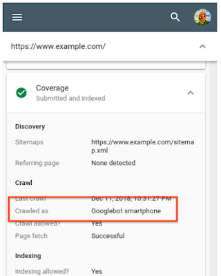
- Check that the Googlebot for smartphone crawl is in line with the SEO objectives of the web pages;
- Verify the conformity of the number of pages with the site map;
- Identify possible accessibility problems identify possible accessibility problems, erroneous pages, broken links…
- Define the different actions necessary to improve the global referencing of the site;
- Etc…
In the context of such an important test, theaudit solution from Twaino audit solution is the most appropriate.
2.1.3.4. Finally, the test of the structured data of the web site
Also called markup schema, structured data is a type of code that facilitates the crawling, indexing and display of your content in the SERPs 
2.2. The imperatives: Comply with mobile first indexing
2.2.1. Optimizing websites for mobile is a priority
Not having a mobile version of your website is one of the best ways to lose leads and revenue. It is therefore essential for your website to be perfectly optimized for mobile. There are many technical aspects to consider when preparing a classic website for mobile. It is crucial that the management of these aspects is entrusted to professionals like Twaino.
2.2.2. What are the best practices for optimizing a website for mobile?
The best way to improve your mobile ranking factors is to optimize the user experience. To do this, there is no better way than to follow the best practices set out by Google:
- Make it easy to access and display content and resources of the mobile version of your website by users and Googlebot;
- Ensure thethe correct incorporation of structured data on all versions of your website;
- Ensure theexact equivalence of metadata in all versions (mobile and desktop) of your website;
- Ensure that the visual content of the mobile version of the website respects google’s recommendations and that the placement of ads does not negatively affect the user experience;
- Respect additional guidance from Google s additional guidance for websites with separate URLs;
- Follow the troubleshooting guidelines proposed by the search engine to overcome possible problems;
- And so on.
The objective is to always keep in mind the promotion of the user experience
Chapter 3: FAQ on mobile first indexing
For website owners, webmasters, SEOs, and other SEO enthusiasts, mobile first indexing can be confusing. Here are answers to some frequently asked questions.
3.1) How to know if your website is subject to mobile-first indexing?
As a website owner, you will be directly informed by the search engine through a message left on your Google Search Console account. 

3.2. Can I opt out of mobile-oriented indexing?
Of course not! Understand that once your website is supported by mobile-first indexing, there is no going back. As the initiation of your website to mobile-first indexing is automatic, you have no manual control over the process. It is therefore absolutely necessary to think only mobile first in relation to the website.
3.3. What happens to AMP pages with mobile first indexing?
Many sites have an AMP (Accelerated Mobile Pages) version in addition to the mobile and desktop versions. Google stipulates that for websites created with both mobile and AMP versions, only the mobile version will be indexed. Meanwhile, the AMP version will serve as a ranking factor for user experience in the Web Vitals.
3.4. Should rel=alternate and rel=canonical tags be reversed?
With priority given to mobile, wouldn’t it make sense to now reverse the assignment of rel=alternate and rel=canonical tags, for separate URLs? As logical as it may seem, Google does not do it. The search engine clearly continues to ask website operators to indicate the desktop URL with the canonical tag on the corresponding mobile site. On the other hand, it asks to add the mobile URL as analternative on the desktop site. For Google, it would be too much to ask the website operators to reverse rel=alternate and rel=canonical.
3.5. For mobile first indexing does Google rely on less content?
Given that the mobile version of websites is more or less lightened in terms of content, it is legitimate to wonder if the value of content has decreased with the search engine. It is not the case! For Google, content is still king. However, the search giant rigorously notifies that it will only rely on the content of mobile pages for display and ranking in the SERPs. 
3.6. On mobile, will hidden content be ignored by Google?
This is not content that is absent from the source code of the mobile page, but rather hidden for the purpose of mobile ergonomics. One may wonder if Google will take hidden content into account. By default, the search engine gave little consideration to hidden content when the user arrived With mobile first indexing, Google reassures that hidden content on mobile pages for user experience (Ux) reasons will be fully taken into account.
3.7. Should I prefer a mobile site via separate URLs or Responsive web design?
It is strongly recommended to prefer Responsive web design. And for good reason, no matter what we say, it will always be more laborious and complex in terms of natural referencing to manage a mobile site separately from the desktop site. Google has already pronounced itself on the subject: 
3.8. How will the results on desktop be evaluated?
As with mobile, the results presented on the computer will be determined according to mobile content and criteria. In other words, the ranking will be based on the mobile version of websites, even though the desktop versions of those websites will appear on the computer.
3.9. Has the classic computer version become useless?
What is certain is that in this new era of mobile first indexing, the desktop version of websites has obviously lost its priority to the mobile version. To what extent? Nobody can say yet However, a website with only a desktop version will not disappear from Google’s index. It will still be crawled by Google’s crawler, perhaps to a lesser degree than before.
In conclusion
From this article, we will remember that the concept of mobile first indexing is the centerpiece of a machinery aiming to make the web an environment in tune with the user experience It is an elaborate process, already functional, that has changed forever the face of web search as we know it. In doing so, the mobile orientation of Google indexing raises many concerns. In order to adapt and thrive under mobile first indexing, it is a good idea to follow Google’s prescriptions regarding this new mobile first index.
- What do you think about Google’s Mobile first indexing?
- How did the transition of your site to mobile-oriented indexing go?
- Do you have any other concerns on the subject?
Feel free to share your experience and concerns about Mobile first indexing in the comments. See you soon!

Related terms


