Landing page

A landing page or destination page is a specific page that appears when a user clicks on a link. They are usually linked to marketing campaigns and are often optimized for conversion or for promotion.
If you’re not using landing pages yet, you’re missing out big conversion opportunities for your visitors.
Indeed, the majority of companies that use them find that they are effective with an average conversion rate of 35.62%.
If you do not yet have a clear idea of what they are or if you are already using them without obtaining complete satisfaction, the next lines will allow you to know:
- What exactly are landing pages;
- The essential elements of a landing page;
- Best practices for designing a landing page;
So follow!
Chapter 1: What does the concept of landing page really mean?
Herewe go together:
- Define the landing page expression;
- Show the difference between landing page and home page;
- List the types of landing pages;
- Describe how a landing page works;
- And give some advantages of a landing page.
1.1 What is a landing page?
In a simple way, the landing page is the first page that appears on the screen of an Internet user when he clicks on a link.
Based on this idea, the destination page can be likened to:
- A home page;
- A blog post;
- A product page;
- A lead capture page.
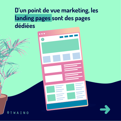
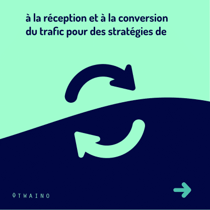
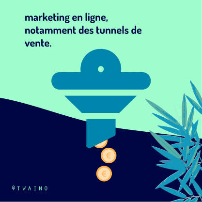
Beyond this fairly simple definition, it is important to remember that from a marketing point of view, landing pages are pages dedicated to receiving and converting traffic for online marketing activities, in particular tunnels. of sale:

With regard to this new definition, the home page should no longer be considered a landing page, as the idea of its design is not primarily based on converting traffic for a given marketing campaign.
1.2. The main difference between a homepage and a landing page
By taking a look at the image below, you will notice that the homepage has several links while the landing page has only only one.
This is typical enough to already show the difference between the home page and landing pages:

Source : i.ytimg
As you might expect, landing pages convert more due to the lack of a large number of choices or links.
This is because a lot of clickable links on a page take visitors away from the call to action.
Anyway, the home page remains an essential element on a website, because it allows:
- To display your brand;
- Visitors to browse various products;
- To provide various information about the company and its value.
Visitors can go anywhere from there:
- Apply for jobs;
- Read press releases;
- Consult the terms of service;
- Post on community forums;
- Etc.
But they don’t necessarily buy. This is the most essential point that can be retained from a home page.
The landing page, on the other hand, pursues another objective.
It is associated with a powerful advertisement that promotes a unique product and the use of several other tricks, the implementation of which increases the chances of turning visitors into potential customers.
Here is in a nutshell what you need to understand about the definition of a destination page or landing page. I now invite you to know the different types of landing pages that exist.

1.3. Types
of landing page There are practically two types of landing page namely: Landing
- pages designed to generate leads;
- Landing pages designed for clicks.

Source : mtarget
1.3.1. Lead Generation Landing
Pages Also known as “lead capture” pages, these pages use a form as a call-to-action button.
This form collects data about potential customers, such as the visitor’s name and email address.
This type of landing page is more used by companies that sell expensive products.
These pages are also designed so that the recovery of the visitor’s email appears as an exchange.
Indeed, the vast majority of these sites give visitors something in exchange for their contact information.
It may be:
- An ebook file to download for free;
- An invitation to a webinar;
- Obtaining a free service;
- Etc.
The major e-commerce brands also use this type of page to create lists, or offer free shipping or special offers.
1.3.2. Click-Type Landing Page
Frequently used by online and SaaS (software as a service) marketers, click-through pages are direct to sales or subscriptions.
This type of landing page is most often characterized by using a simple button as a call to action. This button usually sends the visitor to the payment page.
1.4. How do landing pages work?
The functioning of a landing page can be summarized in four essential points:
- The Internet user sees a link and clicks on it. He then arrives on a landing page;
- Once on the page, he is offered to fill out a form. He fills out the form and now becomes a prospect;
- The information he uses to fill in the fields of the form is then saved in the database reserved for this purpose;
- The product or offer is marketed to the prospect until they buy it.

If you manage your leads with a marketing automation tool like HubSpot or Marketo, you can see:
- The offer the lead converted to;
- The moment he converted;
- The other interactions he had with your site.
Information that will allow you to determine the most effective marketing actions to adopt so that the prospect subsequently turns into a customer.
When you perform targeted marketing actions on the prospect, they are more likely to become a qualified prospect. He will thus be able to quickly pass the different stages of the sales funnel.
This will benefit you, as the return on investment (ROI) of your marketing efforts as well as the satisfaction of your sales teams are more likely to occur.

1.5. The Benefits of a Landing Page
Effective landing pages have several other benefits beyond increased conversions.
Indeed a landing page or destination page can help you to:
1.5.1. Getting SEO Ranking
Like other pages, the landing page is also designed around an industry-specific set of keywords .

and others methods.
Both of these increase the chances of landing page rankings because they ensure your product is introduced to people who might be in need.
1.5.2. Promote a product
In general, the landing page is designed to convey a message.
It is because of this that it allows you, among other things:
- To have a higher conversion by putting a specific sales or marketing objective in the foreground;
- To follow the success or the evolution of an objective or a product.
1.5.3. Make the purchase or subscription process more efficient
The landing page acts as a portal and allows you to move visitors more efficiently through the sales funnel.
At the risk of finding your call-to-action (CTA) button in an inappropriate place, visitors find it on the landing page: A place specially designed for it.
They can therefore:
- Subscribe;
- Register;
- To buy ;
- Or join.

This will undoubtedly have the advantage of making you earn even more money.
Now that you understand what a landing page is and how to use it and the benefits it provides, learn the essentials to consider when designing a landing page.
Chapter 2: Landing page – The essential elements to create a good
one Creating a competitive landing page that converts well is not an easy task.
You have to take into account some important elements, but also have a good idea of what customers want.
For example, here is an infographic that shows you how each element fits on the page:

Source : pinterest
As you can see, not all landing pages fit this template. However, this is a good example for discussing the building blocks of a landing page.
These elements are:
2.1. ”Above the Fold Content” ”Above the Fold”
is a phrase marketers use to refer to the first content a user sees when they land on a page.

So being the first thing users see when they land on your page, you need to make it as convincing as possible.
To do so, bear in mind the following points:
2.1.1. Main title
Generally, the title is the shortest, but the most difficult element to create to generate the desired action.
A good title is like a beacon for your potential customers. For this, your title should not just be an overview of the page, but should engage readers in some way.
Likewise, it must meet their needs and be designed according to what you are selling, but also in relation to what you want visitors to do on your page.

The key to a well-written headline is understanding who the audience is, why they’re on your landing page, and what problems they hope to solve.
Once you understand these three things, finding the title to try is easy.
2.1.2. Supporting Title
While it may seem difficult to address the requirements of your audience in your title design, you can develop this aspect better with supporting titles.
Supporting titles actually give you the opportunity to provide important details about your business.
Indeed, on the Internet, the title is the most important and most convincing argument that you can use to encourage a person to do what you want.
A small detail may well be the necessary motivation people need to take action.
Admittedly, the essential part of the message is in the title, but the supporting titles provide other details that make the main title more convincing.

Not all landing pages need an additional title, but if you use a good additional title effectively, you can make your landing page more engaging.
2.1.3. Visuals
Of course, you can only say a few words about your main and secondary titles.
This very small space will certainly not allow you to say everything you want. So you will need branding.
Your branding is the aesthetic part of the landing page that tells people, “You’ve come to the right place, you can trust this company.”
The chosen image must prove something, make the user feel something special.
You can, for example, use an image of your product or of a person who uses it.

You can also use different types of visuals:
- Infographics ;
- Graphics;
- Video ;
- Etc.
If you choose to use images, make sure they are:
- Large in size;
- High quality ;
- Relevant to your service or product.
Your product image is even more necessary if you are selling a physical product.
When you sell a service, the image you must use must inform about the usefulness of your service.
If you have no knowledge in the creation of attractive visuals, do not hesitate to request our services.
2.1.4. Summary of Benefits
By showcasing your product’s benefits, you set the hook that will entice people to scroll through the content above the fold to the rest of the page.
Essentially, your benefits summary should tell visitors what they will get (Ebooks, tips, pdf…) when they do what you encourage them to do on your page.
Also, you should keep it short, simple, and to the point.
2.2. The Call to Action (CTA)
This is the most important element when you want to create a landing page that converts well.
The call to action button can be part of a lead generation form or a standalone button on your landing page.
The button containing the call to action (“Subscribe”, “Submit”, “Buy now”, etc.) must be clearly visible on the page, but must always be positioned after the essential information.

The call to action must be compelling, exciting and very visible. Use contrasting colors and make it stand out. You can locate it directly under an image or under the testimonial section.
2.3. The Key Benefits
The benefits of your offer flow directly from the Unique Selling Proposition and provide a more detailed description.
You should provide more details about the offer and answer any questions your customers have, especially what your service or product can do for them.

Include a summary of benefits for clarity, as well as detailed descriptions of benefits and features that extend your bullet list.
Features describe what your product or service does, but benefits describe the problem you solve.
2.4. Social proof
By using social proof, you show that other people have purchased what you offer. Visitors are more likely to convert to consumers if they see that others have used your offer before them.
You can use social proof on your landing page by:
- Providing a count of the number of registrations;
- Using social signals from public networks;
- Displaying awards from reputable organizations;
- Using testimonials and customer reviews.

2.5. The Reinforcement
Statement The Reinforcement Statement is another page title that sits halfway through your landing page and is meant to communicate a mid-experience message to your visitors.
2.6. The closing argument
By finishing your landing page, you have another chance to communicate the benefits of what you are offering: This is the closing argument.
It is similar to the reinforcement statement and helps support your core value proposition.
Chapter 3: 6 High-Converting Landing Page Examples
Now that you know how a successful landing page works and the essential on-page elements to include, let’s explore some of the best landing page examples from real businesses.
3.1. Netflix : Sample
Signup Landing Page This Netflix signup page is one of the best examples of a landing page that converts perfectly.

Upon entering the page, you are immediately confronted with what they offer. This removes decision-making friction and encourages visitors to act quickly.

The reasons why this landing page design works:
- Title – The title captures the reader’s attention instantly;
- Trust – The assurance that the page and brand presents removes all risk;
- Registration Form – It has only one form field which makes it easy for users to register;
- Easy Access – Essential information is at the top of the page making it easy to access;
- Persuasive Copy – On-page copy focuses on benefits in favor of features, which is more persuasive;
- Clarity – FAQ section removes barriers to registration;
3.2. Asana – Landing page targeting product managers
In this landing page design, Asana targets product managers, offering a product management software solution.

The page is fully tailored to this audience, explaining why their product is the best choice.

Although the page looks simple at first glance, it also presents an ease of understanding how the product works.
Individual page sections break up information into manageable chunks, directing your attention at each step until you reach the final CTA.
Here are the reasons why this sample landing page works well:
- Titles – Titles describe all the benefits of Asana at a glance;
- Use Cases – Multiple use cases show users all the different ways they can use the product for their business;
- Video Case Study – The video case study shows how a popular brand uses Asana for business success, which is much more useful than the written word;
- Free Trial – The final CTA offers a free trial, which is less scary than diving in and buying the product right away.
3.3. Zoom : Industry Report Landing Page
Zoom is a popular video conferencing software for customers in a variety of industries. So it makes sense that they want to position themselves as a leader in their area of expertise to potential clients.

They tried to do this by offering a free report that showcases the company as a leader in meeting solutions. Users can register to download and read the report at no cost.
The reasons this sample landing page works are:
- Free download – Offering the report for free makes the information more accessible;
- Simple form fields – The registration form includes only the information the business needs, which can reduce the form’s abandonment rate;
- Compelling Copy – The copy positions this report as must-read, promising to explain why Zoom is a leader. This creates curiosity and encourages users to register and download the file;
- CTA button – The color contrast of the CTA button makes it stand out from the page and make it more clickable.
3.4. Constant Contact : Free PDF Landing Page
Much like Zoom, Constant Contact serves a variety of industries with its email marketing platform.

However, in this sample landing page, they are specifically targeting real estate companies.
The landing page design is clean, restrained, and straight to the point. It offers a free download full of important tips and success stories to help you with real estate marketing efforts.
Moreover, it includes a CTA inviting users to try Constant Contact for free.

The reasons why this sample landing page works:
- Powerful title – The title and description clearly explain what users will get from the download;
- Compelling Copy – The copy is accurate and demonstrates the benefits of reading the guide;
- Images – Users can see a preview of the PDF to get an idea of what it will include;
- Proof – Includes a customer testimonial explaining how email marketing has worked for other customers;
- CTA – The CTA button prompts users to sign up for the free trial. Users are more likely to opt for a trial, as there is no financial commitment.
3.5. Lyft : Transportation App
Landing Page Lyft’s landing page is a perfect example of a simple sign-up page design.

The title is simple, telling users exactly what to do, and the registration form only asks for a mobile number, making it very easy for users to get started.

Here are the reasons why this sample landing page works well:
- Minimalist design – There are no unnecessary distractions to distract the visitor from the purpose of the page;
- Simple Form – The registration form consists of only one form field, which increases the chances of successful registration;
- Images – The simple image creates an emotional response in users, reaffirming why they are acting;
- CTA – The CTA button is highlighted with the action Lyft wants you to take.
3.6. OptinMonster : Sales Landing Page
If you’re looking for a SaaS business landing page design, you’ll love this example from OptinMonster.

Their agency solutions sales page has all the important elements of a high converting landing page.

Not only are their brand colors relevant, but they also use a variety of tactics designed to maximize conversions, which I’ll explore below.

Here are the reasons why this sample landing page works:
- Page Sections – Different page sections break up the page, making it easier to find the information visitors are looking for;
- Feature Benefits – The feature section focuses on the benefits of using the software;
- Testimonial Slider – You will also find what real customers think of the software;
- Images – Images and gifs show exactly what the software is doing;
- Social Proof – This page uses a combination of recent sales notifications and a live count of the number of people served by the software, which shows its popularity;
- CTA – CTA buttons are used throughout the page, providing users with easy ways to purchase;
- Live Chat – With live chat, users can get their questions answered immediately.
Now, let’s look at some best practices for creating an effective landing page.
Chapter 4 : Best practices and best tools to better build landing pages
4.1. 8 best practices for creating an effective landing page
Even if you have years of experience creating landing pages, you can sometimes make design mistakes that will cost you dearly.
For example, not getting the results you want might be due to a failure to update.
Anyway, here are some best practices that will help you improve email or landing page templates:
4.1.1. Create a Focal Point
The more pages websites have, the more they tend to be cluttered with extra calls to action, side menus, social media buttons, and other design elements all vying for attention. attention of users.
In reality, you can’t have a page where everything “opens up”. There must be a clear direction. The rest of the page should simply serve as a medium for visitors to explore.

If potential customers have reached your landing page or opted to subscribe to your mailing list, it’s for a very specific reason. Do not lose sight of how you were able to attract these visitors in the first place. Make it the focal point of your page.
4.1.2. Offer clear incentives
The key to attracting new subscribers and profiting from new visitors is tooffer incentives. Include coupons, discounts, shopping giveaways, and any other bonuses to entice people to sign up for mailing lists and come back to your page.
Incentives can also be a great way to encourage people to share your page with their friends.

Some companies do a great job of including incentives in their emails, but don’t do the same for landing pages.
If you’re struggling to decide what would be the best focal point for your page, an incentive offers a clear choice. Highlight an interesting offer, then provide examples of products or services.
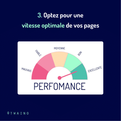
4.1.3. Go for optimal page speed
According to Unbounce’s “Pagespeed Report for Marketers”, 70% of consumers agree that load times affect their purchase intentions.
If your web page takes more than 3 seconds to load on a mobile device, you will lose many potential customers.

Avoid weighing down your landing page with unnecessary elements that slow it down: Everything you add should have a specific purpose.
Make sure all images are optimized and you’ve followed Google’s speed recommendations.
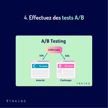
4.1.4. Perform A/B proof testing
If you’re not consistent in performing A/B testing for landing pages and email campaigns, you’ll never know what mistakes you’re making and what improvements to make.
One constant activity you need to do to improve conversions is, quite simply, testing.
To find the best performance for your landing page, you need to test different elements at once, track conversions for each change, and then implement relevant changes as you go.
For more efficiency, you can use a tool like Crazy Egg. This will provide all the necessary metrics to help you track your page’s performance during the test.

You can also use your landing page builder if this feature is supported.
When it comes to email templates, it’s also important to test subject lines as well as the balance between text and images.
Your audience may be looking for additional informational emails that answer specific questions, so you should focus on quality written content.
If readers are already familiar with your industry, they might respond better to new product images. Use testing to get to know your audience and work to create a variety of solid templates to use as needed.
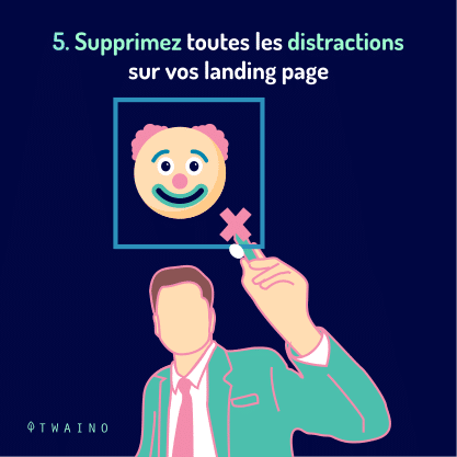
4.1.5. Remove all distractions on your landing pages
A good landing page focuses on a single conversion goal, so minimize other distractions that could confuse or even annoy visitors.
Resist the urge to include unnecessary links away from your landing page, including site navigation, additional calls to action, or even links to your homepage.
Your landing page will work best if it’s self-contained.

The visitor can simply focus on the offer because there is no no distracting navigation bar.
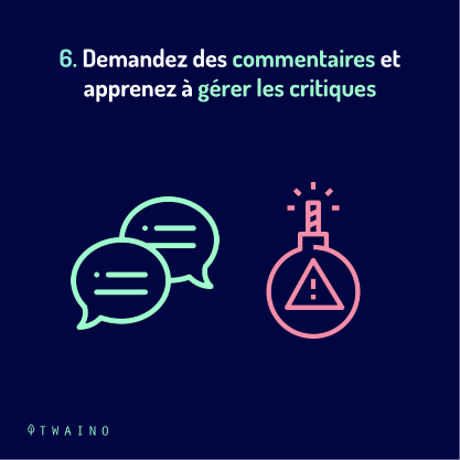
4.1.6. Ask for Feedback and Learn to Handle Criticism
While you’ve heard these tips before, it never hurts to have a reminder.
Sometimes you can inadvertently make a mistake. Take a step back, check out this list of tips, and find out if you’ve gone off the rails with your patterns.
If you’re still having trouble looking at your work from a different angle, seek help from an expert. Your friends and family can also provide valuable user experience feedback.

Don’t be afraid of these reviews, be open and hold -into account to improve your different strategies.
It will also be important for you to stay up to date with design best practices, as the continuous adjustment of models can have a significant impact on the overall success of your business.
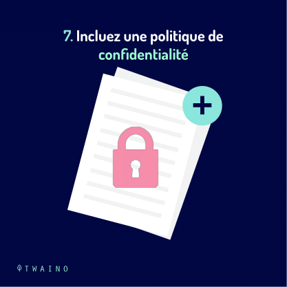
4.1.7. Include a privacy policy
Forms collect personal information, which requires a bit of delicacy. Including a link to your privacy policy will reassure your visitors that their data is safe with you.
Its inclusion is also required by a number of national and international laws.
You do not have a team of attorneys on mandate? There are tons of free privacy policies you can download online. For example, this generator created by Shopify.
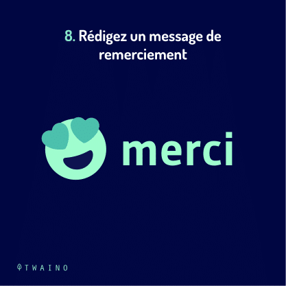
4.1.8. Writing a thank you message
When a visitor to your site fills out a form, leading them to a separate thank you page can create new opportunities.
This not only lets them know that the form has actually been submitted. This is a step that some landing page owners overlook, but gives the opportunity to re-engage users.
For example, you can ask them if they want to sign up for your newsletter or visit another part of your website.

Or you can start selling premium subscription immediately. Or you can even take the opportunity to sweeten the pot with an additional offer. There are tons of post-conversion possibilities.
4.2. What are the best tools to create an almost free landing page?
Creating a landing page is no longer such an expensive project as it was a while ago.
With the help of the tools, most of which are free, marketers will no longer have to break the bank to create the landing page of their choice, no matter what goal they are pursuing.
Here is a simple summary of the main tools for creating a free landing page that will meet your needs:
- To create landing pages that will allow triggering automations, use: Wix, MailerLite and MailChimp.
- For the launch of an e-commerce landing page, use: Omnisend, MailChimp.
- To ensure excellent design flexibility, use: Weebly, Wix.
- For integrated reports, use: MailChimp, ONTRApages, Strikingly.
- For using your own domain name for free or at low cost, use: Carrd, Ucraft.
- For multilingual landing pages (paid), use: Webnode.
Chapter 5 : Landing FAQ page
5.1. What does a landing page mean?
This is a page on your site designed to convert visitors into leads. It differs in particular from the other pages of your website based on the following rule: It allows you to capture a visitor’s information using a form in exchange for a relevant offer.
5.2. What is a favorite landing page?
A preferred landing page is the URL you use to target a keyword or the URL you use to get the highest ranking for that keyword. When a URL is listed as the preferred landing page for a keyword, it is considered one of the URL’s targeted keywords.
5.3. What is the main purpose of a landing page?
It follows through on everything you promised in your content. It’s basically the next step for a visitor to become a customer. Your landing page allows you to exchange some sort of special offer, information, or agreement, in exchange for the visitor’s contact information.
5.4. What should my landing page look like?
It should be short, sweet, uncluttered, while containing all the important information. Avoid overloading your landing page with content, otherwise there is a good chance that visitors will bounce back without taking the action you want. So provide the essential information that will interest your audience and nothing more.
5.5. Do I necessarily need a website to have a landing page?
No, you don’t need a website to have a landing page. The latter can be standalone, but it is recommended to ensure that it has a professional URL. A landing page can work as a single-page website permanently or temporarily while you’re testing an idea. It could also be used as a page with a single, targeted goal.
5.6. What is the difference between a landing page and a website?
Unlike home pages as well as other pages on a website, which are designed for exploration, landing pages are personalized to a specific campaign or offer and guide visitors to a single call to action. In short, landing pages are built for conversion.
5.7. Is a sales page the same as a landing page?
Post-click landing pages and sales pages are the same thing because they are two stand-alone web pages that have a specific goal in mind: To convert the visitor into a lead.
5.8. What makes a great landing page design?
A good landing page should have a strong offer and be able to explain why the offer is valuable in clear, concise terms. Your landing page title and subtitles should provide a key opportunity to promote the value of your offering.
5.9. What describes a good landing page experience?
A good landing page typically offers a simple and intuitive design, relevant content, a clear value proposition, and a prominent call to action.
5.10. What content should be on a landing page?
A successful landing page should have a value proposition, a clear message, and a dominant CTA.
5.11. How to convert visitors into potential customers?
Once visitors have landed on your business blog, you need to find a way to collect their contact information or start a conversation (for example, you can use a chatbot). Thus, visitors who provide their contact information will become a “lead marketer”.
5.12. How can I improve my landing page experience?
You can improve your landing page experience by taking any or all of the following steps:
- Provide content that is useful, relevant, and original;
- Promote the reliability of your site;
- Make mobile and computer navigation easy;
- Check and reduce if possible the loading time of your landing page;
- Make your site fast.
5.13. How to create a high converting landing page?
- Create a workable title;
- Adapt the content to the stage of the sales cycle;
- Consider “scannability” with your design;
- Simplify your path to conversion;
- Think twice about your call to action;
- Retain visitors after their conversion;
- Don’t guess, test.
5.14. What should be theoptimal viewing time for a landing page?
For mobile, 72 seconds. Short-form post-click landing pages tell a simple story, and they do it quickly, so the visitor gets their questions answered quickly.
5.15. What is a good call to action?
A good CTA tells customers directly what action they need to take next.
Therefore, you must be very clear about the choice of action words and the description that follows them. Here are some perfect examples of CTAs: “Buy”, “Try”, “Join”, “Discover”, “Watch” and “Get Started”.
5.16. How many CTAs should be on a landing page?
A CTA!
Keep friction to a minimum to increase your conversions. Only use one CTA on your landing page. If your marketing goals are many, use multiple unique landing pages for each conversion requirement. Businesses with multiple or more landing pages generate eight times more conversions.
5.17. How much does it cost to create a landing page?
If you want to hire a digital agency to create a landing page, you will pay for landing page development services from $150 to $3000. A quality landing page costs between $500 and $700 in many cases. Anyway, the cost of the landing page depends on the complexity of the task.
5.18. How is landing experience calculated?
For example, according to Google, the landing page experience is evaluated based on:
- Relevant content (determined mainly by the presence of keywords on the page), useful and original;
- Transparency and reliability;
- Ease of navigation.
5.19. Are the landing pages ranking on Google?
Google doesn’t like landing pages! In fact, they consider them essential to a good sales funnel.
5.20. Are mailchimp landing pages free?
Landing pages are free for all Mailchimp users, so you can create as many as you need. To get started, choose a template and use their landing page builder to design and configure your pages.
In summary
Since the landing page is the page on which you direct your visitors to offer them an offer and encourage them to buy, you should not take its creation lightly.
As you know, the creation as well as the success of such a page requires a lot of thought and practice.
That’s why in this article, I’ve covered not only what a landing page is, but also the essential elements that make it up as well as some best practices.
By following all these explanations, you will know what it is important to do to create a landing page capable of converting.
Goodbye !

Related terms


