Design is the silent ambassador of your brand
Through this thought of Paul Rand, we find the usefulness of infographics for marketing.
Admittedly, we have a natural tendency to prefer infographics to textual content.

A study confirms this fact by showing that 65% of the population is made up of visual learners.
In other words, most people learn information much more easily when it is presented in visual form.
In addition, we generally take less time to understand the information conveyed through these images:

Therefore, visuals and especially infographics are very important for effective content marketing.
If you want to optimize your visibility on the web, adopting this content format in your content creation strategy is essential for a multitude of reasons that we will see.
In addition to revealing the advantages they offer, I also show you all the different steps to create good infographics.
As a bonus, you will know the history of infographics as well as the 20 best tools to create them easily.
A secret: Today, creating infographics is not as complex as before!
Let’s start with the basics:
Chapter 1: What is an infographic and where did it come from?
1.1. What is an infographic?
An infographic is a coherent combination of text, images and/or graphics that provides an easy-to-understand overview of a topic.
Example:

Although this infographic is rich in statistics, it does not take more than 5 seconds to understand the essence of the information conveyed.
So, when complex information needs to be described quickly, precisely and clearly, an infographic is the appropriate solution.
Now that we understand what an infographic is, where does it come from?
1.2. What is the origin of infographics?
The term “infographic” may be new, but the concepts of data visualization and visual storytelling have been around for a very, very long time.
Indeed, prehistoric humans painting their way of life (such as hunting strategies) in cave walls over 36,000 years ago :

Source: Lucidpress
the best known examples of computer graphics are hieroglyphs or paintings Ancient Egyptian cave paintings, 5,000 years ago:

Source: Lucidpress
This means that this format was used long before the creation of the written language in 3,500 – 3,000 BC.
This can give an idea of how natural it is for people to feel drawn to visual presentations of information.
As for the first examples of modern infographics, it will be William Playfair who will publish them with his “The Commercial and Political Atlas” in 1786:
Source: ResearchGate
Among the first organizations that adopted the format of infographics in the United States, one mainly finds:
- Fortune magazine;
- The Chicago Tribune;
- The New York Times.
Then, the advent of the computer had a huge impact on the types of computer graphics used by these publications.
Then newspapers reduced the need for skilled painters and started using programs like Apple’s MacDraw.
The Gallup Organization, which is known for its statistics and surveys, was the first to study in depth the opportunities offered by computer graphics:
In 1990, its research concluded that graphic elements receive greater attention and have a more memorable impression on viewers than a presentation using only words.
Indeed, our brain retains an image much more easily than text and, of course, blogs and social media have played a huge role in popularizing infographics.
But let’s never forget that it is above all something very “human” to feel the attraction of computer graphics.
And like so many other things, the internet has simply functioned as a powerful medium to spread this inherent natural ability.
It will be around 2009 that the interest in computer graphics will experience a real boom until now:

1.3. Who uses infographics and why?
The categories of professionals who generally use this type of content format are:
- Scientists;
- Technical writers;
- Mathematicians;
- educators;
- statisticians;
- Etc.
These professionals often have large volumes of data to process and using this format makes it easier for them to:
- Organize information;
- Data logging;
- Communicating information.
Thus, infographics are used to:
- Present a large amount of data or information in a compact and easy to understand way;
- Periodically monitor the course of certain parameters;
- Analyze data to uncover cause and effect relationships;
- Etc.
1.3. What is an infographic continued from?
Basically, there are two important elements in an infographic.
These are:
- Content elements : This is the message conveyed by this communication medium. These are among others:
- Numbers;
- Statistics ;
- The references ;
- Facts ;
- Etc.
- Visual elements : This is anything that contributes to the design of the infographic. They include:
- Graphics;
- Icons and illustrations;
- Images ;
- color coding;
- Etc.
The first is much more important than the second since an infographic serves above all to convey a message:

Source: Graphiste
But this does not mean that design should be neglected since it is the right combination of the two who make great infographics.
When I see “infographics” I expect design-rich content that gives me a fun experience. And you? Feel free to share with me what you want from an infographic.

1.4. What are the different types of infographics?
Infographics can convey several types of content, which allows them to be categorized into five different categories.
1.4.1. Timeline

infographics Timeline infographics explain an event or process as it happened over time.
This style of presenting information, which is based on a timeline, allows readers to analyze the temporal relationship between the different stages of a process.
For example, you can find an infographic that shows the development of a company from its inception to its current level of development.
1.4.2. Informative infographics
They generally contain more text than other types of infographics.
This style of content works best as summative pieces that provide a succinct explanation of a topic:

1.4.3. Quantitative or statistical

Infographics Quantitative infographics allow statistical data to be transmitted to readers quickly and clearly.
These styles of infographics include:
- Charts;
- Bar graphs;
- Tables and lists;
- Etc.
Statistical tools such as pie charts can also be used to summarize complex data:
1.4.4.Infographics
These graphics explain the cause and effect relationships between different comparators.
For example, if you place your links in the ideal place, you will optimize the link juice that passes.
1.4.5. Directional Infographics
This style of infographics allows readers to navigate through a process using:
- Symbols;
- Fleas ;
- Arrows;
- Icons;
- Etc.
It is at this level that you will come across traffic symbols or maps that help with navigation and that serve as landmarks.
1.4.6. Process Infographics
This style is designed to summarize and simplify complex processes. They are perfect for visualizing:
- Marketing strategies;
- Preparation recipes;
- Customer travel cards.
Imagine that you bought paws and you don’t know how to prepare them. It would obviously be easier to figure out how to do this with images than only with texts:

Imagine how difficult it would be to do this without the images! A video would be even better in my case.
That’s why you’ll find that there is on the back of some products the process to follow to use them.
1.4.7. Geographic infographics
As the name suggests, you are trying at this level to present data through a geographic map:
1.4.8. Product infographics
This format is generally used by companies and factories to convey useful information to users in relation to their products:
With such an infographic, you can list all the different characteristics of your products. This allows consumers to quickly get an idea of what you offer.
1.4.9. The comparison infographic
Want to highlight the differences between two different elements, this format is the most appropriate:
1.4.10. Infographics in the form of a list
Infographics also lend themselves to the creation of lists. If you want to list multiple items:

1.4.11. The flowchart infographic
This design is perfect for showcasing a new workflow for your organization, or how a linear or cyclical process works in your industry.
At this level, there are also organizational charts that show the structure or explain the hierarchy of a structure or any element:

1.4.12. Image
This type of infographic based infographics is for content creators who try to reveal trends and information from shapes, drawings, or photographs, rather than just numbers and figures .
Here are 10 different types of infographics most commonly used. There are obviously others and I will update the list as soon as I find them.
Chapter 2: Why should you use infographics in your content marketing?
There are many reasons why you should consider using infographics in your content marketing strategy. Here are a few:
2.1. Infographics are the best format for conveying information
You certainly know this adage “a picture is worth a thousand words”!
When we consider infographics, we can see that they are usually made up of images and words.
This is probably what makes the power of this format since it combines the other two. It is therefore understandable why infographics hold people’s attention much more easily.
In fact, statistics show that people who follow instructions with text and illustrations do 323% better than those who follow instructions without illustrations.

2.2. Infographics can present complex information in a simple and attractive way.
This content format allows you to cover complex topics in a pleasant way.
Take this infographic:
I believe it would be very difficult, if not impossible, to detail these figures in words in such a way that the reader can easily make a comparison.
Infographics are therefore excellent means of communication to present certain types of data in a simple way.
It should also be noted that this form of presentation is generally pleasant to consume.
2.3. We are visual creatures and infographics are the best way to receive information
70% of all our sensory receptors are in your eyes! it is therefore our eyes that allow us to consume more content than the other sense organs.
And although texts and visuals are consumed visually, the former are less well processed by the brain.
In fact, 90% of the information transmitted to the brain is visual, which is processed 60,000 times faster in the brain than text:

This is a rather natural tendency: We prefer an infographic rather than reading a long text containing the same content.
2.4. Your visitors will spend a fairly short time on your website

This is why they only consult on average 20% of the text of a web page during a visit.
Opting for infographics is a good way to let your visitors quickly skim through your content and then decide if they want to read more.
2.5. Infographics make information easier to assimilate
Research shows that visual cues help improve information retention.
Indeed, we remember 80% of what we see, unlike 20% of what we read:

Thus, infographics are a sure way to burn your information / brand in the memory of the public.
Another study goes further and shows that after 3 days:
- People remember 10% of the information they have heard;
- People retain 65% of the information if a relevant image is associated.
This is a very good reason to always add your brand logo on your infographics so people can easily find you when they want more information.
2.6. Infographics arouse the commitment of Internet users
The content format that knows the most sharing on social networks is none other than infographics:

Infographics are therefore the format par excellence in terms of shared content . Apart from sharing, which requires a higher level of engagement from Internet users, this format also records a lot of:
- Likes;
- Comments;
- Etc.
This incredible craze for infographics increases their chances of going viral.
Note that this is not limited to social networks since other blogs and websites can use your infographic.
2.6. Infographics can attract traffic
If you want people to view your content, opt for infographics. In fact, color visuals increase 80% the desire to read content
That’s not all ! Infographics can increase your web traffic by 12% according to the same source. Don’t forget their tendency to quickly reach the nooks and crannies of the internet.
If you have goals for increasing your traffic, you now have a strategy you can add to your list.
2.7. Infographics are one of the best ways to get backlinks
The traffic you get from backlinks is partly due to the links that other websites create to your content and to shares.
If they use your infographic, they will need to cite you as the source. This allows Internet users to directly access your website through these links.
This is why the use of infographics is one of the best netlinking strategies:

In addition to traffic, you have link juice that contributes to increasing the authority of your website, interesting, isn’t it?
Many SEO experts recommend investing in infographics as an effective way to improve search engine rankings. Do not forget it !
2.8. Infographics Avoid Duplicate Content Problem
If you’re a content creator like me, you know how difficult it can be sometimes to use certain specific words.
I often feel like using the most exact words to describe certain processes, but sometimes they have to be changed because of the duplicate content problem that can arise.
This can happen even if you create all content in your own words without consulting other content.
Using infographics allows you to avoid this problem and use the most precise terms to develop your ideas.
It is also a very good way to repeat quotes or thoughts:

2.9. Infographics are very easy to share
In the same logic as the previous point, it is very easy to share infographics as blog posts.
It is true that a blog post can be shared on social networks, but it is much more difficult to do so on a website. Generally, you are forced to create your own content, especially if you want to share the same information with your audience.
On the other hand, with an infographic, you can simply publish it on your website with a few words and the link to the source. Which doesn’t take you more than 10 minutes.
Most interestingly, you can use an generator to have HTML code. This greatly simplifies the process of embedding the infographic on another website.
2.10. Infographics can be printed
Infographics can easily be exported to:
- Presentations;
- Posters ;
- Paperbacks ;
- Leaflets;
- Etc.
Which allows you to use them in different marketing strategies.
2.11. Infographics allow you to make your brand known
I mainly use infographics because they allow you to do branding.
Indeed, they carry the logo and the visual identity of the creator. And since they can be technically integrated into any type of marketing campaign, infographics can help you boost your brand awareness.

So, even if there is no link to your website, your infographic allows you to improve your notoriety.
2.12. Infographics are the preferred content format for marketers
According to Venngage, 30% of marketers use original graphics, such as infographics, more than any other type of visual content, including videos and GIFs.
If marketers use infographics that much, that would mean it’s a format that performs well, right?
This is indeed the case according to statistics from Lucidpress:
“When asked what types of visuals were the most engaging, 42% of marketers said that infographics and other original graphics were the most engaging. It is the most widely used form of visual content.»
2.13. Infographics are the best way to stay visible in a sustainable way
Infographics are the oldest content format as we have seen, and we must recognize that they know how to adapt over time.
With our ancestors, it was engraved on stone, then on paper at the beginning of modern times. After the advent of the computer, it has become digital and is now adapting to smartphones.
Infographics are great for bringing your content to phones, tablets, and any other mobile device.
Over time, computer graphics have been able to occupy a prominent place and everything suggests that this format will last over time. This, even with the voice search.
I would always prefer an infographic that gives me a global point of view of how to prepare the legs, than a voice that tries to guide me:

All this to tell you that investing in infographics is the best way to sustain your visibility .
With a long shelf life and appeal to readers, infographics can stay relevant and shared months after they go live. Yes, infographics are the permanent content format you’ve been looking for.
Here are a few reasons why you should consider adding infographics to your content creation strategy. It’s time to know how to create them:
Chapter 3: How to create attractive infographics?
Like creating authority articles, there is a specific process you need to follow in order to create compelling infographics.
Don’t worry, I won’t try to teach you how to use Adobe Illustrator. I will describe a simpler option which is to use templates that already exist to create your own infographics.
Using resources that already exist means you don’t have to start from scratch. Or to call on a professional to whom you must pay a few tens or even hundreds of euros.
I detail the different approaches through the following different steps:

Step 1: Identify the audience for which your infographic is aimed
Apart from the design, which is the factor arousing the most enthusiasm for infographics , there is the information you wish to convey.
The content needs to be as compelling as the design for your post to be a big hit.
To do this, you need to make sure that you are addressing the right audience.
According to the Harvard Business Review, there are five possible audiences that can change the way you choose and present your data:
- Novices who have initial exposure to the topic and don’t want oversimplification;
- Generalists who have some knowledge of the subject and who seek to have an overview of the main themes;
- Executives who need a deep and practical understanding of the intricacies;
- Experts who want to learn more about the subject with findings without having too many stories with too many details;
- Leaders or executives who don’t have a lot of time and want to get the meaning of things and conclusions directly to get an idea of how it applies to their business.
To start, define the ideal reader for your infographic, if you haven’t yet created your buyer persona. Then determine its position through the 5 previous types of audience.
Which best matches the infographic you want to create?
Keep this profile in mind in order to design an infographic that really resonates with your target audience.
Note that a “novice” audience may need data with more obvious meaning without too much complex data.
General practitioners will want to have different information on different topics.
An audience made up of “leaders” will prefer to use their time to consult the simplest or most critical information, and the impact it will have on the company.
As for an expert audience, they might be more interested in the ability to go into detail about your numbers and theorize around them.
Knowing who your audience is makes it easier to decide on the infographic’s tone, dimensions, and colors to use.

For example, is your audience primarily on Instagram? In this case, your infographic should probably be square.
Does your audience frequent Pinterest a lot more? In this case, your infographic should be Pinterest ready.
Step 2: Define the reason why you are creating an infographic
We now know that an infographic can allow you to do a lot of things. You can:
- Provide an overview of a topic;
- View research results or survey data
- Compare and contrast multiple options
- Explain and simplify a complex process;
- Etc.
The question that prevails here is: Why do you want to create an infographic?
The answer to this question should be in your mind as you create your infographic.
If you want to create an infographic, it’s so that your audience can get something very specific out of it.
This very specific thing should be the answer to a real problem your audience is having. The purpose of your infographic will be to solve this problem.

Once defined, you will bring out the different points that underlie your main reason.
Step 3: Define the main questions that your infographic will cover
You know the purpose of your infographic and the logical next step is to define 3 to 5 points that you will address.
To do this, you can use the following question pyramid:

First, you have the problem you are trying to solve with your infographic.
In second place, you have the supporting questions which should reveal the basic information your audience will need to know to understand the main topic.
Finally, you have the probing questions that will show data or statistics that can help people solve the main problem.
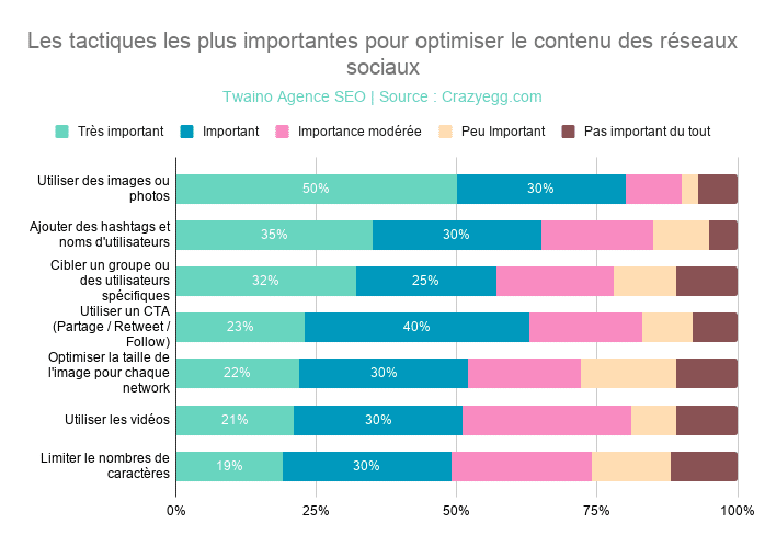
For example, we have this infographic:

The main problem: Showing the evolution of Voice over time. As supporting questions, we can have:
- What are the different significant events of the Voice;
- What is the order in which these events occurred.
For a deeper insight, we can ask ourselves: On what date did these different events occur.
At this level, you already have a clear idea of the information your infographic should contain. It’s time to go find the information:
Step 4: Collect relevant data
The next step is to collect and organize the data you plan to use in the infographic.
To do this, you have two different options:
- Use your own data;
- Use third-party data, taking care to cite your sources to show the reliability and quality of your content.
If you have your own data, you can skip to the next step.
Otherwise, you have a ton of public data if you just know where to look.
Consider these few strategies for conducting your research:
Tip 1: Use Google’s search operators
Google is often the best place to start your search.
Target your Google searches more effectively with symbols and specific search terms. Check out my article on the 26 search operators you might use.
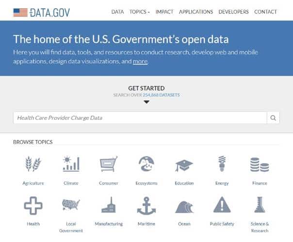
Tip 2: Search existing data repositories
While Google searches are quick and easy, you’re not always going to find organized and/or relevant data.
Browsing through resources to find ready-to-use data is a great option.
These include, for example:
- Statistia– Market studies:

- The US Government’s Open Data – Data on several topics, including agriculture, climate, education, health, etc.:
- US Census Data for Social, Economic, and Health Research :

Google Trends Datastore – Datasets curated by the Google News Lab:

Kaggle – User-uploaded datasets on almost any subject:

- Pew Research – Research on demographics, public opinion…:

AggData– Business location data:

- American Time Use Survey– Data on how much time Americans spend on various activities like sleeping, eating, exercising…:

- Google Scholar – A user-friendly search engine for academic publications:

Speaking of engine search, you have a list of 19 search engines that can help you find specific information.
With these different resources, you should be able to find enough data to create your infographic. Otherwise, you may need to collect your own data.
When collecting your data, make sure you have in mind the story you want to tell with this information.
Adding data for fun adds no value to your infographic.
Make sure that the data you are going to present is sufficiently “complete” to give your readers an appropriate context around the information you want to convey.
For example, presenting to your audience the fact that you have an increase in your conversion will not carry much weight.
But if you add that your conversion rate was down and you managed to get it back up, your content will be much more valuable.
You will obviously add the different steps and tricks you used to reverse this trend. But by doing so, you provide appropriate context for the information you are conveying.
Once the data has been collected, think about organizing it:
Step 5: Check everything and cite your sources
Don’t forget to check all the information and data you plan to include in your infographic.
There’s nothing worse than an infographic with incorrect data or claims. This will definitely give you and your business a very bad image.
Also, keep track of all the URLs you visit to get your information. You will add them to the footer of your infographic or in your article.
Step 6: Decide how to visualize your infographic data
Once you have all the data and information, try visualizing it.
The first step in data visualization is to separate the textual information from the data.
Depending on your data, you can choose from different types:
- Tables;
- graphics;
- Widgets;
- From timeline;
- Flowchart;
- Etc.


Now you will choose your ideal template:
Step 7: Choose the infographic template of your choice
Here, the important thing is to choose a template that works specifically for the type of content/data set you want to present.
You have different options depending on the tools you want to use. I will make it simple by giving the two easiest solutions to use:
- PowerPoint or Google Slide;
- Online tools.
On the web, you will find an infinity of free ready-to-use PowerPoint templates that are compatible with Google Slide.
You have sites such as:
- Free-powerpoint-templates-design:

- 24slides :

- Smiletemplates :

- Powerpointify :

Online tools include templates that you can directly customize.
Also note that Hubspot offers 15 PowerPoint infographic templates from which you can choose the one you want.
Step 8: Customize your infographic template
This is obviously the most time-consuming part, but it’s also the most fun.
Just find a catchy title, enter your data/content and adjust the font size and formatting.
Feel free to change the graphics and colors too, so they relate to your brand and the data you provide.
If you see a template that matches the infographic you want to create, just download it:

After downloading, you open it in PowerPoint to make the changes you want:

You can edit the chart data by clicking right-click, then select “Edit Data”:

You will have the dialog box that allows you to make the necessary changes:

You will see that the graph changes as you modify the data:

Better still, you can change the presentation of the graph. Here you will see I have changed the colors and that each interception of the lines is represented by a big dot:

There are several tutorials on the web that can help you master PowerPoint or Google Slide. You can devote part of your time to learning to master these software if this is not the case.
At the end, just click on the “File” menu then on “Save-as” to choose the JPG format:

You will then have your graph with high quality:

And here you are, you have your computer graphics in less than an hour of time!
The same principle applies to online tools that offer you ready-to-use templates. The full list of these online tools can be found in the next chapter.
When you can’t find exactly what you’re looking for, you can use the simple charts and tables provided by PowerPoint to create things like the bar chart or the pie chart:
To further customize the look of the infographic, you can add or change colors or font styles.
Step 9: Include a footer with your sources and logo
To complete your infographic, consider including the sources you got your data from. Generally, it is necessary to exploit several sources in order to design a high-quality infographic.
And since you have to cite sources, there are often a lot of URLs to include on the infographic. This can distract readers and worse, affect the quality of your design.
A good way to cite a lot of sources is to include a simple URL at the bottom of your infographic that links to a page on your site that contains all the sources you’ve used.
This way your infographic looks clean and professional.
If necessary, the most curious will go to your page in order to have access to the sources, regardless of where the infographic is shared or embedded.

This is also an opportunity to add your logo so people know who created the infographic.
When it is shared on social networks or integrated into other websites, people will immediately know that it comes from you.
Thus, you allow your brand to have visibility, traffic and backlinks.
These are the main benefits of creating infographics.
Now there’s one last step:
Step 10: Add an embed code, Pinterest button, and publish
At this step, all that’s left is to publish and promote your infographic. I recommend that you use your blog to publish it in order to have great ease in listing the sources that you have exploited.

Check out my ” Embed Code Generator” and the benefits you can get from this tool. By using it, you allow your visitors to easily embed them on their own websites and blogs.
Finally, consider including a Pinterest button so visitors can easily “pin” your infographic to Pinterest.
Chapter 4: The 9 best online tools to create your infographics
Here you will find online tools that already offer a multitude of templates for use to create your graphics.
We have already seen two: PowerPoint and Google Slide.
Most give you free trials, so you can try them out before you think about making a monthly subscription.
4.1. Visme.co

Visme is a powerful tool that allows you to create various kinds of visuals, namely:
- Infographics;
- The presentations ;
- Banners;
- The animations ;
- Etc.
It has an extensive library that gives you access to many:
- Ready-to-use templates;
- Shapes to use in your creations;
- Icons to insert;
- Etc.
In case you are not very good at advanced manipulation of graphic elements, you can simply edit the text and click on publish.
You can also directly insert data values to modify tables and graphs.
Another positive for this tool is the fact that it is affordable for all online entrepreneurs.
Indeed, Visme is fremium and allows you to test some of its features for free. Moreover, the first option at the premium plan level is $14 per month:

Note that Visme also offers other solutions for business and education. If you are a teacher, Visme has the perfect solution for you:

4.2. Canva
Canva is arguably one of the most popular online visual creation tools. The tool allows experienced designers and non-designers to find cool and creative stuff for their visuals.
Canva is an ergonomic and easy-to-use platform. Once connected, you can proceed to the creation of your project, whether it is:
- A presentation;
- From a Facebook cover photo;
- A business card;
- From an announcement;
- From a poster;
- From a banner;
- A ready-to-publish infographic;
- Etc.
Like Visme, you are entitled to more than 50,000 ready-to-use templates:
You are also entitled to practical tutorials that guide you in creating your visuals:
Canva is very affordable compared to software with the same features.
Indeed, you can enjoy some features of the tool for free without having to pay any penny.
But to have a premium account, you must reserve less than $10 as an individual and only $30 if you are a business:

4.3. Venngage
Venngage is a solution used by more than 21,000 companies, including giants, such as:
- Google;
- Microsoft;
- Hubspot;
- Airbnb;
- Forbes;
- Harvard University;
- Etc.
In three simple steps, you have already designed your infographics:
Choose a template, add graphics and visuals, then customize your designs and voila:
You can choose from ten graphics:
If you are a student, you will be able to enjoy some Venngage features for free. But note that the firm will put its mark on your visuals.
The premium option costs are relatively affordable since you only need $19 per month as an individual.
If you want to do like Google and Microsoft, you will have to pay $49:
4.4. PiktoChart
PiktoChart presents itself as the tool that allows “non-graphic designers to create beautiful infographics in just 10 minutes”.
Piktochart has over 814 fully customizable templates with:
- Images;
- Items ;
- graphics;
- Etc.
You can modify and adjust all these elements according to your preferences. Expect an enjoyable infographic creation experience like the 16 million users:
Piktochart offers you tutorials that let you familiarize yourself with its interface and the various features it offers:

As far as pricing goes, Piktochart lets you to start for free. But you will need to subscribe to one of two paid plans:

However, if you are a non-profit organization or a teacher with students, you can contact Piktochart for a personalized offer.
4.5. Easel.ly
Easel is a platform that will help you make beautiful infographics in just a few clicks:
Choose a template from a long list that you can filter to find the exact template you are looking for.
Once you have selected your template, you can add other shapes, backgrounds, cards, objects and of course text to personalize the template.
The basic version of this tool is offered for free, so you can start making free infographics in no time!
In terms of cost, Easelly is arguably one of the cheapest tools at just $4 a month:
4.6. Imfogram
Used by over 30,000 businesses, Infogram is one of the most popular platforms for creating visuals.
There are prestigious structures such as:
- MSN;
- Euronews;
- FastCompany;
- INTERCOM;
- LinkedIn;
- Etc.
Whether you’re a blogger, educator, brand ambassador, or organization, you can make really high-quality charts/infographics with their many templates.
In addition to a blog and many resources to help its users, Infogram provides access to tutorials:
The firm offers solutions adapted to all user profiles:
4.7. Google Charts
Why not just use Google Charts?
It is probably the best-known charting platform when it comes to real-time data.
As you would expect, this tool is also completely free and if you don’t know how to go about it, Google has some free guides that can help you.
You can choose from all kinds of graphs, maps, bars and other statistical tools since the Google gallery is very rich:
4.8. Creately
Over 3 million people use Creately to quickly design their diagram. Here we find some big brands such as:
- Amazon;
- NASA;
- PayPal;
- ebay;
- NATIONAL GEOGRAPHIC ;
- Etc.
Here you have 1000+ templates that you can easily customize with tools that provide high precision.
The most interesting, you can work on collaborative projects with your colleagues or your customers.
In terms of cost, you only have to pay $4 per month to enjoy all the features offered:
4.9. Gliffy
Gliffy will transform your ideas by providing you with a variety of:
- Flowcharts;
- UML diagrams;
- Wireframes;
- Network diagrams;
- organizational charts;
- Sitemaps;
- Etc.
Create digital visualizations by dragging and dropping shapes/lines/objects from the library and turning words into graphics.
This tool is quite popular since it is used by more than 10,000 companies including:
- Adidas;
- Adobe;
- SAMSUNG;
- Twitter;
- NASA;
- AUDI;
- Etc.
You can try Gliffy for free. But if you want to go premium, you have to book about $8 individually and $5 per person when you are a team:
These different tools are more than enough to create any type of graph.
Chapter 5: Some good practices to follow to have attractive infographics
Finally, it is relevant to see some good practices that will allow you to succeed with your infographics.
Practice 1: Information first, brand second
Infographics are a marketing tool, but that doesn’t mean you have to put your brand everywhere.
The only time your brand name should appear should be as a modestly sized logo in the bottom or top corner.
This infographic presents relevant information for readers, whether they are customers or not. Frequent and subtle touchpoints are what create an emotional connection between brands and customers.
Practice 2: Finding the Balance Between Information and Graphics

Marketing firm Siege Media reviewed 1,000 of the most popular infographics and made a few findings:
- The most shared infographics averaged 396 words;
- The average size of the most popular infographics was 3683 pixels long by 804 pixels wide, or about 38×8 inches;
- Nearly 73% of infographics had an identifiable color scheme (the most popular schemes are triadic and monochromatic).

Your infographic must contain enough information so that it brings a certain added value to the readers. But if you accumulate too much information as well as too many colors, the infographic becomes too cluttered and unreadable. Which is not necessarily ideal for the mass adoption of your infographic.
This brings us to the next point:
Practice 3: Aim for simplicity
Keep this axiom in mind:

As Einstein also said, you can explain something simply if you understand it well enough.

Explaining things with attractive and easy-to-understand infographics helps build your credibility. People will notice your thought leadership and expertise.
Two powerful elements to optimize the EAT of your online business.
Practice 4: Choose the right font
size The sizes used for text in an infographic are very important. If the content of your infographic is unreadable, it will not perform well in the SERPs.
Source: Venngage
Here are some recommended font sizes for the infographic:
- Large headings: 24-36 pt.
- Medium Headers: 20-24 pt.
- Text content: 14-18 pt.
Remember to keep the title at the top of your infographic and make it look prominent by using a strong font style that grabs attention.
Practice 5: Choose the font combination for your text content
There are two reasons why font pairing is important for your infographic:
- It affects the look of your infographic;
- It allows to adjust the size of text blocks.
I advise you to use a maximum of two font styles in your infographic, one for the header and another for the text blocks.
You can either use two styles of the same font or two completely different fonts. Just make sure the font(s) you choose matches the tone and message of your content.
The choice of fonts and style can also help you with the general size of text blocks. Some fonts look larger than others, even at the same font size.
If you change the font size as you use it, be sure to maintain balance. For example, all primary fields must be the same size. This also applies to other similar blocks of text, such as body content.
Practice 6: Make your infographics shareable
You don’t just want people to see your infographic, you want them to share it. The good news is that people tend to share infographics more than other content formats.

Social networks, especially Pinterest are real levers to increase the reach of infographics.
Blogs and news sites are often on the lookout for compelling visual content. Consider allowing them to repost your infographics, with the attribution condition and a link back to your site.
As Kenny Kline on Inc.says,
“High-quality infographics are especially well-known for attracting organic links, which help drive traffic to your site and build brand credibility in addition to boosting to SEO.Do
n’t forget that!
Conclusion – Infographics: An Indispensable Content Format
Over 36,000 years old, infographics have remained one of the most beloved formats for presenting and/or receiving information.
This mainly explains the natural tendency of man to be attracted to visual presentations.

And although it does not technically allow you to perform well in the SERPs as textual content would, infographics have significant advantages.
If you haven’t adopted them into your content creation strategy yet, it might be time to do so.
In the past, creating an infographic was a difficult task since you had to use some very complex software or hire graphic designers. Both of these options could quickly tip your small business budget in the wrong direction.
Fortunately, this is no longer the case!
There are much more practical solutions: Ready-to-use infographic templates.
In this article, we had the opportunity to go through the different approaches that can allow you to succeed in your infographics thanks to these templates.
You also know all the tools that can allow you to create infographics in a few clicks.
In all, you will only have to spend a few minutes or even a few hours. But don’t forget, simplicity is key here:

Feel free to share with me the first infographics that you will create thanks to this guide.
See you soon !