With over 1.4 billion websites worldwide in 2018, it’s only natural to have trouble standing out quickly. Of course, the number isn’t the only factor to consider; you need to have one that’s impeccable to ensure your success on the internet.
To achieve this, the design of each page should not be taken lightly. After all, visitors won’t necessarily pass by your home page before getting the information they’re looking for.
What’s more, all the indexed pages on your website are likely to benefit from direct traffic. You therefore need to offer an optimal user experience on the home page as well as on all the others.
And this, of course, requires an appropriate, responsive design and relevant content. To this end, I’m going to show you the best practices and the various steps involved in creating a WordPress page from the home page. In addition, I invite you to view the video I’ve added to this article to follow the process directly.
Creating a page on WordPress
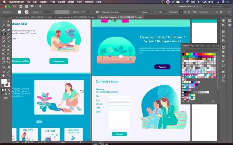
So for this, I’ve made a quick presentation, so on powerpoint to show you the different elements I’ve found:
Why is it important to design each page of your website properly?
Unless you want to create a one-page site, you need one or more pages to accompany your home page. These allow you to provide much more information on your products and services, or on specific themes when you have a blog.
And once they’ve been indexed by search engines, they appear in the results when web users perform searches related to their themes.
As a result, they’re all gateways to your website , and you need to take care to design each of them well. Otherwise, you run the risk of losing significant traffic through poorly designed pages, especially as your domain begins to gain authority.
Also, bear in mind that 57% of visitors who come to a website with a poorly designed page will not recommend it. Whereas your conversion rate can increase by up to 5.5 thanks to personalized recommendations.
So if you want to quickly gain visibility and improve the performance of your WordPress site, you owe it to yourself to offer an excellent user experience through your layout, and there are certain practices that can help.
Best practices for creating a WordPress page
When creating sites, we tend to focus on their aesthetics, whereas it’s their ergonomics that will enable you to improve the conversion rate. This means that their structure and design must be designed with the user experience in mind.
To this end, I’ve put together a few best practices to help you createthe best pages for your WordPress site.
Project your pages
The main piece of advice I can give you is to first create a mock-up of your website. This is a crucial step, as it allows you to take the time to think things through and come up with the best site for your project.
In the end, you’ll have a precise result that will enable you to design much more quickly.
Opt for simplicity
Your design isn’t the thing that visitors come to your WordPress site to admire. They want to find specific information or, in some cases, perform a certain action. I therefore suggest that you consider simplicity as a golden rule in order tooffer easy and pleasant navigation.
To this end, use only those elements that have a real function for users, and take care to avoid those that can make your site too complex. Otherwise, you risk damaging the user experience, which is likely to have a very significant impact on your website’s performance.
Establish a visual hierarchy
The various elements of your web page need to be well hierarchized and visually organized. People landing on your page need to automatically pick out the most important elements, so that they can find what they’re looking for simply and seamlessly.
Take action on aspects such as size, color, layout, buttons, call-to-actions, etc., to ensure successful hierarchization and organization.
Offer an intuitive navigation system
If you don’t have a one-page site, I suggest you make it easy for visitors to move from one page to the next. The idea is that they should be able to move from one point to another without any effort or wondering where to click.
To achieve this, opt for a very simple tree structure with a maximum of three levels, and don’t hesitate to use netlinking to link the pages of your website. In addition, make sure your navigation menu is clearly visible and, if possible, integrate a navigation menu into your site’s footer.
Your site must be “coherent
In addition to easy navigation, you need to ensure that all the elements of your pages are consistent. There has to be logic and consistency on every page, but there also has to be consistency when you move from one page to another on your website.
This mainly concerns the graphic elements, namely:
- The fonts used ;
- Colors ;
- Illustrations ;
- Etc
The point is not to have exactly the same layout throughout the website, especially when you have a large number of pages. The key is to find the right balance and not confuse users when they move from one page to another.
Optimize accessibility on different media
In one of its studies, Mobify found that 30% of Internet users abort a transaction if a website doesn’t adjust properly to their mobile’s format. And when you consider that this technological medium is the number one driver of Internet traffic, with a 51.6% share, it’s important to take a close look at the subject.
Indeed, every page of your website needs to adapt tothe size of every screen in order to offer an optimal user experience. What’s more, Google pays a great deal of attention to the responsiveness of sites, ranking those that are first at the expense of those that are not.
If you want your website to be responsive, check out this step-by-step article on how to make it happen.
Respect web conventions and standards
Internet users are already familiar with certain page templates and web design conventions, and I advise you to respect them. These include
- Place the logo at the top left or in the center of the page and add the link to the home page;
- Place the main navigation menu at the top or on the left-hand side of the page;
- Configure links so that they change color when users move their mouse over them.
- Etc..
Even if it’s sometimes tempting to try to be original, don’t make the mistake of modifying these conventions. In fact, changing them could waste readers’ time or cause confusion, all of which would be detrimental to the user experience.
Create a relevant page
The definition of a relevant page is nothing more than the page that gives visitors what they’re there for. In fact, a web page is created to provide a given piece of information, and you need to make sure that this is the case. That said, if you’re planning to add pages to the home page, it’s probably because you want to provide more information about your services, products or a given element. To do this, you need to provide answers to questions such as :
- The page’s relevance to visitors;
- What your visitors need to know;
- Information that will give them confidence;
- Data that will encourage them to take action.
Putting yourself in your visitors’ shoes
According to Vitamin T, 68% of website visitors don’t convert because they don’t think websites are interested in their experience. So, when you’re thinking about the design of your website, you need to put yourself in your visitors ‘ shoes, since it’s ultimately for them that you’re doing it.
That’s why you need to know your target audience’s preferences beforehand. But you can always carry out tests or ask for feedback afterwards to improve the user experience. To do this:
- Ask your friends and family for their opinion;
- Ask your visitors for feedback;
- Analyze your visitors’ behavior with tools such as Crazy Egg;
- Etc… [fusion_menu_anchor name=”3″ class= ” “][/fusion_menu_anchor]
Once you’ve got a clear idea of how your page will look, you can now move on to the actual creation phase, and here are the steps.
Twaino SEO Agency page creation: Steps to create your wordpress page
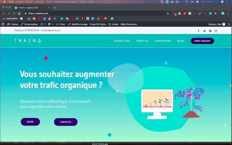
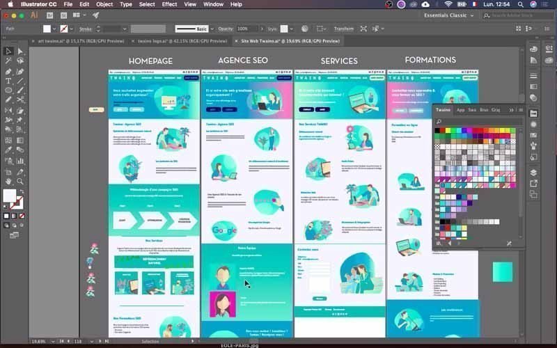
Before creating the second page of the website of my SEO Agency, Twaino.com, I had the opportunity to do two things:
- The mock-up of my website pages;
- The home page of my website.
These two elements will enable me to quickly create the second page of my site. The mock-up will give me a precise idea of the result, while the home page will serve as a model or support.
What’s more, I’m using the “Avada” theme, which provides me with the “Fusion Builder” plugin that will be useful for editing the new WordPress page of my website like a text editor. Please note that there are three main stages in this process:
- Creating a template from the home page
- Creating blocks for display on medium and large screens
- Creating blocks for display on small screens
First, however, you need to log in to your Dashboard.
Log in to your website Dashboard
To create the second page, you need to access the WordPress console.
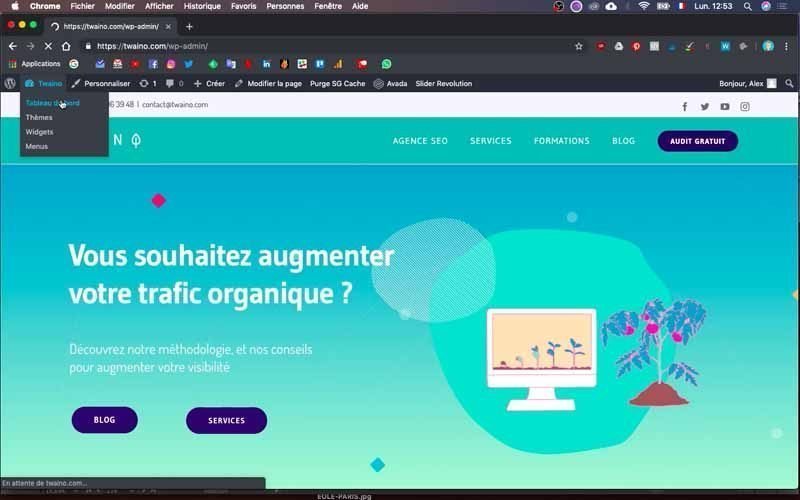
To do this, simply add “…./wp-admin” to the URL of your WordPress site in your browser. Mine is “https://twaino.com/wp-admin”.
On the login page, fill in the boxes with your credentials and then validate to access the dashboard.
1) Create a template from the home page
This involves duplicating the structure of your home page so that you can use it as a template when creating a new page.
1-1) Access the components of your home page
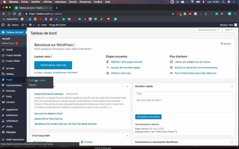
On the right-hand sidebar of your Dashboard, click on “Pages” and then on “All pages”. You’ll have access to all your pages, including the one entitled “Home”: this is your home page.
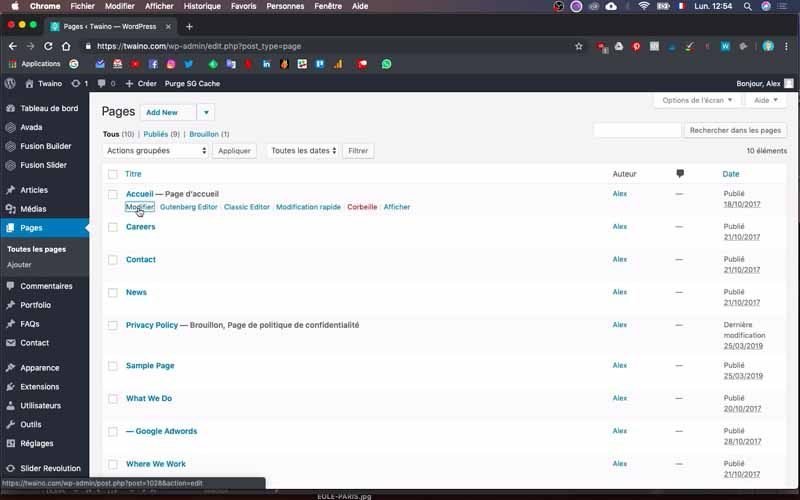
Then click on “Modify”, which appears as soon as you move your mouse over the page title.
On the following page, you’ll find all the components or blocks of your home page, in the “Fusion Builder” plugin.
1-2) Create a template from the home page
Check that the “Builder” window is active and click on the third icon on the same line on the right-hand side.
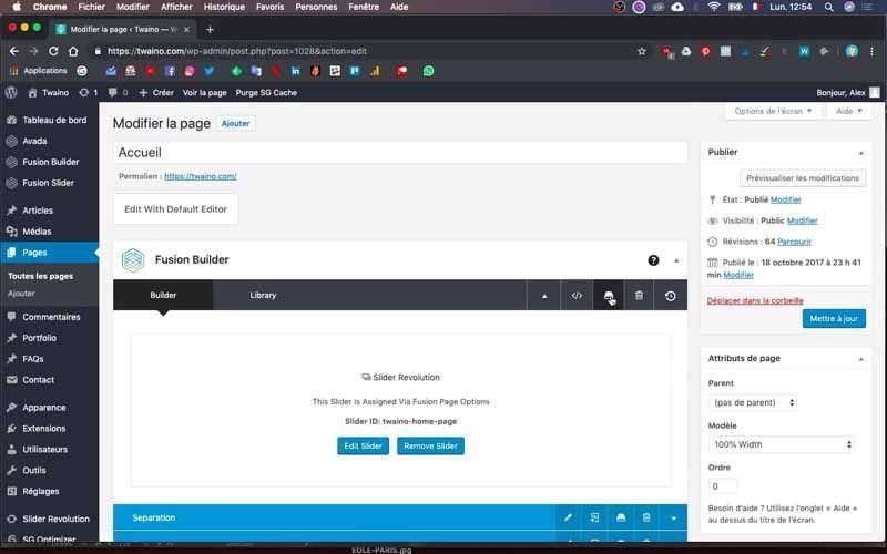
You’ll then have five windows on this new interface:
- Demos ;
- Templates ;
- Containers ;
- Columns ;
- Elements.
Select “Templates”, if you haven’t already done so, and create a new template from this page.
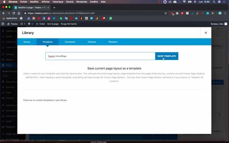
Name the template in the box provided and click on “Save Template”.
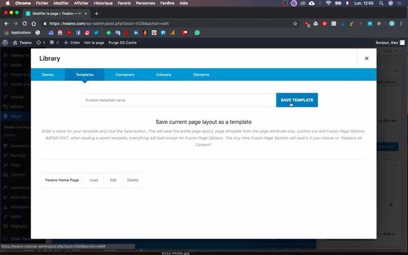
I call mine “Twaino Home Page” and save it.
1-3) Create a new page
To create a new page, you can click on the “Create” window at the very top, next to “View page”.
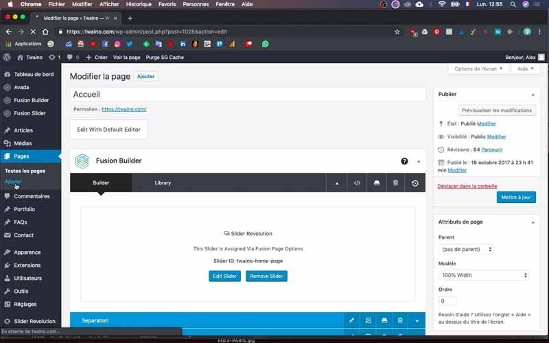
You can also create a new page by clicking on the “Add” option in the “Pages” section on the left-hand sidebar.
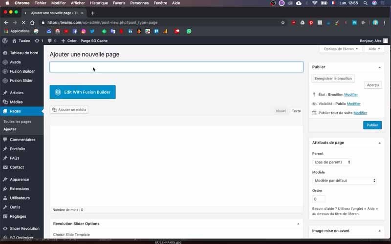
Name it by entering its title in the first box just below “Add a new page”. I call mine “SEO Agency”.
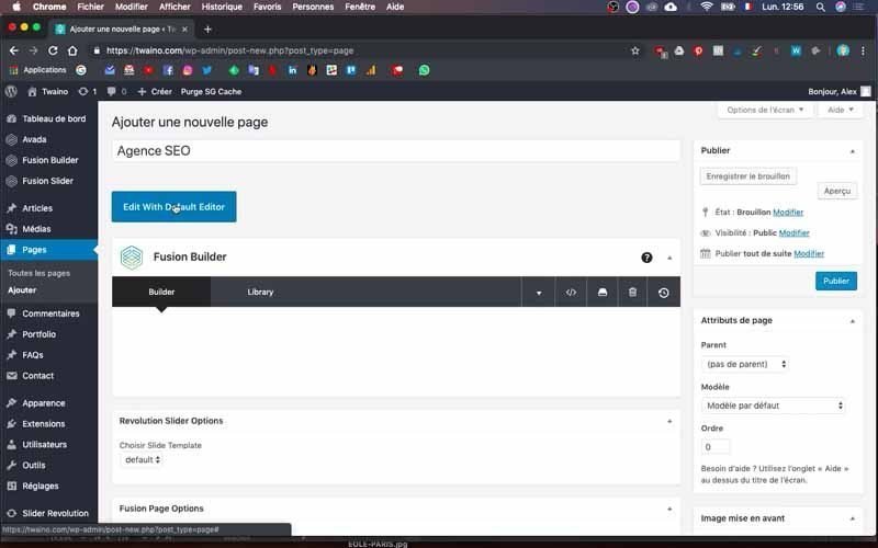
You’ll notice that, by default, “Fusion Builder” is not active. To activate it, click on the blue “Edit With Fusion Builder” button, and its various options will appear.
1-4) Load the saved template onto the new page
Click on the third icon on the same line as the “Builder” window. In the “Template” section, you’ll see the template you’ve saved, and press the “Load” option.
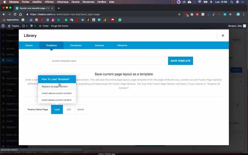
A menu appears, allowing you to choose how to load the template in question. These are :
- Replace all page content: replaces all existing page content;
- Insert above current content: Inserts content above current content;
- Insert below current content: Inserts content below current content.
I take the first option for the “Twaino Home Page” template, which therefore replaces all the content and brings me all the parts I had to create on my home page.
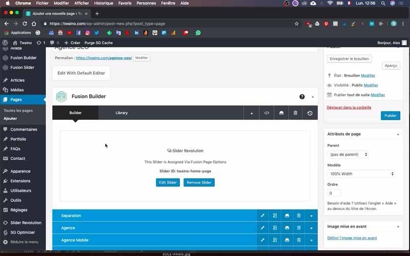
Then I publish it to see how it looks. To do this, click on the blue “Publish” button in the bottom right-hand corner and then click on “Preview”.
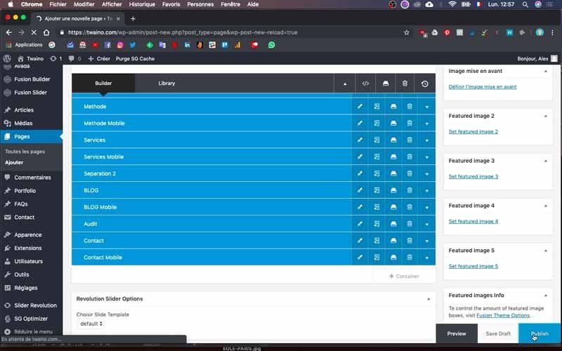
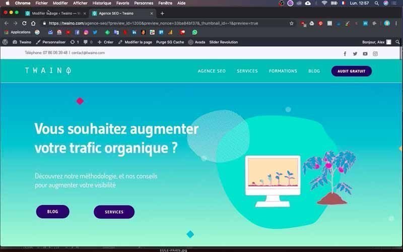
As far as I’m concerned, I’ve got the “SEO Agency” page with the URL https://www.twaino.com/agence-seo/, and it looks exactly like the home page of my website.
2) Creating blocks for medium and wide screens
“Fusion Builder” includes the various components of your web page, and as you scroll down, you’ll see several lines in blue. These are the different blocks of the page, and the modifications you make here will be taken into account in the final rendering.
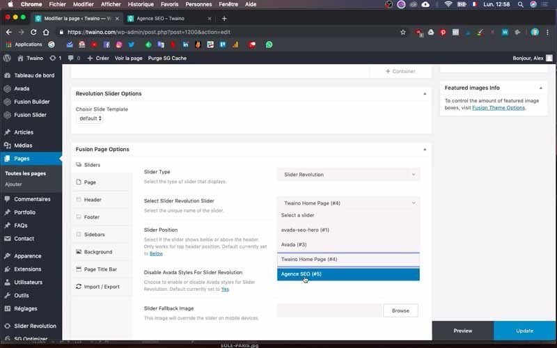
What’s more, since you’ve made a duplication, all you have to do is make modifications and not create each block from scratch.
I’ve also had a chance to create the “slider revolution” for this new page, and I’m simply going to load it. Indeed, this is the part of your web page that comes just below the navigation menu. It appears to users without them having to scroll to the bottom of the page.

If you want to do this, you can simply modify it from your home page template. However, if you’re not sure how to do this, I suggest you take a look at how to create a ” Slider Revolution “. Follow the steps to create your own for each of your pages.
2-1) Modifying the first block
There are several blocks on this template, including the separator block, which I’d like to keep. In this case, I’ll leave it and modify the other blocks, taking my layout into account.
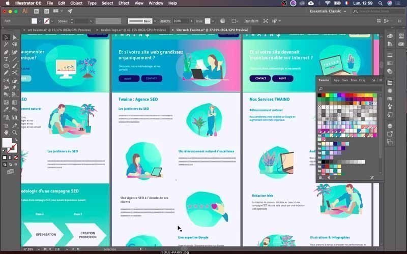
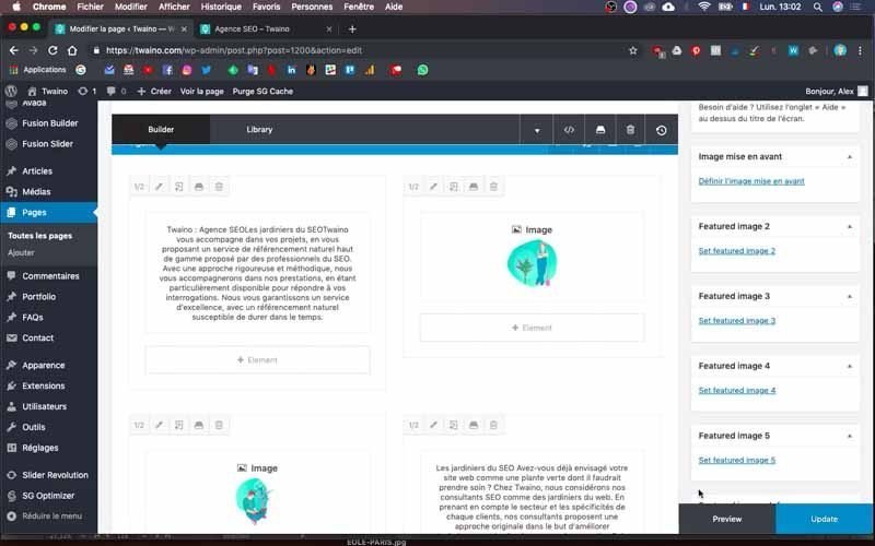
I unfold the contents of the second “Agency” block by clicking on the little arrow on the far right.
2-1-1) Modify the text
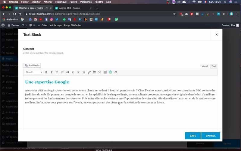
To modify the text, click on the edit icon that appears when you drag the cursor over the text cell.
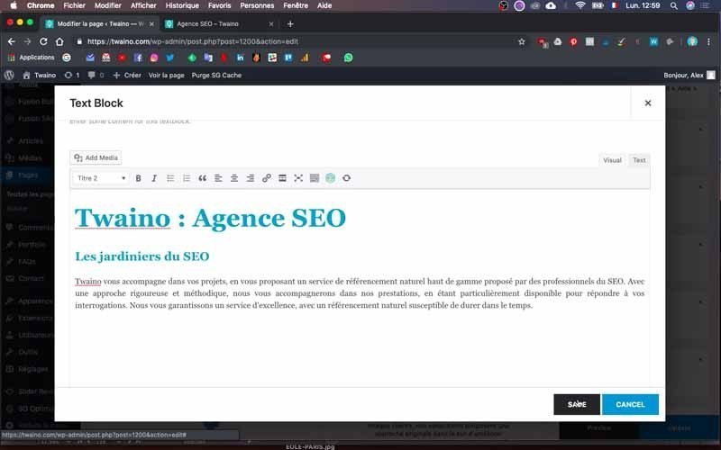
Move down a little, and you’ll see the text field where you can enter the new text and format it.
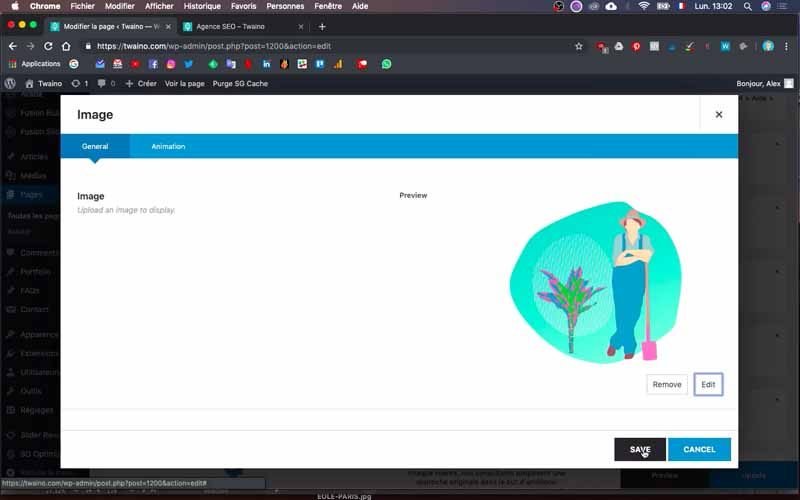
Then click on “Save” to save the new text.
2-1-2) Insert an image
I’ve had a chance to make all the images I’m going to use in advance, and you can do the same to move ahead more quickly.
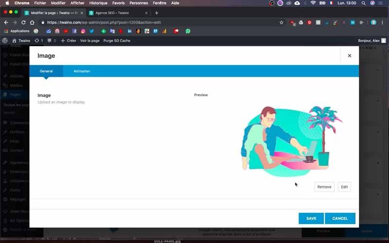
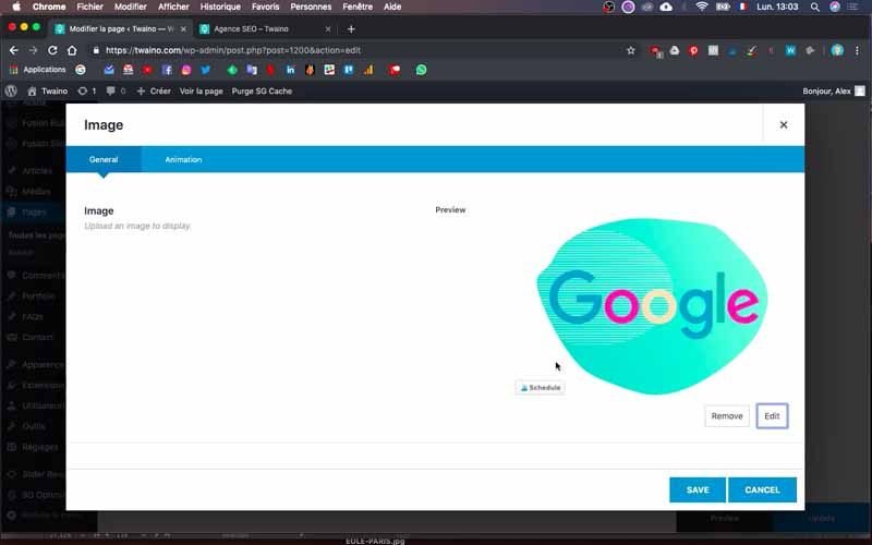
Click on the edit icon that appears when you move the cursor over the image cell next to the text cell.
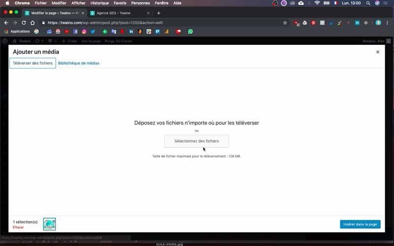
On the interface that appears, click on the “Edit” button just below the old image.
You then have your “Media Library” where you can directly select and add media such as images.
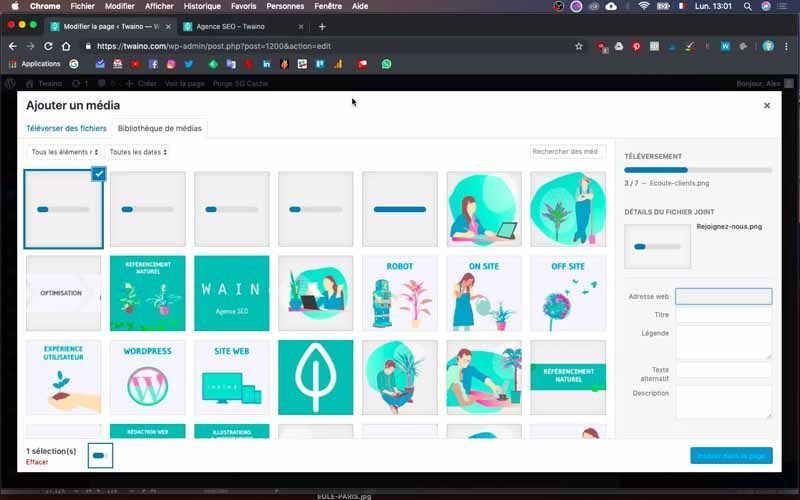
You can also import them by clicking on the “Upload files” window next to the “Media Library”.
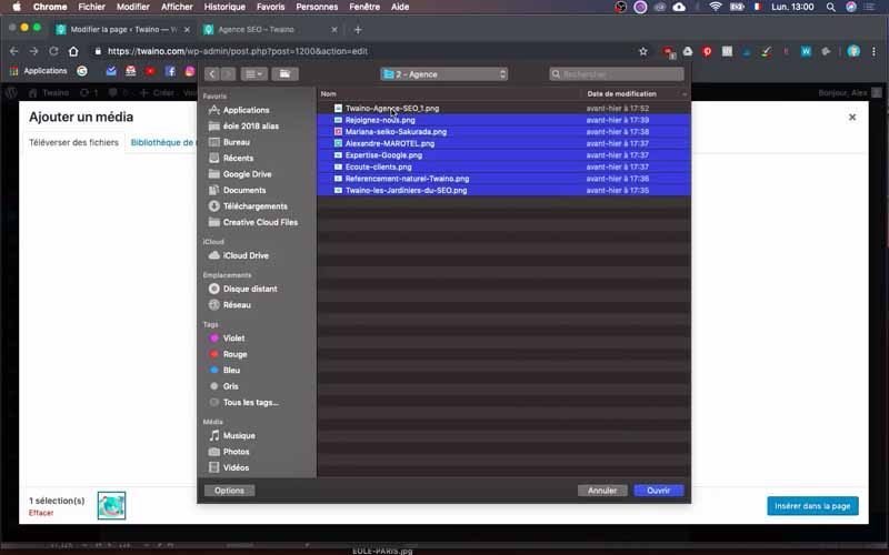
Press the “Select files” button and browse your computer for the images you want.
At this point, rename your images – I’m naming mine :
- Twaino the SEO gardeners;
- SEO Search Engine Optimization ;
- Clients ;

- Google expertise ;
- Alexandre MAROTEL ;
- Mariana Seiko Sakurada ;
- Join us.
I then insert the “Twaino les jardiniers du SEO” image and save, before inserting the second image in the third cell on the second line.
I also insert the second text “SEO excellence”, taking care to do the necessary formatting.
2-1-3) Insert other lines of text and images
At the layout level, there’s a third line containing an image and text. To save time here, duplicate the previous cells.
To do this, click on the second icon directly after the edit icon, which appears when you drag the mouse over the cell concerned.
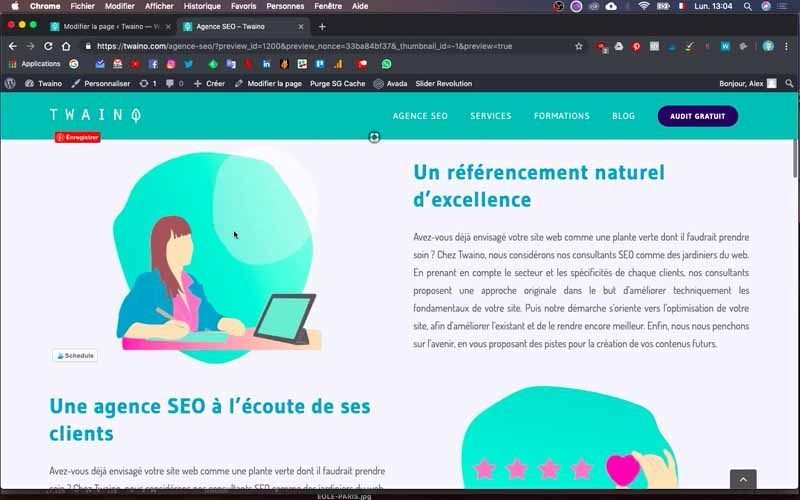
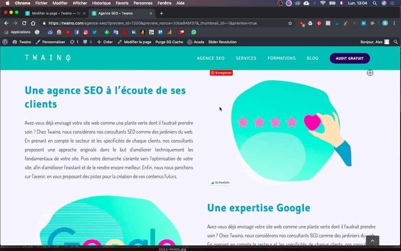
At my level, I duplicate a text cell and an image cell, which I move to the bottom. I use the same principle as before to change the text and image. So I have the third line, which includes :
- Text: An SEO agency that listens to its customers;
- The corresponding image.
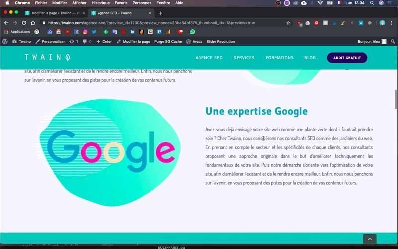
I create a fourth line with :
- Text: Google expertise;
- The corresponding image.
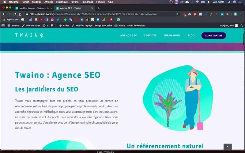
Save the changes and click on “Preview” to see the rendering. The rendering is fine except for the “Google” image, which is a little too large.
2-1-4) Adjust the size of your images
When you notice that the size of an image is a little too large, click on the edit icon in its cell and press the “Edit” button.
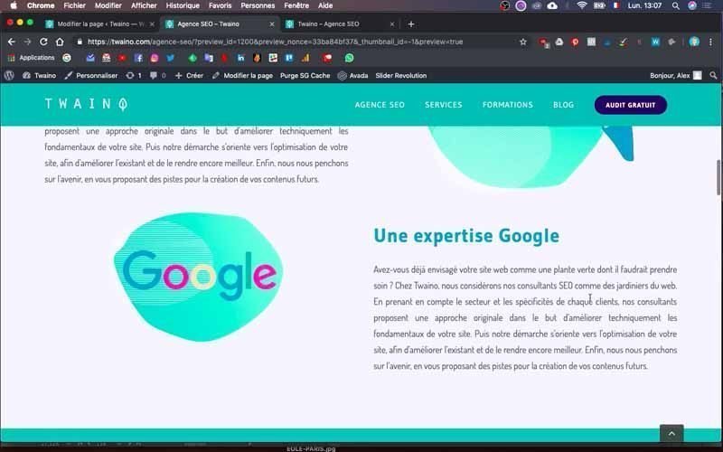
On your “Media Library” interface, you’ll see the “Size” option to the right of and just above the “Insert into page” button. Choose a default element that might match what you want.
At my level, I choose Avada’s “400 * 265” size. The rendering is much better and I take the opportunity to center the image.
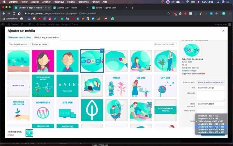
For this last action, click on the edit icon and go to the “Align” option, then select “Center” and save.
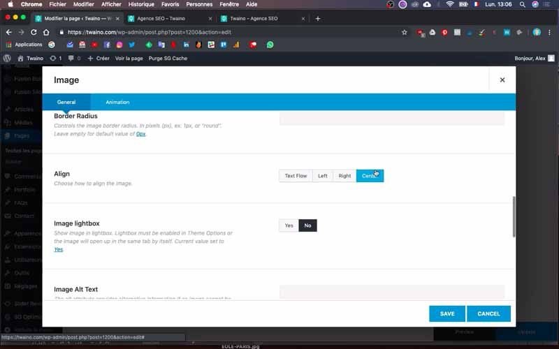
I also take care to center all other images and reduce their size.
2-2) Add the second block
Just below the “Agency” block, I’ll add the “My Team” block. To do this, I rename the block that follows as “Our Team”. In this block, I modify the text cell already present by inserting the title “Our Team” with the accompanying text. I’m keeping the same formatting, as I want the same result.
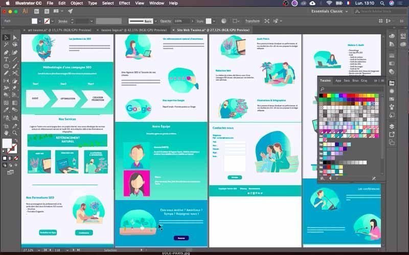
I’m now going to insert the two images that follow each other vertically with their text.
2-2-1) Insert an image
I take the cell I’m going to use for my image and delete all the other cells I won’t be using.
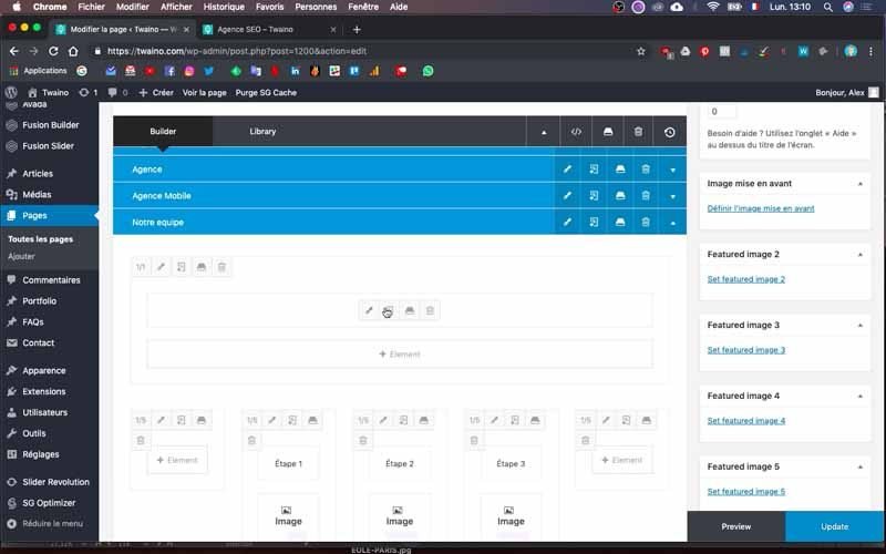
Then I set its proportion to “1/3” by pressing the first icon in the top right-hand corner of the cell.
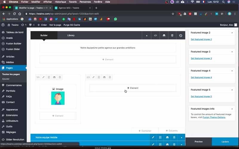
To add the image, click on “Element” in the cell and on the new page, look for the “Image” element. Then click on the “Image” button that appears, and press the “Select image” button on the new interface. The “Media Library” appears and you can choose the image you want.
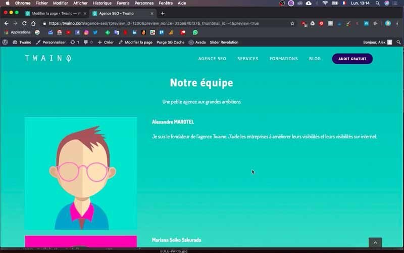
2-2-2) Insert text
To insert the text that follows this image, duplicate the cell and give it the proportion “2/3”. Then click on “Element” and this time look for the “Text” button.
Click on the element and on the configuration interface that follows, add your text and proceed with its formatting.
For the next image and its text, simply duplicate the previous ones and make the changes.
At this point, I have :
- My image and a text describing me: “Alexandre MAROTEL,………”
- Mariana’s image and a text describing her: “Mariana Seiko Sakurada,……”.
Save the changes and preview to see how it looks.
2-3) Modify a block with a background color and a button
To save time, I suggest you take the old blocks that most closely resemble the ones you want to create. At my level, the “Rejoignez-Nous” block I want to create has the same features as the “BLOG” block in the template.
So I opt to modify the “BLOG” block and delete the intermediate blocks I no longer need. These are, for example
- Services ;
- Mobile Services ;
- Separator.
2-3-1) Insert text and image
For “Join us”, there are three elements to insert:
- An image ;
- Text with title;
- A button.
First, I delete the cells I don’t need.
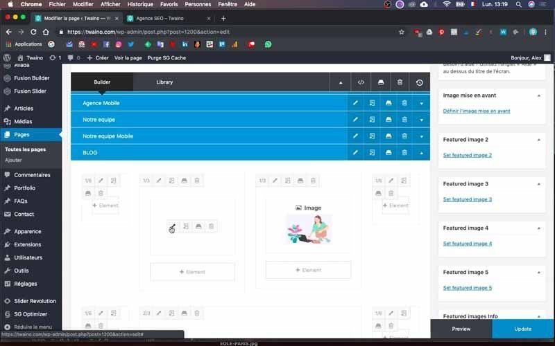
I insert my text by modifying the old content using the same principle.
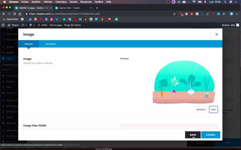
I also change the image and take care to give the proportion of ½” to each of the two cells.
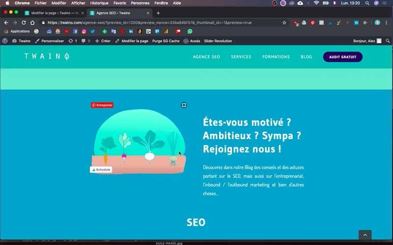
I then place the image cell on the left and the text cell on the right.
2-3-2) Insert a button
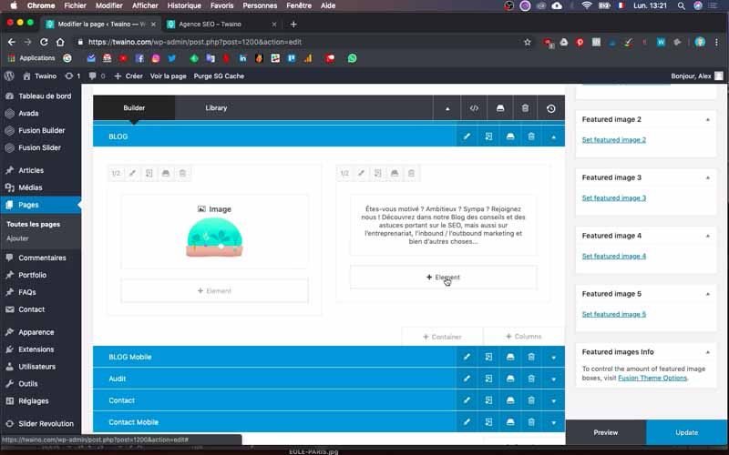
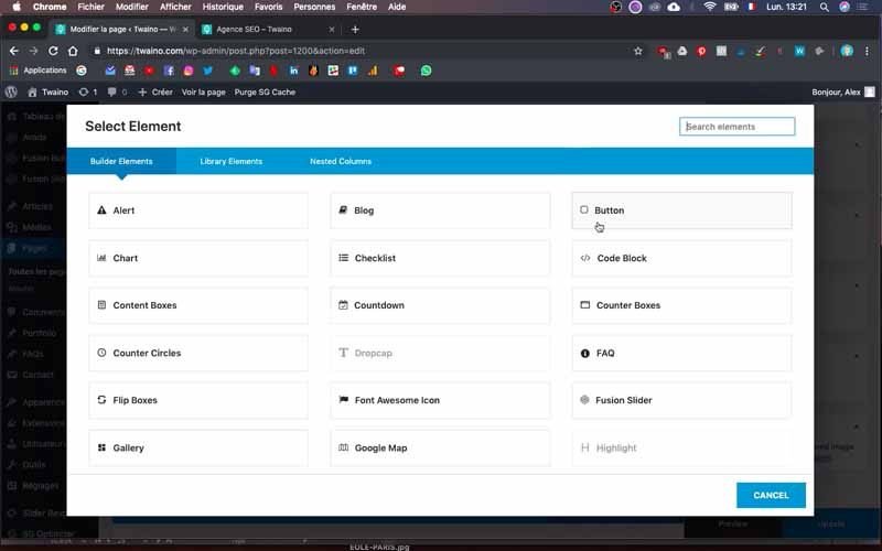
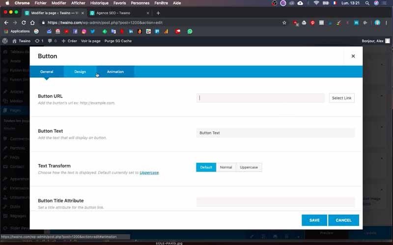
To insert the button, click on “Element” located on the text cell and search for the button element using the search bar. Click on “Button”, which takes you to the configuration interface.
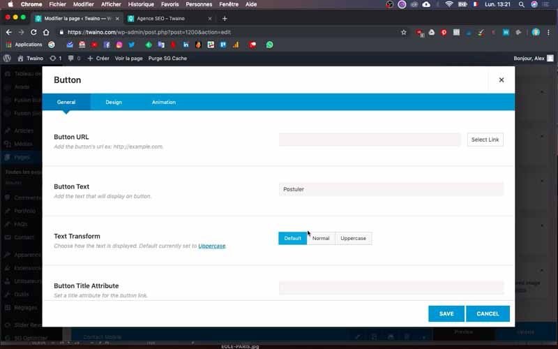
By default, you have the options of the “General” window, and if you already have the link for your button, you can enter it in the box reserved for this purpose, under the “Button URL” option.
Enter the text to be displayed on the button using the “Button Text” option.
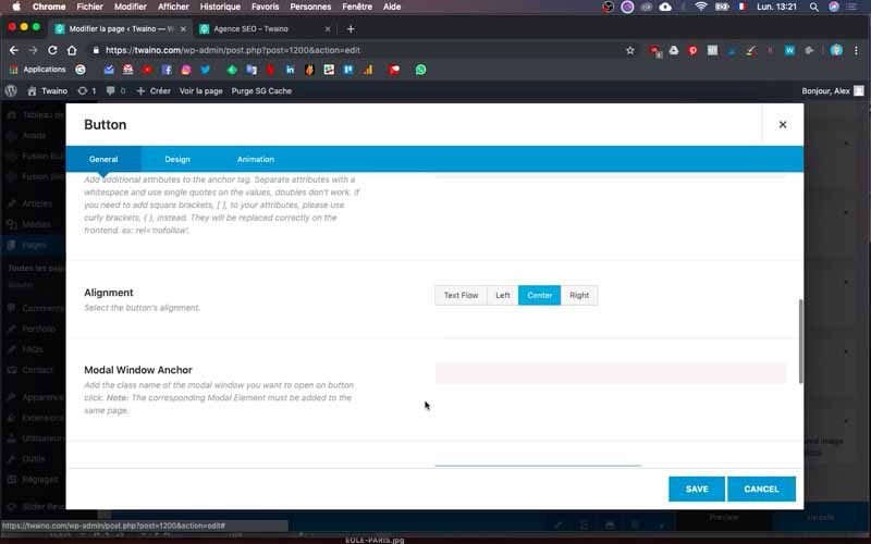
In “Alignment”, select “Center” to center the text on the button.
2-3-3) Add space between button and text
As the distance between the text and the button is very small, I’m going to put a little distance between them. To do this, I’m going to create a separator that will be placed between these two elements.
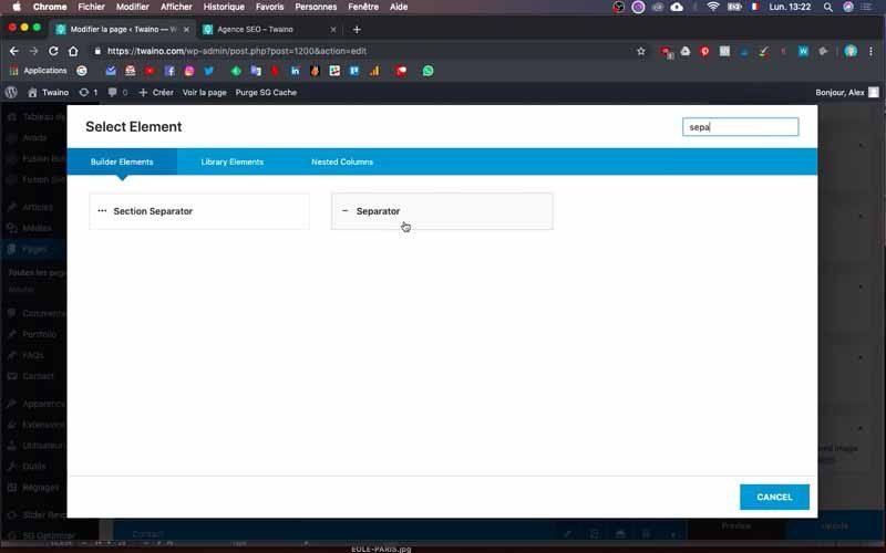
Click on “Element” and find the “Separator” element, then click on its button. On the next interface, select the “No Style” menu item in the “General” window for the “Style” option.
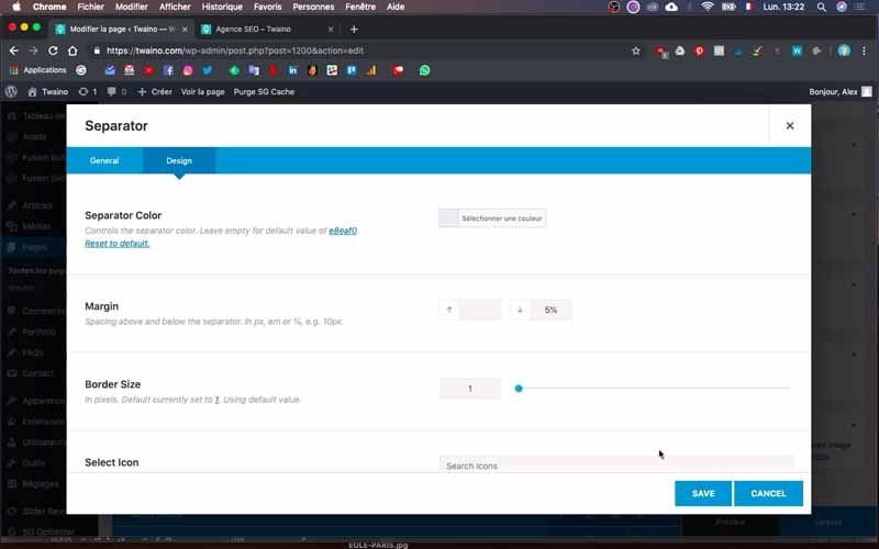
Next, select the “Design” window and in “Margin”, set the distance you want. I enter a value of 5% and place the separator between the button and the text.
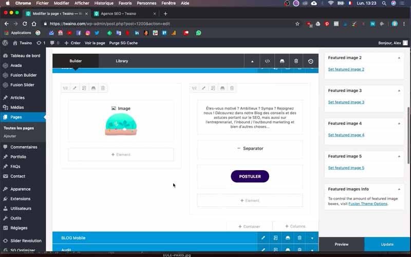
Afterwards, I click on “Preview” to check whether the rendering is pleasing, which it is.
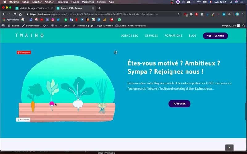
3) Creating blocks for display on small screens
Note that computer displays are not always optimized for cell phone displays. For this reason, you need to create blocks dedicated to mobile-optimized display. You can refer to my article on the subject, which gives much more
details.
To check the page’s mobile display, you can :
- Use your cell phone to see directly what it looks like;
- Reduce your browser tab to about “2/3” the width of your computer screen.
3-1) Duplicate and modify the first block
To speed things up, simply duplicate the blocks you’ve created for the default display.
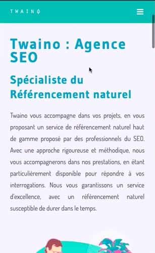
In my case, I duplicate the “Agency” block and rename the second one “Mobile Agency”. For this block, which has just been created, I go on to modify it by clicking on the little arrow on the right to display its contents.
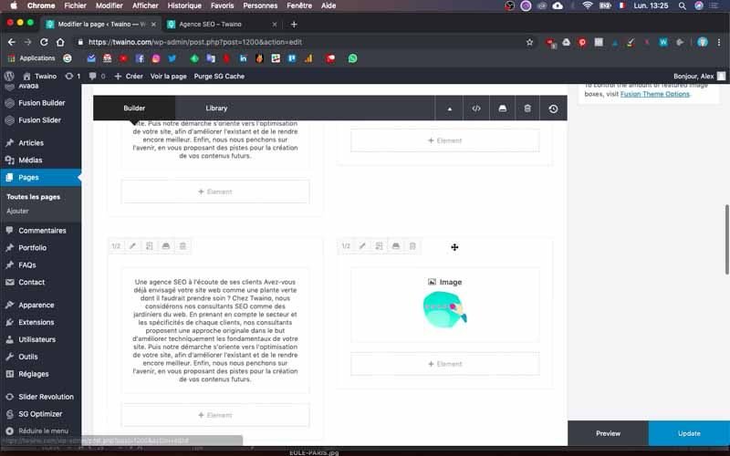
I then reorganize the block’s text and images, separating each image with text.
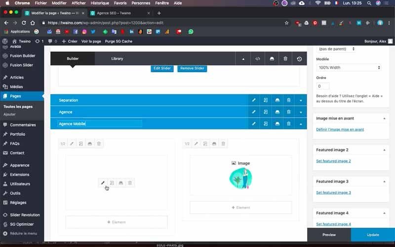
I also click on the text cell edit icon to reduce their size.
To do this, I set the size of the titles to “40 pixels” instead of “50 pixels”.
3-2) Activate mobile display
To see the changes you’ve made, you need to activate the mobile display. Click on the block’s edit icon and, in the “General” window, scroll down to “Container Visibility” to see the three display options:
- Small Screen: For display on small-screen devices such as mobile phones;
- Medium Screen: For medium-screen devices such as tablets;
- Large Screen: For widescreen devices such as computers.
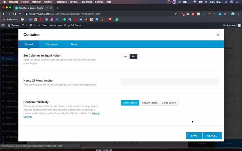
Select the first option and deselect the other two. You’ll then have the first option turned blue and the other two grey.
This action allows this configuration to be displayed only on small screens such as telephones.
Save and preview to see how it looks.
3-3) Create the second mobile block
I want to create a new Mobile block for “Our team”. To do this, I’ll duplicate it and set it to phone mode using the same method as above.
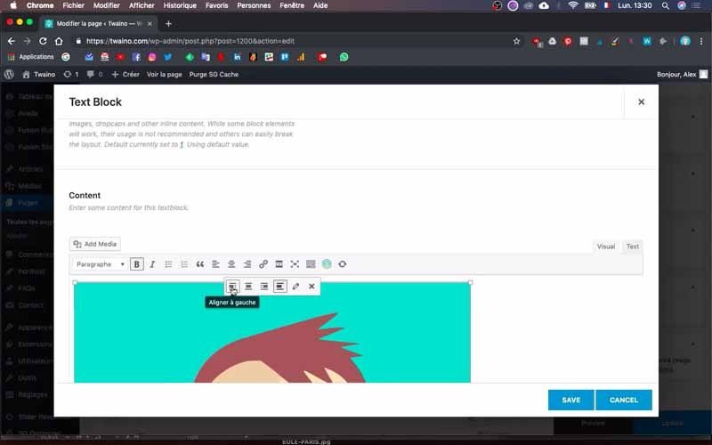
At this point, my image is already too large for display on a phone. To make it smaller, I’m going to insert it directly into the accompanying text cell.

Click on the text cell’s edit icon and, just above the text field, press the “Add Media” button.
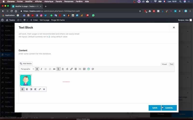
Then choose the image you want, and I take my image and align it on the left, taking care to reduce its size to “80 pixels”.

On the other hand, move the text just below the image in the field so as to render it nicely. I do the same with the second image and its text, taking care to activate the mobile display.
In addition, the last “Mobile Recruitment” block already has a good layout and I don’t need to modify it any further. All I need to do is activate the mobile display.
4) Check your changes
Once you’ve made all these changes, take the time to check the page’s display on the various media. This will enable you to detect any problems and make the necessary corrections.

And that’s it, you’ve just created the second page of your website.

Conclusion
Once you’ve created the home page, it’s time to create the other pages of your website. These will provide your visitors with additional information on your products and services, or present your blog posts. And once indexed by search engines, these pages become gateways for visitors. For this reason, you need to ensure that each of them is well designed and offers an optimal user experience. To achieve this quickly, I suggest you first create the perfect home page, then simply duplicate it and use it as a template.
See you soon for another article!

