Banner Blindness is a term that explains the tendency of people to ignore banner ads they encounter on websites and elsewhere. It is a behavior that results from the limited attention of people on the Internet nowadays.
For a long time, banner ads have been a good way for many web marketers to monetize their sites.
But with the changing behavior patterns of people on the internet today, the attention given to banner ads is becoming increasingly minimal.
While an average Internet user is exposed to 1707 banner ads in a month, the average click-through rate is barely 0.11%.
This is a phenomenon that is in full trend and that makes web marketers lose a lot of money.
So,
- What is Banner Blindness?
- What are the factors that influence banner blindness?
- How to minimize this phenomenon?
The answer to these three main questions will be the subject of our article, so follow!
Chapter 1: Generalities about Banner Blindness
Let’s clarify in this chapter some basic notions to help you better understand the concept of Banner Blindness.
1.1. Banner Blindness: What is it?
As a reminder, banner blindness is a process by which users pay almost no attention to banner ads or anything that looks like an ad on :
- A site;
- A search result page; or
- Social networks;
- Etc.

Source: alidropship
In reality, it’s a bit difficult for any type of reader to be able to read everything on a page.
This is actually what creates a selective attention in the reader that allows him to focus only on what interests him.
Thus, he looks for what brought him only to certain parts of the page where he assumes to find the relevant information with the help of cognitive schemas built with experience.
The cognitive schema is a mental framework that allows humans to organize and interpret information. These frameworks help humans understand concepts when presented with a similar environment.
Whenever the user lands on a new website to find information they need, they now use this logic to go directly to the parts of the web page that look promising
Typically, these are mostly places on a site where he has already found valuable information.
Banner blindness is our defense mechanism against typical information overload, especially on the web.
On the web we don’t really read the text but scan the most relevant information like headlines and lists.
We do a transversal reading and focus only on what interests us.
On the web we look for information, we do it in a hurry and advertisements are part of the unsolicited information that we exclude in a more or less unconscious way.
1.2. Banner blindness & people’s attention
When visiting a website, the attention paid to the content varies from one site to another, it also depends on the visuals and the browsing behavior of the people
Consciously or unconsciously, users tend to avoid advertisements because they immediately assume that they contain no relevant information.
It is in this way that we can say that banner blindness is considered a consequence of our limited attention

Everyone in a network is able to communicate. So the attention paid to viewing, reading or listening to content is quite limited
The more content people produce, the harder it becomes to be heard or read
If we had to pay attention to everything around us on the Internet, we would be overwhelmed with information and would not be able to grasp anything.
As user interface elements such as banner ads are designed to attract attention, users are becoming increasingly able to sort out what to pay attention to.

Chapter 2: What are the influencing factors of banner blindness?
There are several factors that influence banner blindness.
Some are related to the quality of the banner ad and others to the way users read web pages.
Let’s look at them in detail:
2.1. Advertiser factors
For a banner ad to be ignored or not, it must have certain characteristics so here are some of them:
2.1.1. Nature of the ad
Another reason for banner ads to be ignored is the way the ads are presented on the web site.
When a site is cluttered with contextual ads and banner ads, users feel sensory overload and lose their ability to assimilate the information they are on the site for.
Ultimately, this causes publishers to lose monetization opportunities, as users lose interest in the ad content and focus only on the main content of the page they originally came for.
2.1.2. Visuality and ad style
Often, users expect to see an ad with a specific visual appearance
This conscious or unconscious expectation of the appearance of ads means that users simply avoid them when browsing content
The following elements usually indicate to a user the specific style of the ad, causing them to ignore it.
- Alternative formatting: Sometimes you encounter ads with different kinds of fonts. Font colors also matter. Different font, font color;
- A colored background that is different from the rest of the website’s color scheme;
- Text embedded in the image.
2.1.3. The relevance of the ad
Whether it is the content of your website or the content of your ad, relevance is important for the success of your campaign
Indeed, the visibility and the CTR are directly proportional to the contextual relevance of the ad content and the web page.
When a product is placed as an ad next to content that it matches, it becomes less annoying for the reader.
However, this does not mean displaying keyword-based ads
It’s about not placing an ad on a page that doesn’t match the intent of the content itself.
2.2. Reader factors
With regard to reader factors, they correspond to the way people read a web page.
The principles of cognitive schema and the constant evolution of user search patterns mean that banner blindness will probably never be overcome
But when you understand how the human brain processes information on the web, you can easily predict user behaviors and place elements in the most appropriate places to get their attention.
The way users browse web pages is characterized by:
- Their motivation ;
- Their goals;
- The layout and formatting of the text;
- The content of the page
Depending on their main motivation, users browse the page in one of the following ways:
2.2.1. According to the F motive
In a study, NNG’s lead UX researchers found that people have several ways of scanning web pages quickly.
One of these ways is reading the page in an F-pattern.
Source: nngroup
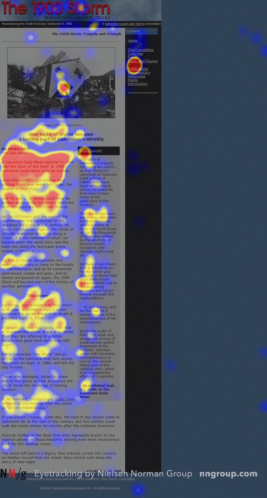
As can be seen in the image, this F-scheme reading pattern is characterized by scanning primarily at the top of the text section and on the left side of the page
We then note that this scanning pattern tends to avoid covering the banner ads that appear above the text and in the right sidebar.
To be clearer, the F-scanning pattern can be summarized in three main points:
- Users start by reading horizontally across the top of the content area, which is the top bar of the letter F ;
- Then they move down to read in a second horizontal movement, forming the bottom bar of F ;
- Finally, they scroll down the left side of the page in a horizontal motion, forming the vertical bar of the letter F.
The F pattern usually predominates when users are not necessarily interested in all the content on the page
When users really want to pay attention to what they are reading, they engage in many other user behaviors, such as the Gutenberg rule.
2.2.2. According to the Gutenberg Rule
The Gutenberg diagram is used to demonstrate how some users are used to reading a page from left to right and top to bottom.
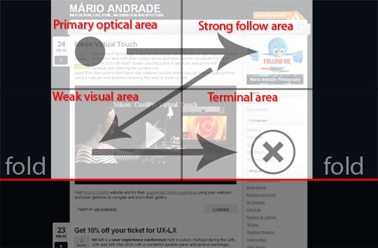
- The primary optical zone: This zone designates the upper left part of the page, this is where users automatically focus when they land on the page to search for information ;
- The strong fallow zone: This zone is the second step in reading according to the Gutenberg diagram. The user reads the page towards the upper right part of the page. It is often not a good idea to stop the experience you have created from the start with the user at this point. This means that if you put a call to action in the strong fallow area, the user will stop at this point and take action if they need to;
- The weak fallow area: This area is the lower left part of the Gutenberg diagram. Although it is readable, it is considered the blind part of the diagram. The user does not attach much importance to the content of this area of the page;
- The terminal area: This area refers to the part of the schema where the user pauses reading when he or she reaches the bottom right part of the page. This can be a good place to place call-to-action buttons.
Chapter 3: How to avoid banner blindness
Let’s see in this chapter how to make your banner ad more relevant to minimize banner blindness:
3.1. find the right location
While it may seem that banner blindness cannot be completely eliminated due to ever-changing behavior patterns, it can be minimized by understanding how users behave on your pages.
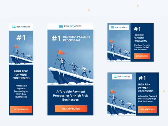
Several studies have been conducted to understand typical reading patterns and eye movements of web users to identify the right placement for banner ads.
Source: graphic designer
In a study by Nielsen, findings from a review of 232 users who viewed thousands of different pages were noted.
The results concluded that the dominant reading behavior was the F-reading pattern.
While F-Pattern ad placement works best on pages with high content, such as blog posts, longer sales pages, etc., the Z-Pattern is best suited for pages with minimal copy.
Here are some more specific places where you can place your banner ads in general
- Above the fold: An Infolink study shows that 156% more people see content at the top of the page. So placing ads anywhere above the waterline is a way to get maximum visibility and better click-through rates ;
- On the homepage: Homepage ads are an ad format, similar to the pop-up ad, that allows you to simultaneously engage visitors and get impressions;
- In your content: The main content areas always get the most engagement and visibility, so native advertising is another great way to avoid ad blindness.
3.2. do A/B testing
A/B testing is a way to identify the most effective option for implementing a given campaign or strategy.
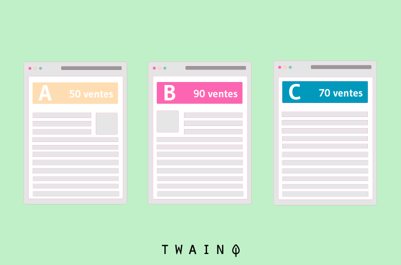
In the context of banners, A/B testing will consist of creating two different banners with different designs
Then, you will put the first one in the public for a good time and swap it after the set time.
Thus, you will note the banner that has shown greater effectiveness, then you keep it on your website.
Split testing can also be done to find out a more advantageous location of the banner on the website.
3.2. try different sizes and formats of ads
Using reasonable sizes and formats is a good way to reduce Banner Blindness on your website
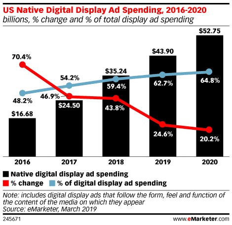
According to a study conducted by eMarketer, US advertisers spend about 64.8% of total display advertising on native ads
Speaking of native ads, they act like organic content on a site and help to significantly reduce banner blindness.
For the same reason, the NYTimes has created a new Flex Frame ad in the native ad format that adjusts its appearance based on screen type and page layout. The NYTimes isn’t the only one doing native advertising
3.3. optimize banners for mobile devices
It’s no secret that the number of mobile device users on the internet is growing day by day.
It is therefore necessary to take this factor into account when designing a website and a banner ad.
To find out if your website is optimized for mobile devices, you can use a free service from Google.
When working on a design for mobile devices, you need to make sure that the site follows certain logic so that banner ads don’t get mixed up with important information.
3.4. keep the content relevant
A worthy campaign requires the publication of relevant content to give a good result.
For this, it is recommended to stay clear and precise about what your audience would like to read
In this case, using the main keywords in your ads allows you to make your banner ads more targeted.
It is important here that you place your ads on sites that are relevant to the content of your ad.
The key elements that you need to pay attention to while ensuring the relevance of your banner ads are:
- It is important to know the inclinations and trends of your visitors;
- The keywords used in the banner ads must be related to your audience research;
- The use of contextual links in your blogs can be effective in solving banner blindness issues.
3.5. Use colors to your advantage
In truth, colors create different types of reactions in individuals and are capable of affecting a visitor’s mood, whether they know it or not
Therefore, it is important to understand the psychological effects of the color palette on your website visitors.
As a general rule, it’s more important to stick to your brand guidelines than to follow someone else’s idea of the perfect banner background.

Especially if you’re running a retargeting campaign, your desire would be for your brand to be recognizable at a glance
However, prioritizing other colors because they prompt action while leaving your brand colors is likely to hurt a retargeting campaign.
3.6. Use native advertising
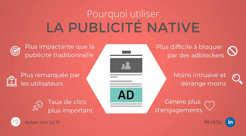
Native advertising is one of the best ways to fully exploit the potential of online advertising
Digital advertising is increasingly moving towards a native format, as it is significantly less disruptive than traditional web ads.
Source: mo-jo
Getting the best ad exposure starts with updating your campaigns to reflect industry trends
Banner advertising is an oversaturated market to the point where the public is subconsciously or even consciously ignoring the information presented in the form of banners.
Native advertising helps advertisers, publishers and audiences avoid the problems of banner blindness because they don’t look like typical marketing. Instead, native ads match the tone and context of the site on which they appear.
Here are some examples of interactive ads:
- Short video ads with high video quality;
- 3D ads;
- Augmented reality ads;
- Etc.
3.7. Photos of people always improve performance
It is often assumed that ads featuring people will always perform better than those without photos
It’s entirely possible that a well-used photo will attract attention, increase trustworthiness and improve performance, but a bad photo is likely to play the opposite trick. It all depends on the photo and how you use it
For consumer brands, featuring a real person using or wearing your product may be the most effective way to showcase it
For B2B companies or consumer brands with more abstract services, this can sometimes be trickier
Ultimately, the trick is to make sure the photo is truly relevant. If your photo helps your customers see themselves wearing, using, enjoying, or benefiting from your product, then it can help you
3.8. Cut down on the time it takes to post
Especially when you are implementing regular marketing campaigns, you need to keep the time a banner ad has to run to a minimum.
A long publishing time means that your visitors will see the same banner ad for a long time on the site.
So they will not pay any attention to it the next time they visit your website.
A recent analysis by AdEspresso shows how the frequency of ads affects factors such as:
- Click-through rate
- Cost per click
- And the cost per conversion of an ad campaign
Ads seen by users at least twice resulted in an 8.91% decrease in click-through rate.
And when seen more than 4 times, the click-through rate dropped this time by 23.34%.
3.9. Affiliate programs are effective in overcoming banner blindness
Affiliate programs can also prove useful in your advertising campaign, as they will give you the opportunity to partner with businesses that share a similar audience.

Fighting banner blindness becomes easier when you display your banner ads on a partner’s site.
You can opt for various affiliate publisher sponsorship programs in your niche that will help you have a rich audience base of the most relevant audiences.
3.10. Use metrics to monitor your performance
CTR can be a valuable metric for the success of your ads, and it often makes sense to determine the winner of an A/B test based on the highest CTR
But, if the goal of your campaign is to promote your brand, clicks may not be worth recording
You’ll need to look to other metrics to measure the impact of your campaign on your audience.
If you simply care about generating traffic, CTR is an excellent measure of success
Conclusion
Overall, banner blindness is a serious problem in digital advertising that causes web marketers to lose many monetization opportunities.
But, by understanding how humans read web pages, you can better optimize your banner ad campaigns to ensure they hold people’s attention.
To that end, we have detailed in this article what you can understand by Banner Blindness and how you can minimize it.
Title: Definition of Banner Blindness
Meta description: Want to learn how to optimize your banner ads to avoid Banner Blindness? Find out in this article.
Banner Blindness definition
Banner Blindness is an English expression that explains the tendency of people to ignore banner ads they encounter on websites and elsewhere. It is a behavior that results from the limited attention people pay to the Internet these days.
For a long time, banner ads have been a good way for many web marketers to monetize their sites.
But with the changing behavior patterns of people on the internet today, the attention given to banner ads is becoming increasingly minimal.
While an average Internet user is exposed to 1707 banner ads in a month, the average click-through rate is barely 0.11%.
This is a phenomenon that is in full trend and that makes web marketers lose a lot of money.
So,
- What is Banner Blindness?
- What are the factors that influence banner blindness?
- How to minimize this phenomenon?
The answer to these three main questions will be the subject of our article, so follow along!
Chapter 1: General information on the expression Banner Blindness
Let’s clarify in this chapter some basic notions to help you better understand the concept of Banner Blindness.
1.1. Banner Blindness: What is it?
As a reminder, banner blindness is a process by which users pay almost no attention to banner ads or anything that looks like an ad on :
- A site;
- A search result page; or
- Social networks;
- Etc.
Source: alidropship
In reality, it’s a bit difficult for any type of reader to be able to read everything on a page.
This is actually what causes the reader to have selective attention so that he can focus only on what interests him.
Thus, he looks for what brought him only to certain parts of the page where he assumes to find the relevant information with the help of cognitive schemas built with experience.
The cognitive schema is a mental framework that allows humans to organize and interpret information. These frameworks help humans understand concepts when presented with a similar environment.
Whenever the user lands on a new website to find information they need, they now use this logic to go directly to the parts of the web page that look promising
Typically, these are mostly places on a site where he has already found valuable information.
Banner blindness is our defense mechanism against typical information overload, especially on the web.
On the web we don’t really read the text but scan the most relevant information like headlines and lists.
We do a transversal reading and focus only on what interests us.
On the web we look for information, we do it in a hurry and advertisements are part of the unsolicited information that we exclude in a more or less unconscious way.
1.2. Banner blindness & people’s attention
When visiting a website, the attention paid to the content varies from one site to another, it also depends on the visuals and the browsing behavior of the people
Consciously or unconsciously, users tend to avoid advertisements because they immediately assume that they contain no relevant information.
It is in this way that we can say that banner blindness is considered a consequence of our limited attention
Everyone in a network is able to communicate. So the attention paid to viewing, reading or listening to content is quite limited
The more content people produce, the harder it becomes to be heard or read
If we had to pay attention to everything around us on the Internet, we would be overwhelmed with information and would not be able to grasp anything.
As user interface elements such as banner ads are designed to attract attention, users are becoming more and more able to sort out what to pay attention to.
Source: The Banner Blindness Infographic (infolinks.com)
Chapter 2: What are the influencing factors of banner blindness?
There are several factors that influence banner blindness.
Some are related to the quality of the banner ad and others to the way users read web pages.
Let’s look at them in detail:
2.1. Advertiser factors
For a banner ad to be ignored or not, it must have certain characteristics so here are some of them:
2.1.1. Nature of the ad
Another reason for banner ads to be ignored is the way the ads are presented on the web site.
When a site is cluttered with contextual ads and banner ads, users feel sensory overload and lose their ability to assimilate the information they are on the site for.
Ultimately, this causes publishers to lose monetization opportunities, as users lose interest in the ad content and focus only on the main content of the page they originally came for.
2.1.2. Visuality and ad style
Often, users expect to see an ad with a specific visual appearance
This conscious or unconscious expectation of the appearance of ads means that users simply avoid them when browsing content
The following elements usually indicate to a user the specific style of the ad, causing them to ignore it.
- Alternative formatting: Sometimes you encounter ads with different kinds of fonts. Font colors also matter. Different font, font color;
- A colored background that is different from the rest of the website’s color scheme;
- Text embedded in the image.
2.1.3. The relevance of the ad
Whether it is the content of your website or the content of your ad, relevance is important for the success of your campaign
Indeed, the visibility and the CTR are directly proportional to the contextual relevance of the ad content and the web page.
When a product is placed as an ad next to content that it matches, it becomes less annoying for the reader.
However, this does not mean displaying keyword-based ads
It’s about not placing an ad on a page that doesn’t match the intent of the content itself.
2.2. Reader factors
As far as reader factors are concerned, they correspond to the way people read a web page.
The principles of cognitive schema and the constant evolution of user search patterns mean that banner blindness will probably never be overcome
But when you understand how the human brain processes information on the web, you can easily predict user behaviors and place elements in the most appropriate places to get their attention.
The way users browse web pages is characterized by:
- Their motivation ;
- Their goals;
- The layout and formatting of the text;
- The content of the page
Depending on their main motivation, users browse the page in one of the following ways:
2.2.1. According to the F motive
In a study, NNG’s lead UX researchers found that people have several ways of scanning web pages quickly.
One of these ways is reading the page in an F-pattern.
Source: nngroup
As can be seen in the image, this F-scheme reading pattern is characterized by scanning primarily at the top of the text section and on the left side of the page
We then note that this scanning pattern tends to avoid covering the banner ads that appear above the text and in the right sidebar.
To be clearer, the F-scanning pattern can be summarized in three main points:
- Users start by reading horizontally across the top of the content area, which is the top bar of the letter F ;
- Then they move down to read in a second horizontal movement, forming the bottom bar of F ;
- Finally, they scroll down the left side of the page in a horizontal motion, forming the vertical bar of the letter F.
The F pattern usually predominates when users are not necessarily interested in all the content on the page
When users really want to pay attention to what they are reading, they engage in many other user behaviors, such as the Gutenberg rule.
2.2.2. According to the Gutenberg Rule
The Gutenberg diagram is used to demonstrate how some users are used to reading a page from left to right and top to bottom.
- The primary optical zone: This zone designates the upper left part of the page, this is where users automatically focus when they land on the page to search for information ;
- The strong fallow zone: This zone is the second step in reading according to the Gutenberg diagram. The user reads the page towards the upper right part of the page. It is often not a good idea to stop the experience you have created from the start with the user at this point. This means that if you put a call to action in the strong fallow area, the user will stop at this point and take action if they need to;
- The weak fallow area: This area is the lower left part of the Gutenberg diagram. Although it is readable, it is considered the blind part of the diagram. The user does not attach much importance to the content of this area of the page;
- The terminal area: This area refers to the part of the schema where the user pauses reading when he or she reaches the bottom right part of the page. This can be a good place to place call-to-action buttons.
Chapter 3: How to avoid banner blindness
Let’s see in this chapter how to make your banner ad more relevant to minimize banner blindness:
3.1. find the right location
While it may seem that banner blindness cannot be completely eliminated due to ever-changing behavior patterns, it can be minimized by understanding how users behave on your pages.
Several studies have been conducted to understand typical reading patterns and eye movements of web users to identify the right placement for banner ads.
Source: graphic designer
In a study by Nielsen, findings from a review of 232 users who viewed thousands of different pages were noted.
The results concluded that the dominant reading behavior was the F-reading pattern.
While F-Pattern ad placement works best on pages with high content, such as blog posts, longer sales pages, etc., the Z-Pattern is best suited for pages with minimal copy.
Here are some more specific places where you can place your banner ads in general
- Above the fold: An Infolink study shows that 156% more people see content at the top of the page. So placing ads anywhere above the waterline is a way to get maximum visibility and better click-through rates ;
- On the homepage: Homepage ads are an ad format, similar to the pop-up ad, that allows you to simultaneously engage visitors and get impressions;
- In your content: The main content areas always get the most engagement and visibility, so native advertising is another great way to avoid ad blindness.
3.2. do A/B testing
A/B testing is a way to identify the most effective option for implementing a given campaign or strategy.
In the context of banners, A/B testing will consist of creating two different banners with different designs
Then, you will put the first one to the public for a good time and make a permutation after the set time.
Thus, you will note the banner that has shown greater effectiveness, then you keep it on your website.
Split testing can also be done to find out a more advantageous location of the banner on the website.
3.2. try different sizes and formats of ads
Using reasonable sizes and formats is a good way to reduce Banner Blindness on your website
According to a study conducted by eMarketer, US advertisers spend about 64.8% of total display advertising on native ads
Speaking of native ads, they act like organic content on a site and help to significantly reduce banner blindness.
For the same reason, the NYTimes has created a new Flex Frame ad in the native ad format that adjusts its appearance based on screen type and page layout. The NYTimes isn’t the only one doing native advertising
3.3. optimize banners for mobile devices
It’s no secret that the number of mobile device users on the internet is growing day by day.
It is therefore necessary to take this factor into account when designing a website and a banner ad.
To find out if your website is optimized for mobile devices, you can use a free service from Google.
When working on a design for mobile devices, you need to make sure that the site follows certain logic so that banner ads don’t get mixed up with important information.
3.4. keep the content relevant
A worthy campaign requires the publication of relevant content to give a good result.
For this, it is recommended to stay clear and precise about what your audience would like to read
In this case, using the main keywords in your ads allows you to make your banner ads more targeted.
It is important here that you place your ads on sites that are relevant to the content of your ad.
The key elements that you need to pay attention to while ensuring the relevance of your banner ads are:
- It is important to know the inclinations and trends of your visitors;
- The keywords used in the banner ads must be related to your audience research;
- The use of contextual links in your blogs can be effective in solving banner blindness issues.
3.5. Use colors to your advantage
In truth, colors create different types of reactions in individuals and are capable of affecting a visitor’s mood, whether they know it or not
Therefore, it is important to understand the psychological effects of the color palette on your website visitors.
As a general rule, it is more important to stick to your brand guidelines than to follow someone else’s idea of the perfect banner background.
Especially if you’re running a retargeting campaign, your desire would be for your brand to be recognizable at a glance
However, prioritizing other colors because they prompt action while leaving your brand colors is likely to detract from a retargeting campaign.
3.6. Use native advertising
Native advertising is one of the best ways to fully exploit the potential of online advertising
Digital advertising is increasingly moving towards a native format, as it is significantly less disruptive than traditional web ads.
Source: mo-jo
Getting the best ad exposure starts with updating your campaigns to reflect industry trends
Banner advertising is an oversaturated market to the point where the public is subconsciously or even consciously ignoring the information presented in the form of banners.
Native advertising helps advertisers, publishers and audiences avoid the problems of banner blindness because they don’t look like typical marketing. Instead, native ads match the tone and context of the site on which they appear.
Here are some examples of interactive ads:
- Short video ads with high video quality;
- 3D ads;
- Augmented reality ads;
- Etc.
3.7. Photos of people always improve performance
It is often assumed that ads featuring people will always perform better than those without photos
It’s entirely possible that a well-used photo will attract attention, increase trustworthiness and improve performance, but a bad photo is likely to play the opposite trick. It all depends on the photo and how you use it
For consumer brands, featuring a real person using or wearing your product may be the most effective way to showcase it
For B2B companies or consumer brands with more abstract services, this can sometimes be trickier
Ultimately, the trick is to make sure the photo is truly relevant. If your photo helps your customers see themselves wearing, using, enjoying, or benefiting from your product, then it can help you
3.8. Cut down on the time it takes to post
Especially when you are implementing regular marketing campaigns, you need to keep the time a banner ad has to run to a minimum.
A long publishing time means that your visitors will see the same banner ad for a long time on the site.
So they will not pay any attention to it the next time they visit your website.
A recent analysis by AdEspresso shows how the frequency of ads affects factors such as:
- Click-through rate
- Cost per click
- And the cost per conversion of an ad campaign
Ads seen by users at least twice resulted in an 8.91% decrease in click-through rate.
And when seen more than 4 times, the click-through rate dropped this time by 23.34%.
3.9. Affiliate programs are effective in overcoming banner blindness
Affiliate programs can also prove useful in your advertising campaign, as they will give you the opportunity to partner with businesses that share a similar audience.
Fighting banner blindness becomes easier when you display your banner ads on a partner’s site.
You can opt for various affiliate publisher sponsorship programs in your niche that will help you have a rich audience base of the most relevant audiences.
3.10. Use metrics to monitor your performance
CTR can be a valuable metric for the success of your ads, and it often makes sense to determine the winner of an A/B test based on the highest CTR
But, if the goal of your campaign is to promote your brand, clicks may not be worth recording
You’ll need to look to other metrics to measure the impact of your campaign on your audience.
If you simply care about generating traffic, CTR is an excellent measure of success
Conclusion
Overall, banner blindness is a serious problem in digital advertising that causes web marketers to lose many monetization opportunities.
But, by understanding how humans read web pages, you can better optimize your banner ad campaigns to ensure they hold people’s attention.
To that end, we have detailed in this article what you can mean by Banner Blindness and how you can minimize it.

