Each time a user connects to a website, he is confronted with an interface which progressively informs him of the information he needs.
The scenario remains the same for all Internet users even if they do not always realize all the work and effort put into providing them with an excellent experience.
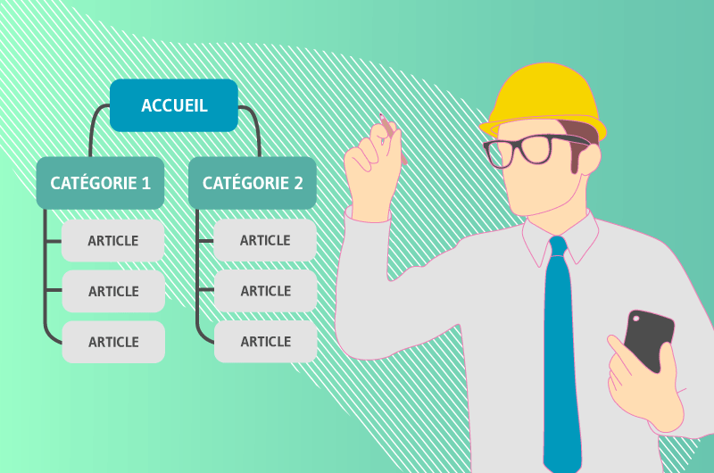
Indeed, a UX and SEO requires real work in the background which results in pleasant navigation and quick access to the information sought. Information architecture is that science of organization that will provide all the strategies for a UX optimized site.
- What is information architecture basically?
- How to use it well to optimize the user experience of your site?
- What tools used?
So many questions to address in this comprehensive guide to information architecture to ensure that your content is well structured and presented in the best possible way to your users.

Chapter 1: What is information architecture and a UX optimized site?
Information architecture and user experience are two inseparable concepts for a successful ergonomic website that really inspires.
1.1. Definition of information
architecture Information architecture (IA) finds its real foundation in the management of libraries, between categorization, archiving and provision of information.
It is therefore not a concept reserved solely for the creation of websites. Information architecture is also used in setting up intranet networks and database systems.
Initially, the term was equated with chip design and dates back to around 1959. But it was in 1976 that it was used for the first time, by Richard Saul Wurman during a conference at the American Institute of Architects in Washington.

According to Wikipedia, information architecture is “the art and science of organizing and labeling data…to support usability”.
It is a term not to be confused with information design, which particularly concerns the visible part of a web page. As for the architecture, it acts in the background and offers an organization of information for better interactivity.
This amounts to properly structuring the categories, menus and navigation paths to facilitate the dissemination of information within the site.
Peter Morville and Louis Rosenfeld will go into more detail by schematizing the three pillars of information architecture as being the users, the context of use and the content.
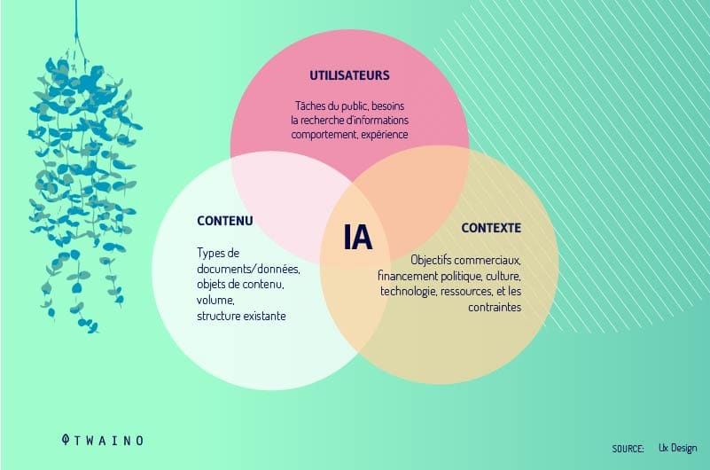
information architecture is the art and science of organizing the content and flow of a website in order to guide user interaction.
An information architect therefore has the mission of developing a structure and a design that harmonizes the desires of the company and a good user experience.
1.2. What is UX or User Experience?
Invented in the early 90s by Don Norman, User Experience loosely referred to the manufacture and creation of consumer-friendly items.
Today, the term has evolved and has been supplemented by the sciences of ergonomics and cognition to qualify the overall sensation of a user interacting with a material or digital product.
Contrary to popular belief, the user experience starts from the formulation of a need by a person and not only when the product or service is used.
Indeed, the user experience extends over a much broader temporality that can be divided into 3 main parts:
- Before use: The experience visualized mentally by anticipation;
- During use: Actual experience;
- After use: Past experience, but remembered in episodes.
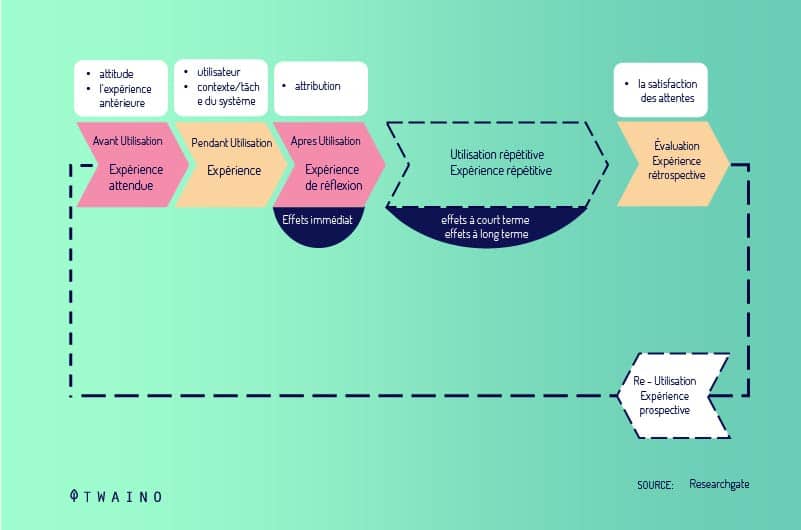
As can be seen in the image, a user experience can be schematized by a series of questions. A series of questions that a person asks when faced with a service or product, in a subjective process of possession to satisfy an initial desire.
In recent years, many researchers have been interested in the study of user experience. Of all the proposed UX maps, we will particularly retain that of Jesse James Garrett in his work entitled “The Elements of User Experience”, which appeared in 2000.
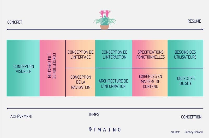
James illustrates through this detailed mapping the 5 conditions necessary for the design of a good digital interface, from the most abstract to the most concrete:
- The strategy: Understand the needs of the user to better satisfy them;
- The functionalities and content necessary for the site;
- Structure: Focused on information architecture and interactions;
- The framework: Harmonious whole of the design of the information, the interface and the navigation;
- The visual layer: For an attractive and pleasant final rendering.
The user experience cannot therefore be reduced to a process of creating a digital object. On the contrary, it encompasses, from conception to implementation, a naturally convincing and user-oriented reflection.
Clearly, the UX is a conjunction between the practicality of use and the pleasant sensations during use.
1.3. Relationship between user experience (UX) and information architecture (IA).
At first glance, the definitions of information architecture and user experience may seem identical. However, although these two terms are similar, they are still different from a technical point of view.
Information Architecture helps build out the design structure in the form of sitemaps and wireframes.
A UX expert will take inspiration from this structure to propose a navigation system, a design for the interface, and many other elements to best improve the user experience.

The notion of user experience therefore goes well beyond the structuring of the content of a website. It helps to set up a convenient interaction model for the emotional and psychological satisfaction of the user.
Clearly, an excellent information architecture remains the basis of a successful user experience.
So:
1.4. What is a UX optimized site?
Today, information access solutions are constantly evolving, not to mention the proliferation of distribution channels and digital interfaces.
Faced with such galloping change, the design of a coherent, fluid and global user experience becomes essential.
The information architecture’s response to this situation makes it possible to understand that the scope of a user experience goes well beyond a simple question of interface design, software or website.
It is no longer a question of setting action limits specific to each domain (user experience, information architecture, interface design, etc.), but of becoming aware of their complementarity.

Thus, thebest possible user experience of a site requires several types of improvement:
- Technical;
- Ergonomic;
- design;
- Utilities and security related.
Peter Morville, one of the pioneers of information architecture, has developed a list of qualifiers that a site must meet to claim to offer a quality experience to users:
- Useful : At first glance, it seems obvious that any website has its use. But basically, a site may well be useless for users. So be sure to check if your site is useful to your visitors;
- Usable : A website must be easy to use and well suited to the needs of Internet users;
- Desirable : The interface of a site must be attractive and make visitors want to continue their session;
- Findable : Internet users must easily find everything they are looking for on the site;
- Accessible : Your site must be accessible to everyone, including people with reduced mobility;
- Credible : The content of your pages must inspire confidence in visitors to bring more credit to the messages you convey;
- Valid : A website must provide added value to Internet users and highlight the vision of the site.

1.5.1. The great architecture
First, you have to make sure you create a high-quality site and then tackle its on-page optimization.
This is a fairly important step, especially since Google encourages sites that offer real usefulness to users. This comes down to thinking of clear and concise URLs that direct the user to accessible and fluid pages.
Each URL must be well structured and include if possible the keyword of the page or one of its variables.
We must distinguish a root supplemented each time by a sub-category section which unambiguously summarizes the content of the page to which the URL refers. The terms used to form the URL should be the result of prior keyword analysis.
The longer the path, the more specific the URL needs to be. Each sub-category added must address a specific aspect of the site’s theme.
Here is an example to better understand how on-page SEO possible to name URLs:
www.myexample.com
www.myexample.com/category
www.myexample.com/category/sub-category
1.5.2. Small architecture
Small architecture complements large architecture.
Site content is distributed according to metadata and carefully structured for crawlers. This data organization will allow Google bots, for example, to understand the HTML content of a page, but also its actual content.
This implies a complementarity of information architecture and design for good off-page SEO optimization.
A poorly structured site with pages that are several clicks away from the home page or worse yet, are not linked to any page, will have difficulty being indexed by Googlebot.
 1.5.1. La grande architecture
Dans un premier temps, il faut s’assurer de créer un site de haute qualité puis aborder son optimisation on-page.
C’est une démarche assez importante d’autant plus que Google encourage les sites qui offrent une réelle utilité aux utilisateurs. Cela revient à penser des URL claires et concises qui dirigent l’utilisateur vers des pages accessibles et fluides.
Chaque URL doit être bien structurée et comporter si possible le mot-clé de la page ou un de ses variables.
On devra distinguer une racine complétée à chaque fois par une section sous-catégorie qui résume sans ambiguïté le contenu de la page à laquelle l’URL renvoie. Les termes utilisés pour former l’URL doivent être le résultat d’une analyse préalable de mots-clés.
Plus le chemin d’accès est long, plus l’URL doit être précise. Chaque sous-catégorie ajoutée doit aborder un aspect spécifique de la thématique du site.
Voici un exemple pour mieux appréhender comment l’optimisation SEO on-page permet de nommer les URL :
- www.monexemple.com
- www.monexemple.com/categorie
- www.monexemple.com/categorie/sous-categorie
1.5.2. La petite architecture
La petite architecture vient compléter la grande architecture.
Le contenu du site est réparti selon les métadonnées et soigneusement structuré pour les robots d’indexation. Cette organisation des données permettra aux bots de Google par exemple de comprendre le contenu HTML d’une page, mais également son contenu réel.
Ce qui implique une complémentarité de l’architecture et du design de l’information pour une bonne optimisation SEO off-page.
Un site mal structuré avec des pages qui sont à plusieurs clics de la page d’accueil ou pire encore, ne sont reliées à aucune page, aura des difficultés à être indexé par Googlebot.
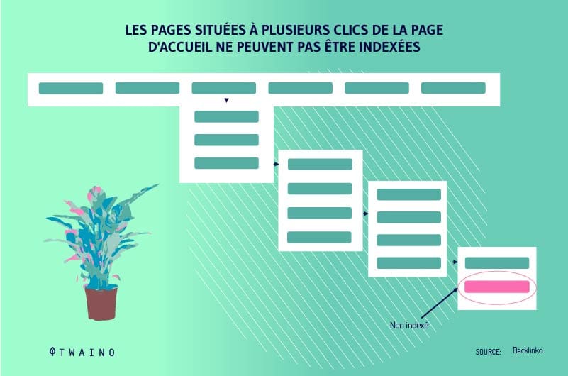
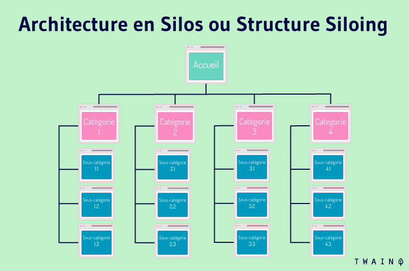
Off-page SEO optimization also takes into account good management of incoming links. A well-structured and interconnected architecture with a good internal mesh will make it easier for Google bots and the pages can be quickly indexed:
The higher the link juice, the better the site will be referenced on the search results pages. This is one of the criteria used by the Google algorithm to assess the PageRank of a site.
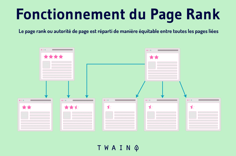
After Google, other tools also offer functionality to determine the popularity of a web page. We have for example Moz with the MozRank or Ryte and the OPR.
Finally, a site based on a good architecture will allow Internet users to quickly find what they are looking for when visiting the site. This can contribute to a good reputation of the site and increase its traffic.

Google will deduce that the site offers a better user experience and will improve its referencing. The information architecture therefore reinforces the optimization of a site.
Chapter 2: The main components of the information architecture
We can assimilate the functioning of the information architecture to a type of narration. A kind of effective approach to attract visitors through their emotions.
Information architecture goes far beyond simply making a page appear structured and neat.
It is an art made up of 4 four main components:
- Navigation systems;
- Labeling systems;
- Research systems
- And organization systems.
2.1. Organization systems to better categorize your content
The principle of organization systems is to offer different kinds of diagrams to better categorize the content of your site according to your taste. Such systems allow users to quickly locate the sections of the site that contain the information they are looking for.
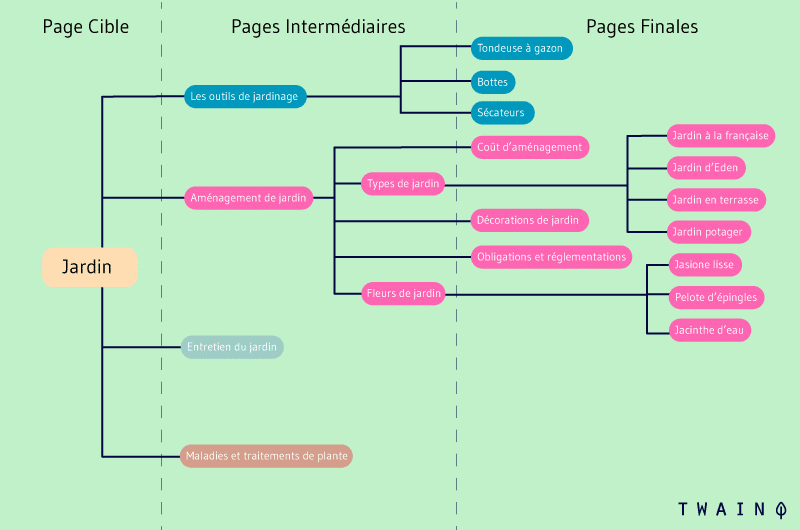
To achieve this, you will generally need two different types of organization charts: Exact organization charts and ambiguous organization charts. Depending on your organizational style, you may prefer one or the other.
2.1.1. Exact organization schemes to meet the exact needs of your audience
Exact organization schemes analyze all content and divide site information into small, mutually exclusive sections.
One can count different types of exact organization diagrams, but classified in sections so specific that none of them intertwine. They can make navigation difficult for an unfamiliar user.
Or who cannot figure out how the information he is looking for is addressed in the organizational model.
2.1.1.1. Alphabetical diagrams
As already indicated by their name, these types of diagrams are based on the alphabet to propose an organization of the content. Alphabetical organization schemes are generally assigned to glossaries and lexicons.
To adopt this type of organization scheme, you must therefore classify your content in alphabetical order.

However, it is important to remember that it is mandatory that the content matches the keywords that the user is looking for, before this scheme works correctly.
Otherwise, the visitor will go around in circles without ever finding what he is really looking for. One can already understand why alphabetical indexes are used as secondary means to complete content search.
2.1.1.2. Timelines
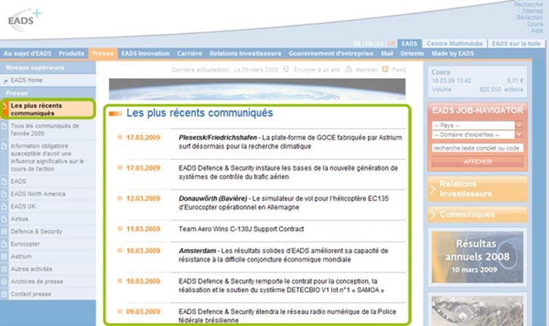
Timelines help organize content by date and are highly recommended for news and press releases. These media are deemed to be consulted in reverse order of publication.
Chronological organization schemes are also used to structure archive modules.
This is a fairly relative concept, since successfully determining the exact date the subject matter of the content took place can be debatable and largely ambiguous.
Source : Content me
For timelines to be truly effective, there must be consensus on the date of this period.
2.1.1.3. Geographic diagrams
These types of diagrams organize the content according to place. Much like alphabetical diagrams, geographical diagrams are used secondarily to complete the navigation of a site.
Google Maps is a perfect example. But also a company that transmits information through an interactive map to list its points of sale, for example.
With these types of diagrams, we observe very few conflicts except sometimes only a confusion on the geographical situation.
However, it is important to remember that a good website can only be satisfied with exact organization diagrams to structure its content. These types of diagrams are not enough for 3 good reasons:
- Generally, most Internet users do not know exactly what they want before consulting a site. They therefore allow themselves to be carried away in a sort of exploratory navigation;
- And even if the rest of the Internet users keep an idea of what they are looking for in their minds, they do not always know how to express it and would greatly appreciate the fact of being assisted;
- It can also happen, although the user really knows what he is looking for, he does not find it in an exact organizational scheme. Suppose the user is viewing all of a company’s press releases related to personal development. It will still be difficult for him to access the desired content if the section is only organized chronologically.
With this example, we better understand the need to mix the exact diagrams with other diagrams to obtain an effective organizational model.
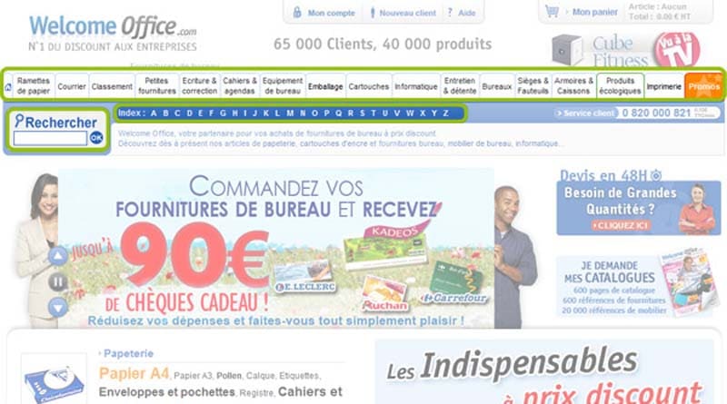
The Welcome Office online sales platform has understood this and let’s see how it has organized several organizational schemes:
Avec cet exemple, on comprend mieux la nécessité de mélanger les schémas exacts avec d’autres schémas pour obtenir un modèle d’organisation efficace.
La plateforme de vente en ligne Welcome Office l’a compris et voyons comment elle a agencé plusieurs schémas d’organisation :
Source : Welcome Office
We can notice that on this home page, Welcome Office offers its users the possibility of searching for a product by the alphabetical index. It also offers product search by global navigation sections.
A user who already knows exactly the product he is looking for would prefer to use the alphabetical index to go quickly. For a razor, he will just have to click on the letter R, choose RAZOR and be directed to the product sheet.
On the other hand, a user who accesses the site to discover new products would prefer to be guided.
If, for example, he wants utensils to renovate his kitchen, he will choose the KITCHEN section before specifying his needs as he goes along according to the sections offered to him.
2.1.2. Ambiguous organization diagrams as a basic model
Unlike exact diagrams, ambiguous organization diagrams focus on subjectivity and choices that are not necessarily precise, in order to establish a model.
Organizing content based on ambiguous organization schemes consists of dividing information into categories specific to a particular domain or organization. As opposed to exact organization diagrams, these types of diagrams are less specific and more open.
However, designing them can be a bit tricky from the start. Especially because an ambiguous organization scheme requires an understanding of the user’s state of mind before proposing an effective organization of content.
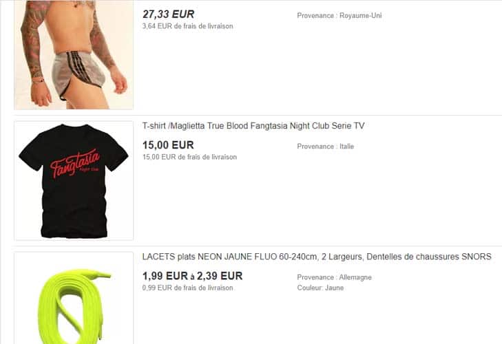
Let’s take the example of an e-commerce store, we can completely classify in the CLOTHING section everything that is coat, t-shirt, panties, laces… But can we add shoes or do we have to create our own section separately?
Source : Ebay
It is up to the information architect to decide which strategy to adopt based on the knowledge he has of his users.
It would therefore be necessary to put oneself in the shoes of the user, to penetrate his state of mind before thinking of a good ambiguous organizational scheme. Once this step is successful, once you can write a user mental model, it will be easier for you to organize your site content and reach the user.
Contrary to the method, a little “black and white” of the exact organization, the ambiguous organization elaborates a certain connectivity between the elements of the content. We can already notice two obvious advantages that testify to all its importance in the creation of websites:
- If we only stick to words, we might think that exact diagrams make more sense than ambiguous diagrams. However, the reality is quite different. Indeed, what do contents grouped in alphabetical order have in common? Obviously nothing, apart from starting with the same letter. On the other hand, ambiguous organization schemes group information together by a given logic or configuration.
- Ambiguous organization schemes are the best way to provide research by association of ideas. The visitor refines his search gradually over the clicks and browses the information one after the other thanks to the hypertext links and the organization system adopted on the site.
Here are some examples of ambiguous organization schemes:
2.1.2.1. Prioritize subject schemas as the main organization schema
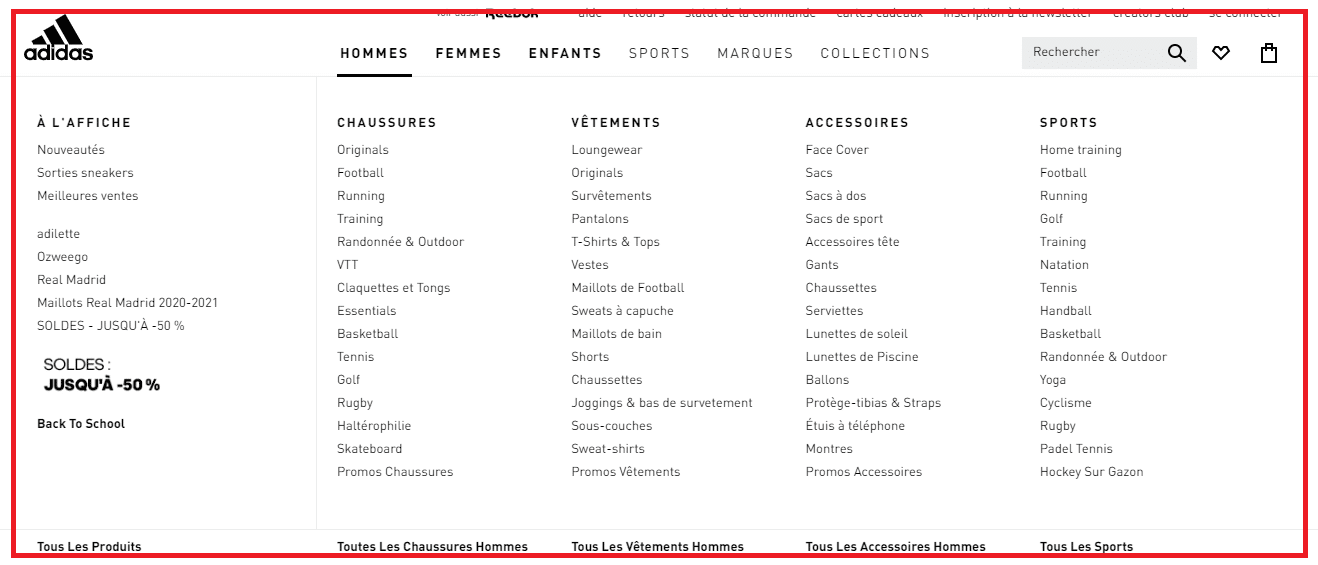
The majority of websites are based on a tree structure that lists content by subject. Intuitive, this tree structure requires a certain rigor in the work in order to classify all the information available on the site.
To remain as effective as possible, the subject diagrams must bring together, at one level of the tree structure, content that shares the same themes or the same typologies. Otherwise, Internet users can get confused very quickly.
 Source : Adidas
In other words, the subject diagrams propose an organization of the content according to the object of the content. They are very practical when the user is looking for a specific subject and already masters the keywords to enter to access the information.
If you manage to categorize your information well according to these targeted keywords, the user will be able to find your content easily.
2.1.2.2. Metaphor Diagrams Metaphor
diagrams organize content and divide it according to familiar concepts or ideas. That is, the content of the site is organized according to other content related to the original information.
Metaphor diagrams are typically used to design interfaces, including folders, trash, or other locations.
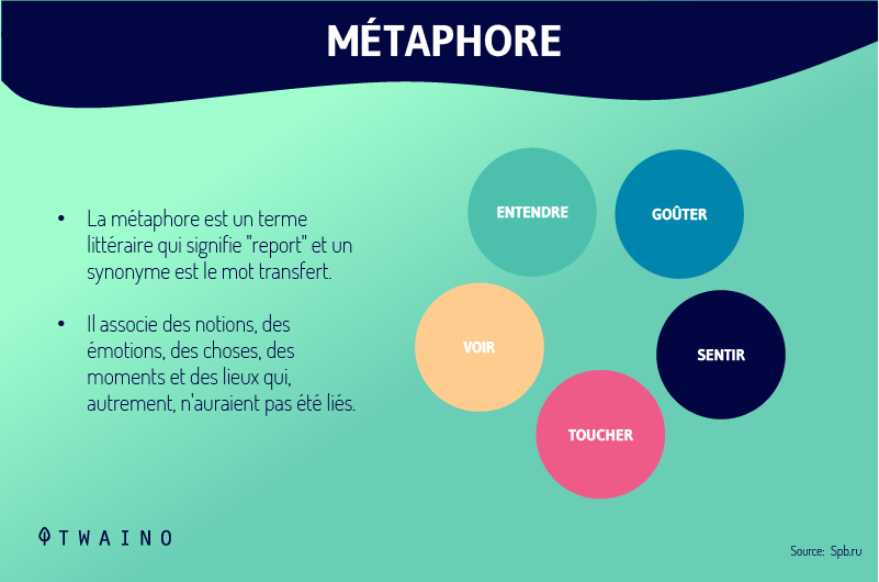
However, a site developed solely on the basis of metaphor diagrams may encounter some problems. It is a type of organizational method that regains its full effectiveness when used as a complementary organizational scheme.
2.1.2.3. Audience schemas to enrich the user experience on your site
Audience schemas recommend structuring the content of a page or an entire site according to the type of audience to which the content is addressed.
They complement the tree structure of the site, especially since it is aimed at an audience with varied expectations. Generally, corporate sites use schemas by audience.
A schema per audience can be reserved or accessible to all:
- Reserved schemas per audience offer exclusive access to certain information to the audience concerned.
- Open audience schemas, on the other hand, provide access to information for all audiences. Although some content is particularly intended for certain types of audience, these diagrams do not make the distinction at the risk of tipping over into excessive personalization of the site. This could confine the user to a kind of typical profile, while we never stop knowing his audience and his tastes.
Indeed, the problem often encountered with audience maps is the difficulty in identifying certain types of audience. In this situation, it will be necessary to intelligently offer content that adapts to several audiences at the same time.
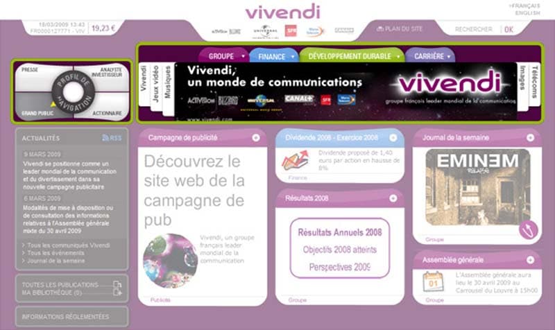
Let’s take the example of the communication company Vivendi to better understand the principle of a diagram organized by audience:
Prenons l’exemple de la compagnie de communication Vivendi pour mieux cerner le principe d’un schéma organisé par audience :
Source : Content Me
Vivendi offers each visitor the possibility of choosing their browsing profile from the top left of the home page. Depending on the selected profile, all the contents of the site change.
A great way to improve the user experience, without forcing it. Since, right next to his browsing space, the user can change his browsing style with a single click or view it in miniature.
2.1.2.4. Use task diagrams to complete the tree structure of your site
Task diagrams have the particularity of organizing content according to actions, needs, procedures or questions to help users quickly find content related to specific keywords.
To be successful, content organization, task outlines must accurately determine tasks beforehand. This may therefore require research to ensure that the site really addresses the most relevant and precise needs or questions of Internet users, in relation to the content.
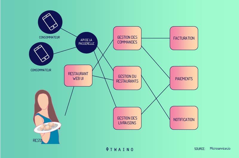
The principle of organization by task diagrams is especially appropriate for e-commerce sites because of the many tasks proposed to interact with the site. The user can create an account, buy or sell products or give their opinions.
Apart from these rather “limited” organization schemes, there are other hybrid schemes that offer more efficiency in content organization. Many sites are already taking advantage of these hybrid schemas to establish the best possible information architecture method.
Exact and ambiguous organization schemes can be used in a context of simplistic organization of information for the user. It is therefore obvious that a single scheme cannot suit everyone.
In the event of a conflict over which scheme to adopt for a site, designers can agree on creating a mix or hybrid of two schemes.
However, the limit of such a compromise is that it can easily confuse the user.
Indeed, if the diagrams are not harmoniously mixed, the user can be confused while trying to find a content. In this case, it is better to stick to a single pattern that you master well.
2.1.2.5. Mistakes to avoid for a successful mix of organization schemes
Think of arranging two or more organization schemes, that’s good, but you still need to know how to go about it to avoid the usual pitfalls. A harmonious mix of organization schemes necessarily involves two mistakes to avoid:
- Make sure you don’t have any duplicate content because of their negative impact onsite optimization. Not only will the two duplicate pages compete for indexing, but inbound links to content on those pages will also be split. A page must therefore be accessible by a single and unique URL.
- Avoid hybrid models that force several organizational schemes in the same system. One of the major challenges in designing a website is to avoid creating confusion and hesitation among visitors. Unfortunately, we see on some sites that the same section of the tree can contain a set of headings organized by task and others by audience.
On the image below, we can notice that by wanting to adopt a hybrid organization scheme by audience and by subject, the construction materials giant Lafarge, has mixed up its brushes and installed a mess.
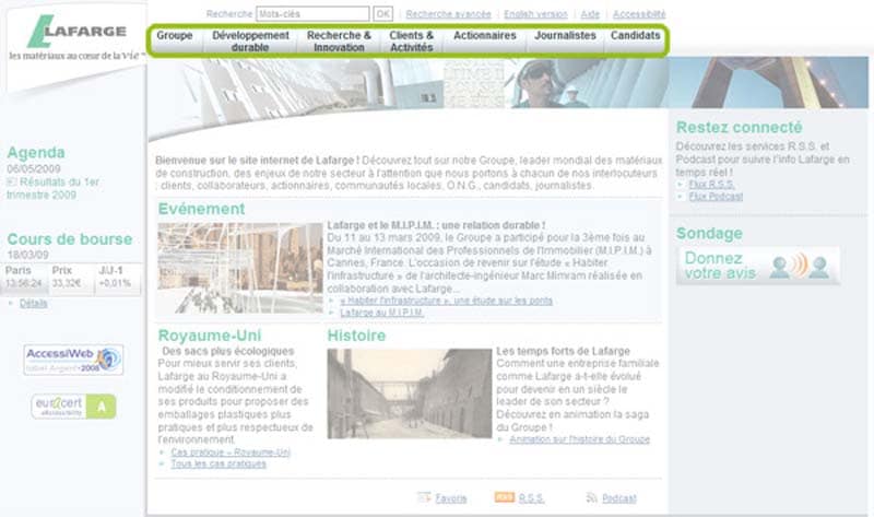
Lafarge homepage in March 2009 – Source: Content Me
Indeed, the brand tries to address several targets at the same time: Candidates, shareholders, journalists… Then it decides to add other sections themes that can confuse visitors.
Let’s admit a visitor who wishes to learn about corporate governance, on which section should he click? On SHAREHOLDER? Or on JOURNALISTS?
2.1.3. Organizational
structures Organizational structures are very close to organization diagrams. Just based on their titles one would assume that they all mean the same thing although there is a slight nuance between the two terminologies.
Organizational structures rely on the relationship that users define between different pieces of content to build a site organization. That is, users can predict the placement of content based on the actual site structure.
In terms of organizational structures, we can distinguish 3 different types:
- Hierarchical structures;
- Sequential structures;
- And matrix structures.
Although it is possible to use only one structure, the majority of developers will combine all three to form the ideal structure for their site.
2.1.3.1. Hierarchical and star structures
We can associate the notion of hierarchical structure by analogy with a kind of genealogical tree. Much like a family tree, organization will need to start with a larger idea.
This type of organization is very similar to a parent / child relationship between the different contents. Content organization can also be done by following a star pattern.
Regardless of the hierarchical theme adopted, the purpose of this type of structure is to guide users so that they start from a general idea. Then, let them refine their research gradually to obtain more detailed information searches.
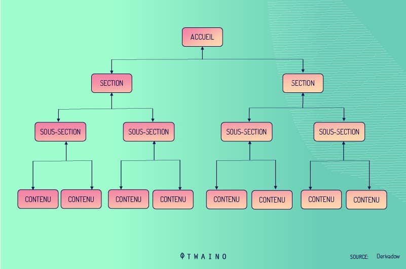
Hierarchical structures work exactly like a family tree.
It could even be associated with a desk structure. There is a manager at the head of the structure which is a starting point where the tree branches off to reach the other compartments.
A big idea as a starting point that breaks down into two. Then these two different subjects break down in turn and are linked by still separate subjects to give sub-themes.
Each subtopic is uniquely and immediately linked to the subtopic positioned above. As the tree grows, the branches stick out more.
On the other hand, in a hub and spoke structure, the subtopics come from the general idea much like the spokes of a bicycle.
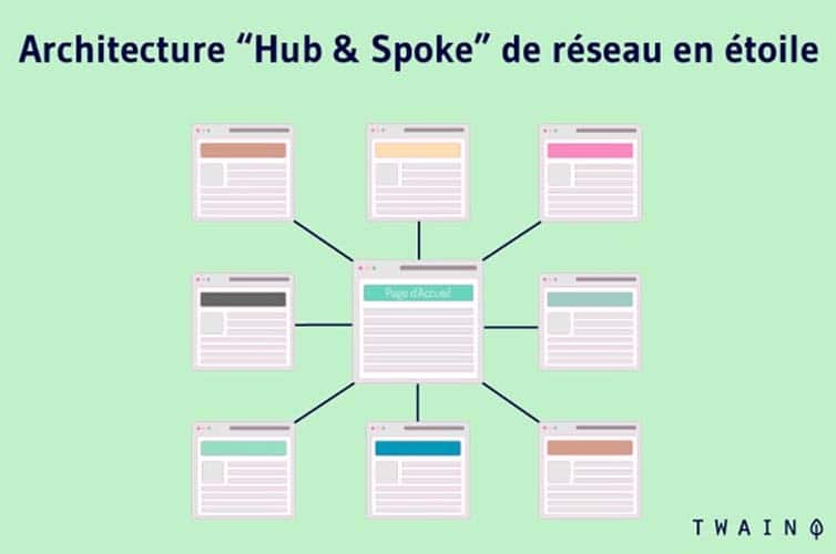
They are all related to a main idea, yet directly distinct. Here, the sub-topics do not branch, one could say that they are all equal. Being rooted to a single centrally positioned main idea, these subtopics are related in some way.
We realize that a starred hierarchical structure offers more freedom than a family tree type hierarchy.
2.1.3.2. Sequential and matrix
structures Sequential structures propose an organization of content in a progressive, step-by-step process. How to leave point A for point B?
The user will be able to start his navigation from a starting point and continue by following the path drawn up by the Web developer.
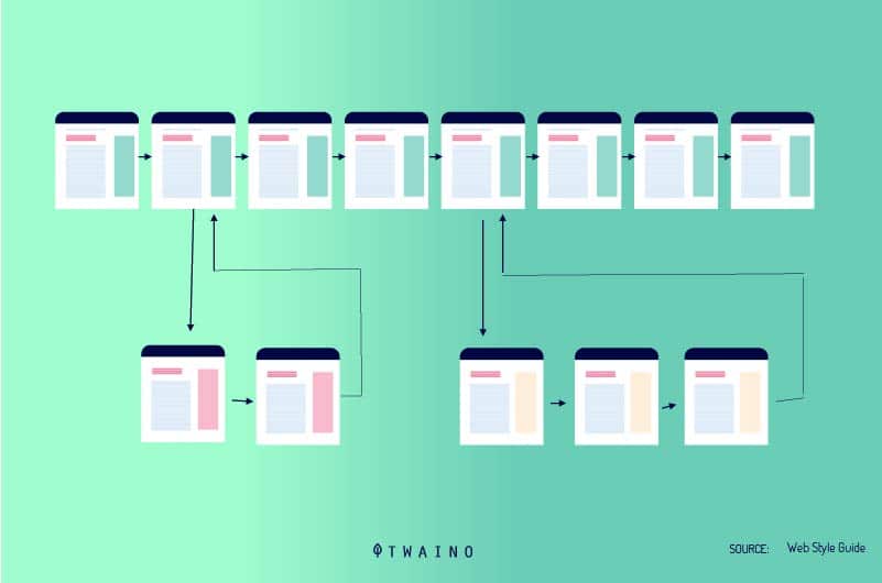
But before proposing a sequential structure, it is important to carry out a preliminary analysis in order to create the most logical steps that would give meaning to the chosen sequence.
Let’s take the example of a user who wants to buy via an online store to better understand the principle of sequential structures.
In a first sequence, he selects the product of his choice, then he clicks on the “add to basket” button. He then fills in the content information before entering his personal information for payment. Finally, he clicks on the “submit” button to confirm the purchase.
The logical theme adopted on this e-commerce site has allowed the user to buy, step by step and without difficulty, a very specific item.
Let’s take another example, that of a user taking a distance learning course. Logic dictates that this user cannot move on to the next chapter until the current chapter is completed.
He is forced to follow a chapter to the end, exactly as the web developer intended. While developing this structure, the developer therefore found that it was the most effective way to push the user to consume the content.

other hand, with a matrix structure, it is the user who holds the power. This way of structuring makes it possible to organize the content and to link it in several ways. It is therefore up to the user to decide to view the content to their liking.
A first user can decide to choose several subjects to access in the content. At the same time, another user can access the same content, but through a completely different process. Everything will depend on how each user navigates.
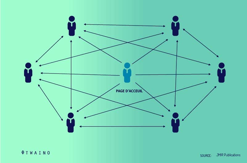
The concept seems interesting, but very complex to achieve. Matrix structures work with HTML or hypertext before making this type of organization feasible.
2.2. Labeling systems
Labeling is the action of identifying and properly naming pieces of information. In today’s context, a label denotes a relationship between content and user. Its purpose is to effectively convey information to the user without taking up too much of their time or space on a web page.
It is through the labels that the user will discover the navigation and organization systems used on a site. Unprofessional labels can damage user trust and tarnish the site’s reputation.
Labels therefore occupy a fairly important place in the organization of information on a site and exist in several forms:
2.2.1. Text
labels Text labels are the most commonly used on websites and take into account contextual links, navigation system choices, headings and index terms.
Contextual links refer to words inserted in a sentence and which refer to a block of information or the body of a document contained on the same page.
To ensure that the labels used for contextual links are meaningful enough, it is important to ask yourself “what kind of information would the visitor want to be directed to?” 
Text labels represented as heading titles serve as an indicator for prioritizing written content. We can for example notice that the hierarchical relationships between the headers of the same content are generally represented by precise visual indicators.
These include numbering, styles and colors, font sizes, indentations or line breaks. It’s a good idea that text labels are used consistently to convey the hierarchy of different topics.
They must help the user to find his way in his reading: where to start, where to go next and what action to associate with each sequence of the process.
2.2.2. Navigation system
labels While text labels require a certain degree of consistency, navigation system labels require more than any other type of label.
We understand this requirement better when we know that Internet users rely on a navigation system to find themselves on a page.
The consistent use of these labels imbues the user with a sort of sense of familiarity. It is therefore crucial that the navigation system labels do not change from page to page.
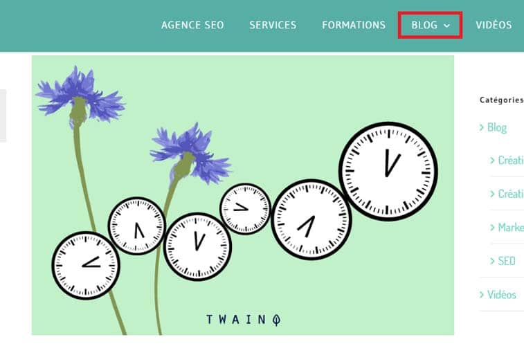
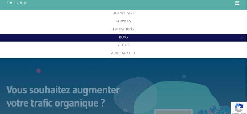
Source : Twaino
Here are some examples of navigation system labels to better understand the principle:
- Home;
- Sitemap ;
- News and events;
- FAQs;
- Contact us;
- About us…
Avoid using the same tag for different purposes on the same site for fear of confusing your visitors.
2.2.3. Indexing terms
Labels represented as indexing terms are what are commonly called keywords. They also refer to descriptive metadata, taxonomies and controlled vocabularies.
All of these tags are used to describe all types of content (pages, sites, content components, etc.) to be searched. They make it possible to carry out fairly precise searches and also facilitate navigation.
For example, the metadata contained in a document block can be used to form a searchable list or menus.
The best example to illustrate these labels is to consider the index of a website which lists a list of links leading to other pages of the site.
2.2.4.iconic
labels are used more in the context of navigation system labels. They can even sometimes designate a title of a section.
The only difference with other labels in the navigation system is that they are not meaningful enough as text.

This is why they are mostly used in small organizations with small option lists. But beware of their use, they can still confuse users.
2.2.5. How to successfully create labels?
Users, content and context are three essential principles relating to all aspects of information architecture, including labels as well. To make sure you create effective tags:
- Shorten the scope of your tags as much as you can;
- Keep your labels simple and specified;
- Use a less commercial context.
It’s also important to use a tone that matches your audience when creating your labels. If there is any ambiguity around the label, consider adding a brief description.

Labels used on the homepage should grab users’ attention and explicitly represent the content. Which brings us to another rule to observe: Consistency.
Consistency is required in the creation of labels because it anticipates the needs of the user and offers better navigation. To stay consistent in your label usage, you need to consider audience, completeness, granularity, style, and presentation.
Here are some recommendations to observe:
- List all your labels on a support to better keep them in view and not lose your objective. For the little trick, you can sort them in alphabetical order to quickly spot duplicates. Then review the list for consistency when using punctuation, letter case, etc.
- Establish naming conventions;
- Prefer a controlled vocabulary to keep terms consistent in your content;
- Explore your content in order to categorize it into coherent sections;
- Test and retest the user side of your site to target bugs and fix them in time;
- Perform card sorting;
- Use the research log for analysis;
- Anticipate the evolution of your site and organize it in advance so that the labels used can be modified or supplemented in the long term without losing the consistency of the content;
- The terms to be included in the labeling system must respect the context and scope of the site;
- Labeling systems should be able to be adjusted as needed.
2.2.6. The danger of labels
A web page that contains labels used wrongly and through or less explanatory can only sow confusion among Internet users. They will go around in circles for quite a while without finding the information they are looking for.
Even if labels are clear and concise, they can still negatively impact the user experience. These include the emotional or social aspect of labels that should not be overlooked.
Such sensitive topics such as health, finances, immigration, disability should be treated with tact for fear of upsetting or stressing your users. You must therefore pay attention to the context and impact of the language you use to make your labels appear.
Here are two examples to get a closer look at the impact labels have on your audience:
- Example #1:
There are many medical conditions that can arise and change an individual’s lifestyle. But it is nonetheless a condition and should be treated as such and not as a disability.
Take the example given by Dis-sin regarding the Disability Tax Credit (DTC) which has two rather remarkable eligibility criteria. These criteria perfectly illustrate the impact of labels on users.
It says that people who are: “…markedly limited in at least one of the basic activities of daily living or in need of life-saving therapy can be admitted to the DTC.“
disability” is not one of the eligibility criteria.
Suppose an individual suffers from Alzheimer’s, diabetes or who has accidentally lost his sense of hearing at some point in his life. This person will not necessarily see themselves as disabled.
He may then think that he is not eligible for a credit program for which he is potentially eligible.

Hence the importance of a well thought-out label. For this scenario, it would be more inclusive to think of a label like “Health Impact Tax Credit”.
It won’t affect the filtering in any way and a lot of people might be affected, or even a loved one.
- Example #2:
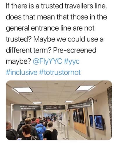
Our example here is an airline’s “trusted traveler” label that designates a security checkpoint for pre-approved travellers.
The term “trusted traveler program” is used often in the jargon of these companies and an employee of the airport will be able to understand it unequivocally.
However, an average traveler might misinterpret it and actually think that customers who aren’t pre-approved are untrustworthy.
Source : Dis-sin
On this Twitter post, we can read the consternation of this user who says:
“If there is a line for trusted travelers, does that mean that we do not trust those who are excluded? Could we use another term? Like pre-authorized?”
2.2.7. Properly identify user keywords to create a good tag
The only effective way to avoid stressing, upsetting, or simply confusing your users as in the previous examples is to use the keywords exactly as they are. are used by Internet users.
Fortunately, there are many tools to search the “research log of your target audience” and find out the most searched keywords on the NET.
We are particularly interested in Google Trends, a program initiated by the Internet search giant and dedicated to displaying the frequency of search terms classified by country, city, period and category.
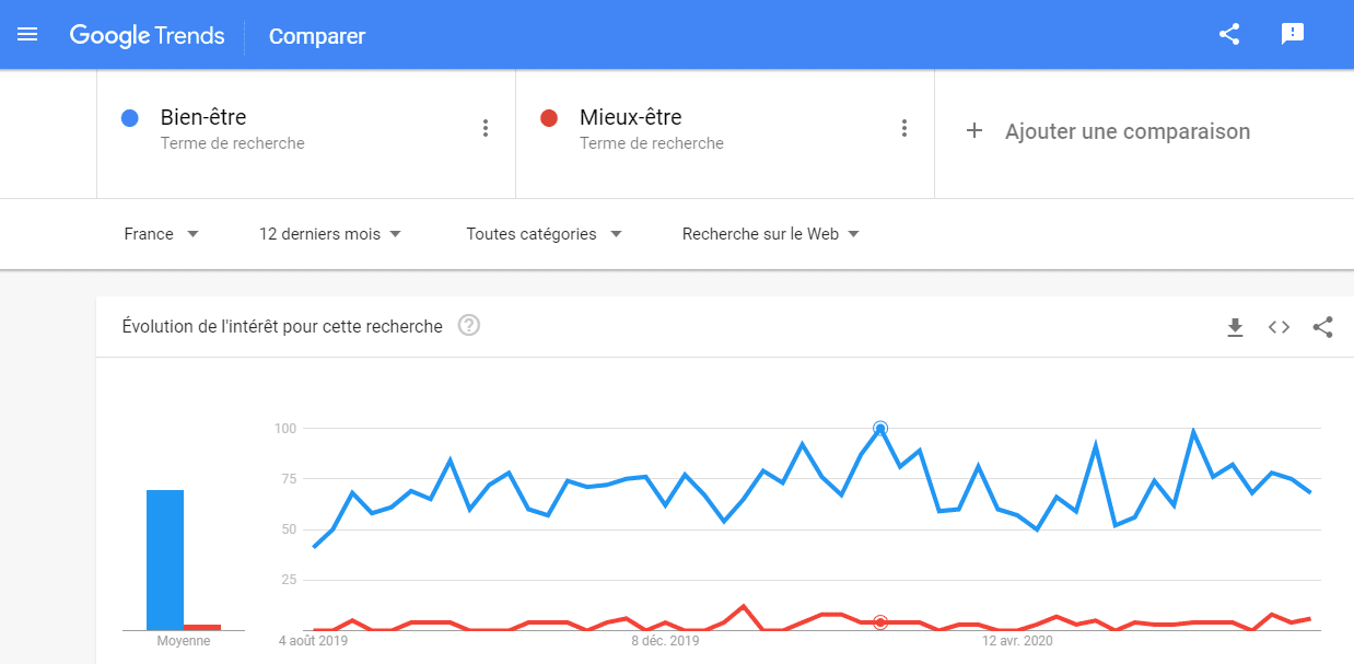
Examples: During the last 12 months in France, the number of times that Internet users have searched for the term “well-being” far exceeds that of “well-being”. The daily average is:
- 70 for “well-being”;
- Against 3 for “well-being”.
Source : Google Trends
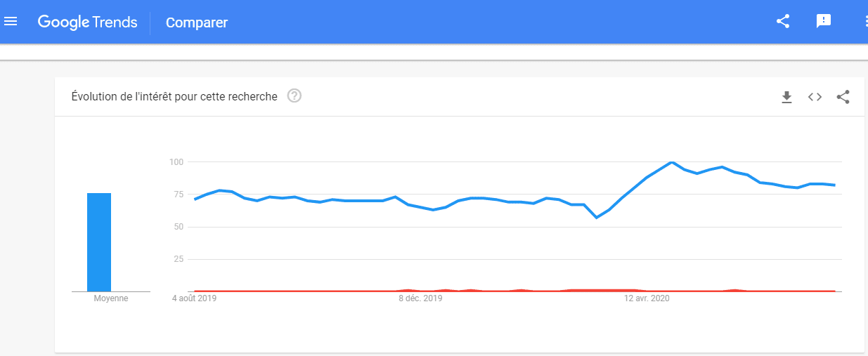
Over the past 12 months in France, the search rate for the term “purchase” has literally crushed that for “supply”. The daily average is:
- 76 on “buy”;
- against < 1 on “supply”.
Source : Google Trends
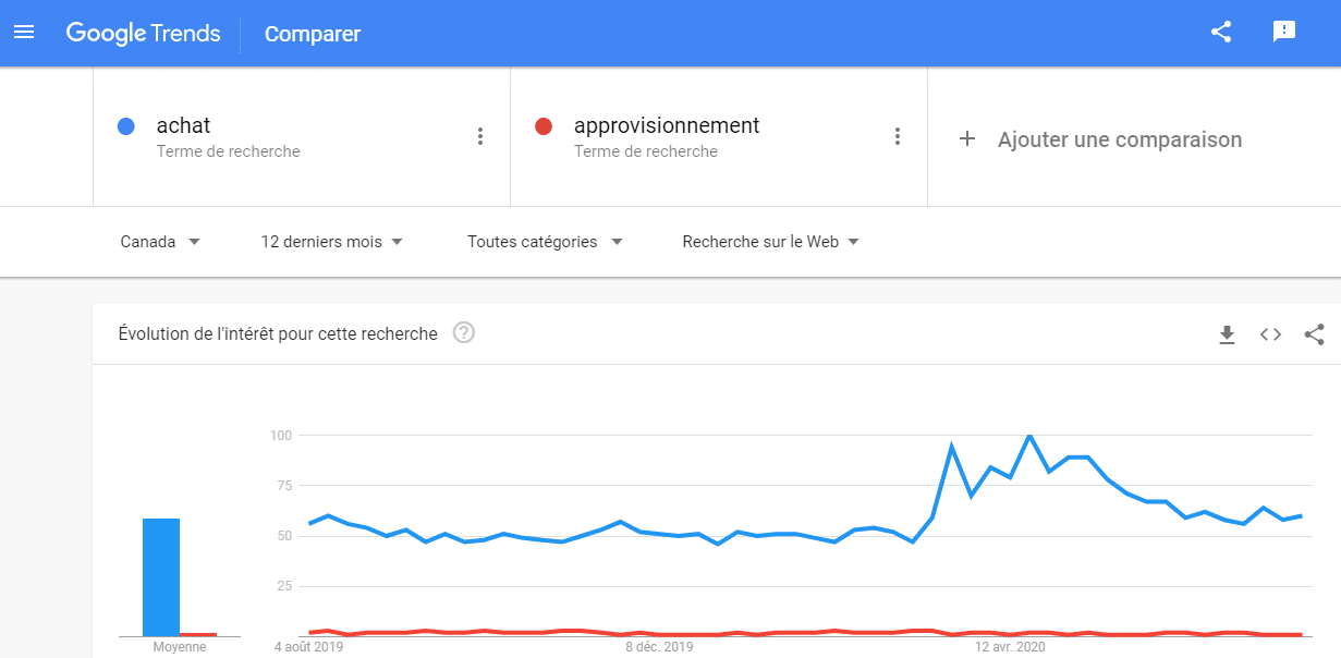
At the same time in Canada, for search terms, the statistics seem to be the same:
- 59 on “purchase”;
- against 2 on “supply”.
Source : Google Trends
However:
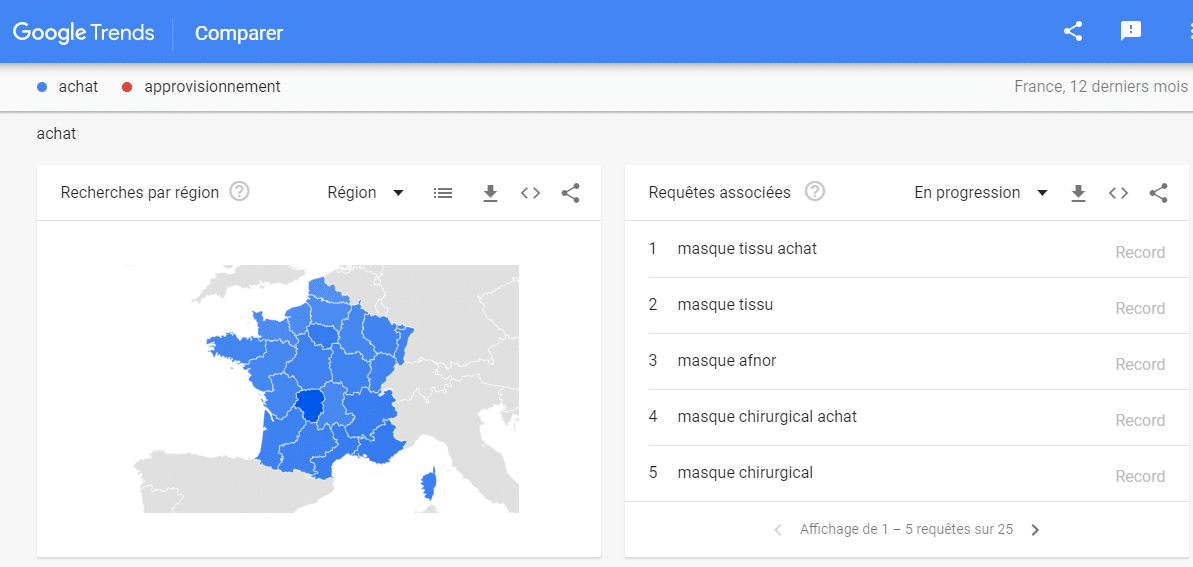
- Scroll down the page further for more details.
Source : Google Trends
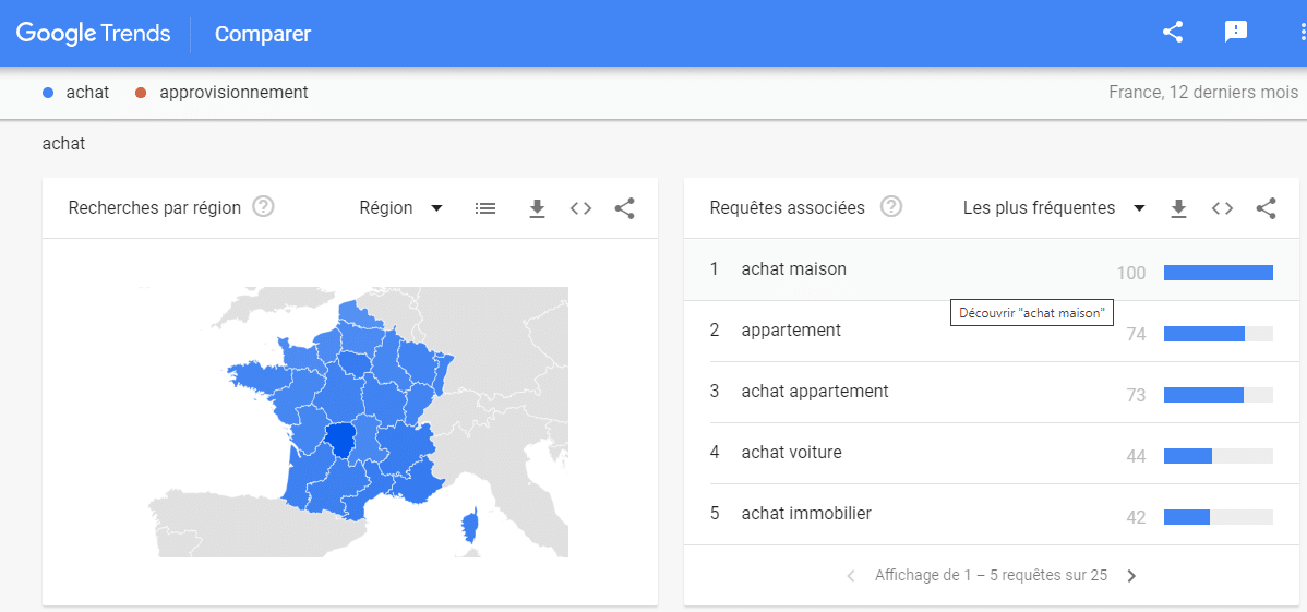
In what context is the search for the term “Purchase” carried out? It is clear that the term is frequently used in the context of “buying a house”. We can therefore conclude that the term “purchase” has been very popular over the past 12 months, but not necessarily for the right reason.
Source : Google Trends
It is therefore one thing to know the keywords often searched for by Internet users, but it is quite another to determine their search context. Keywords should be considered while creating tags.
But they must first be the subject of an in-depth analysis to identify its search context or the search intention hidden behind to better use them.
2.3. Navigation systems
Getting lost in real life is likened to feeling confused, frustrated and sometimes a matter of life and death. While the example is overkill for a user who gets lost on the website, the experience is nonetheless confusing and frustrating.
The purpose of navigation systems is to prevent these scenarios and help the user find what he is looking for on the site. We therefore agree on the importance of navigation systems both for the architecture of the site and for the user experience.
Navigation systems bring together a set of actions that facilitate navigation between the pages of the site. They help users to make a mental model of the hierarchy of information to find them easily.
A distinction is generally made between two main navigation subsystems, namely the built-in and additional navigation systems.
2.3.1. Embedded navigation
systems Embedded navigation systems are further subdivided into other subsystems:
- Global navigation systems;
- Local navigation systems;
- And contextual navigation systems.
Local and global navigation systems are also known as structural navigation system.
2.3.1.1. Global navigation systems (site-wide)
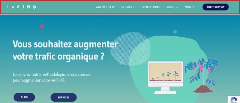
The global navigation system is used on all pages of a website and consists of inserting a navigation bar in the header of each page. In information architecture jargon, this is referred to as a “site-wide navigation bar”.
Generally, these navigation bars include a Home part (presented in the form of a logo in the example below) which links to the site’s home page.
Source : Twaino
Sometimes the global navigation can also have an additional Search part which provides a link to the search functions.
But all global navigation systems must provide direct access to important sections and functions of the site, regardless of the user’s current position on the site.
It’s a fairly sensitive navigation system that needs to be revisited several times due to its impact on the usability of the site. Which gives it a certain responsibility, a global navigation must:
- Answer the question: “Is what I’m looking for available on this site?” when a new visitor accesses the website for the first time;
- Help users build an overview of the size and complexity of the site;
- Help Internet users to restart their navigation path and return to the homepage when they are lost.
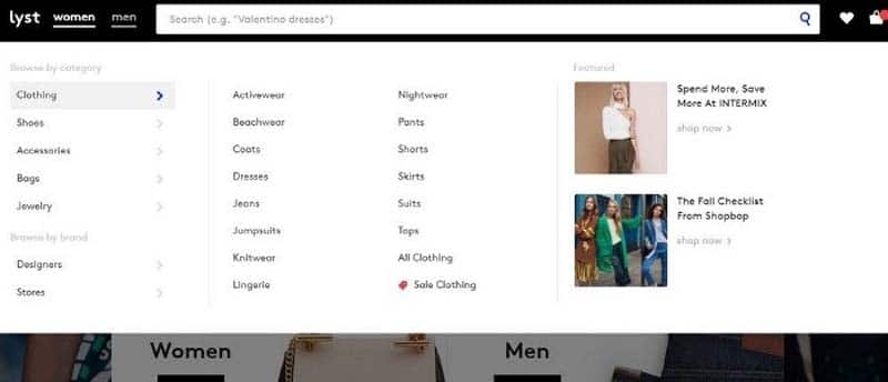
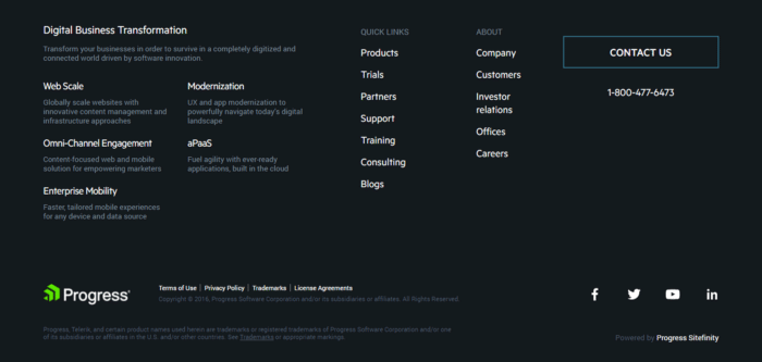
A global navigation system can come in many forms, in recent years the trend has been towards mega menus and large footers.
Source : Ux Planet
Mega menus are especially prized for their ability to help users consult the entire hierarchy of information at a glance and access the deepest pages.
An example of a large footer / Source: Ux Planet
Due to the impact of overall navigation on the usability and ergonomics of the site, it is important to keep the needs of the user in mind. At times, the global navigation should not appear to improve the user experience.
Consider a transaction flow that cannot be interrupted, such as a payment process.
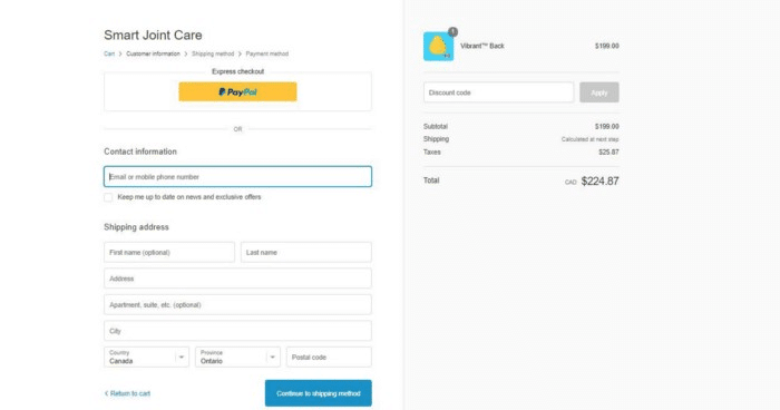
Source : Ux Planet
Here, the global navigation system is temporarily hidden while the user can concentrate on the payment process.
2.3.1.2. Local navigation
systems Local navigation systems are considered a second-level system and offer Internet users the possibility of quickly exploring a specific area of the site. In other words, local navigation systems can be seen as an “extension” of global navigation.
That is to say, they give access to the content of a specific page of the site. Take the example of the ABOUT US section of a website.
And suppose it contains other sub-sections such as RECRUITMENT and TEAM which find their full meaning only in this ABOUT US section.
For this example, and for all other scenarios, you have 3 possibilities to organize the global and local navigation systems: inverted L, horizontal and integrated vertical.
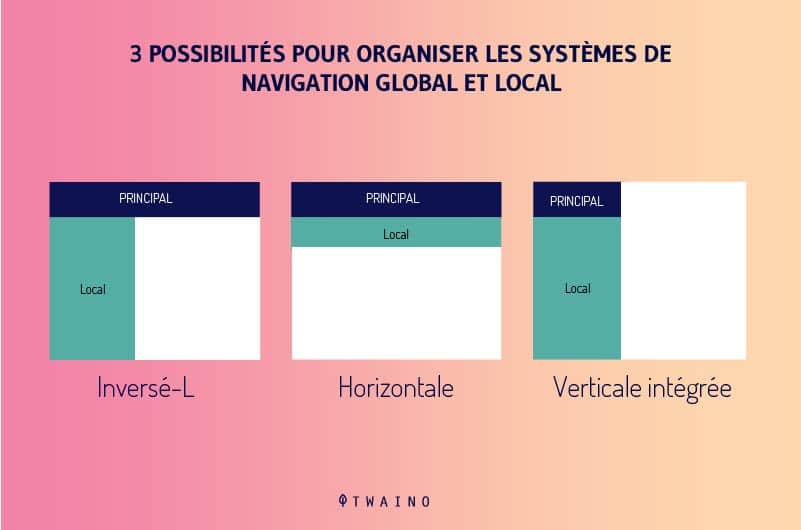
- L inverted
Here, the local navigation is organized as a list of vertical links listed on the left side of the page. It is then completed at the top by a global and horizontal navigation, the whole forming an inverted L.
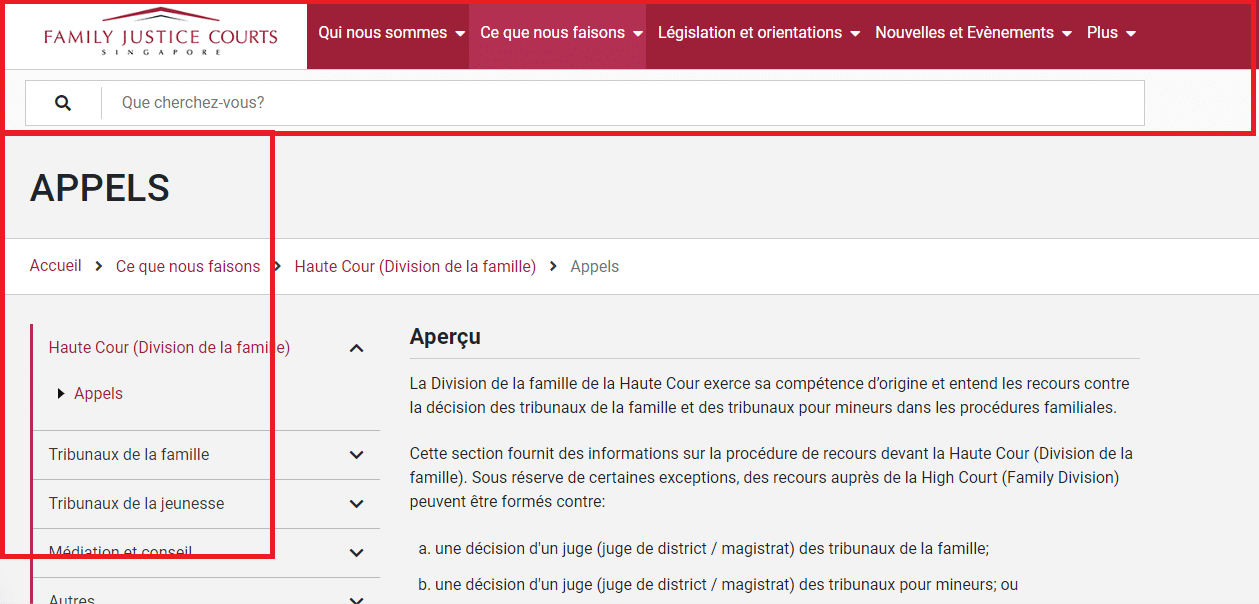
Source : Family Justice Courts
- Horizontal:
The local navigation system is positioned just below the horizontal global navigation to form one large row, providing more options.

Source : Straits Times
- Vertical embedded
Sometimes the global navigation system is presented in a vertical menu on the page. Generally, the local navigation system is integrated into the large options of the built-in vertical type global navigation.
The main challenge of embedded navigation is to successfully harmonize the page to avoid overwhelming the user with too many options. The secret to achieving this is to recognize that global, local and contextual navigation systems can all appear on the same page.
This implies a consistent implementation of each of them based on a relationship of complementarity at the risk of overwhelming the user.
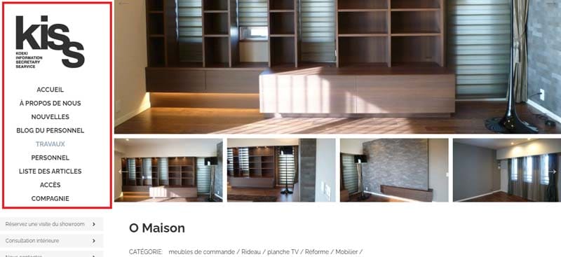
Source : Kiss Jp
It is therefore quite possible to combine several local navigation systems that complement each other on the same page. There is no hard and fast rule that requires the use of only one local navigation on a page.
A navigation system can also be used in a contextual way as on the official site of USA Today for example.

Source : USA Today

It can be seen that access to the ENTERTAINMENT section offers a series of menu options related to the term ENTERTAINMENT. For the SPORTS section, yet another set of menu options is available.
2.3.1.3. Contextual navigation systems
Let’s assume for a moment that your local and global navigation systems are sufficiently well-informed to such an extent that a single added piece of information would be too much.
In these circumstances, the solution would be to opt for contextual navigation to intelligently direct users to other related pages, in an associative learning context without overloading your global and local navigations.
The use of contextual navigation systems consists in proposing specific links associated with a particular page, document or object. These systems generally designate hypertext link references inserted into a sentence or a block of written content.

However, this way of presenting contextual links seems a bit problematic since these links can easily go unnoticed.
Or the user decides to finish reading the whole page before returning to the link. Very often, he can forget to come back or be absorbed by something else.
The alternative approach to overcome this problem would be to present the contextual links differently to attract the visitor’s attention.
Note the subtle way the New York Times presents its contextual links:

Source : New York Times
The same goes for “see also”, “related products”, “you may also like” links that direct the user to services, products, articles, topics, etc. similar.

Source : Etsy
The principle of contextual navigation systems is to offer easy access by clicking which links to sections that cannot appear in the main menus.
They are also referred to as associative navigation and they help answer questions like “What’s next?” “, ” How can I ? », « What else do you have ? “.
The first recommendation to follow when creating contextual navigation systems is to maintain the same visual style to adopt for all the pages of the site.
Then to show consistency and parsimony when inserting these links for fear of installing a mess that could confuse your users.
Make sure that the links used are essential and visible enough for users. What would be the best timing to insert the link? Where would it have more effect? Does this link really strike a balance between the needs of the user and the interests of the site?
2.3.2. Supplemental Navigation
Systems Supplemental navigation systems offer visitors alternative ideas to better accomplish a given task. These systems represent a sort of indicator external to the basic structure of the site.
But, they still provide a number of additional ways to help the user find content on the site.
They are also referred to as a utility navigation system because of their ability to connect pages and help users discover site features.
Additional navigation systems can also be classified as things like login pages, profile pages, credit card information, etc.
Additional navigation systems include sitemaps, indexes, and guides.
2.3.2.1. Site
maps Site maps define the main hierarchical levels of information with the aim of helping users to understand, from a broader perspective, the structure of the site.
They are seen as a planning tool that provides an overview of site content. Sitemaps are unique in that they facilitate random access to small sections of content.
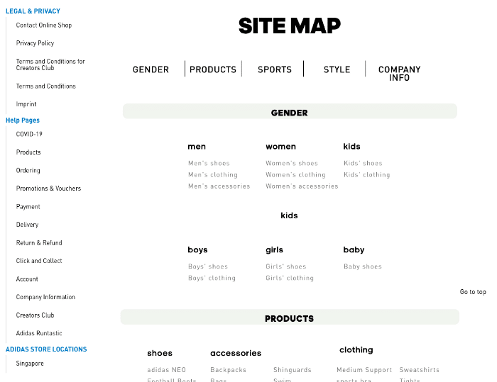
Source : Adidas
From an SEO, sitemaps are also necessary for Google robots to facilitate the exploration and indexing of pages.
It must be recognized that a sitemap is not recommended for a small site with only a few pages.
Sitemaps are most suitable for websites that have a very good hierarchical architecture. If the organization is not hierarchical enough, it is better to choose an index or a visual representation.
Here are some tips for creating a successful sitemap:
- Consolidate the site’s information hierarchy to get the user more and more accustomed to the organization of content;
- Make it easier for users to access the content of the site when performing specified searches;
- Control the amount of information conveyed so as not to overwhelm the user.
2.3.2.2. Site
indexes A site index lists a list of keywords or phrases classified alphabetically without taking into account hierarchical relationships. It facilitates navigation for users who already have a precise idea of the term they are looking for.
Let’s take the example of the Mayo Clinic which thought of listing the name of all the symptoms in an alphabetical and flat structure to facilitate research for these “knowledgeable” users.
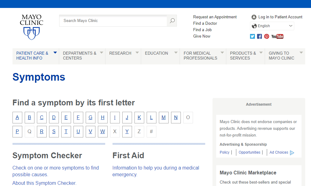
Source : Mayo Clinic
A set of indexes and sitemaps is best for a large, complex site. The site map enriches the hierarchy for better exploration while the site index avoids it for better targeted research.
If it’s a simple and small site, no need to go to all that trouble, a side index will suffice. One of the major challenges to consider in indexing a site is the degree of granularity.
Do you prefer to index the pages, one after the other or all the pages together? Everything will depend on the needs of your audience to work well. To better understand what your users are looking for, scour search logs for trends.
2.3.2.3. Guides
Guides come in the form of tutorials, guided tours, micro-portals focused on a specific audience, task or topic. They complement the means of navigation and understanding of site content, presented so far.
The guides are used in order to produce the presentation of a product or a service, new for the visitors. They usually feature linear navigation, but hypertext navigation should also be added to ensure greater flexibility.
Creating a good guide requires certain recommendations:
- The guide should be clear and concise;
- Remember to offer navigation on your guide to improve the user experience;
- In the event of a voluminous guide with several pages, propose a table of contents to locate the users.
- A guide should be clear and concise;
- The user must be able to leave a guide at any time;
- Navigation should have the same location on all pages to make it easier for the user to move back and forth through the guide;
- A guide must be able to answer users’ questions;
- Screenshots used in the guide should be fairly clear, crisp, optimized and enhanced with magnified details of key features;
- A guide that spans multiple pages should have its own table of contents to prevent users from getting lost.
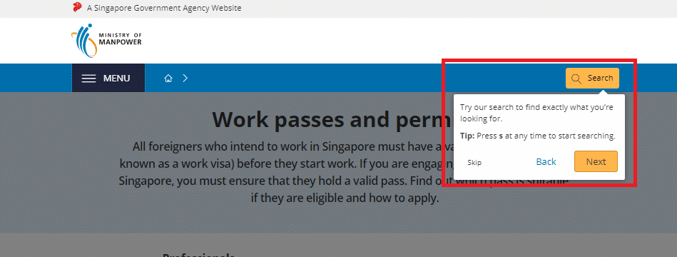 Source : Ministère de la main-d’œuvre de Singapour
They represent a kind of tool to teach new users about the content and functionalities of the site. Guides are also used to serve as marketing tools for restricted sites.
They usually feature linear navigation, but hypertext navigation should also be added to ensure greater flexibility.
2.3.2.4. Configurators
You can integrate configurators on your site independently of the associated pages.
To better illustrate the configurators on a site, let’s take the example of language selectors / or the configurator of a product sheet or the internal navigation between pages.
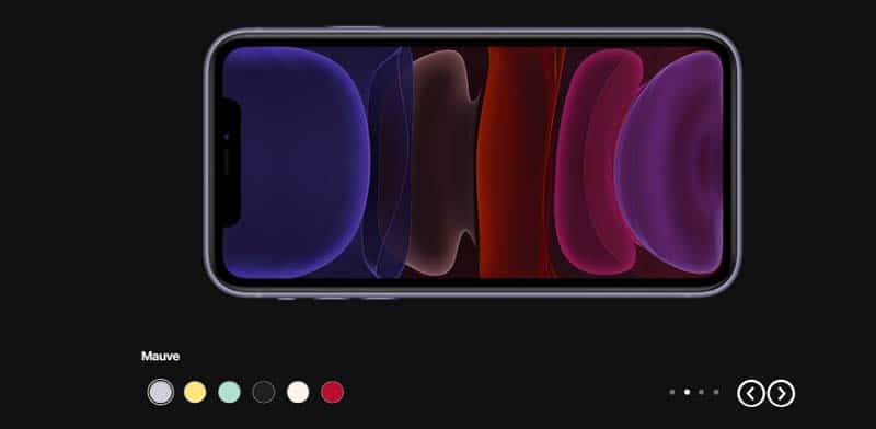
Configuration of a product sheet by the user – Source: Apple
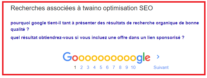
Internal navigation between pages – Source: Google
2.3.2.5. Advanced
navigation Advanced navigation includes the rest of the navigations apart from those mentioned so far. Here are some examples of advanced navigation:
- Customizable navigation Personalization
is the action of offering the user fully customized pages based on a model of this user’s behavior, preferences or needs. The principle is used for example in human resources systems by offering options to a user according to his qualifications or his corporation.
Applied in the context of a website, it is a way of giving the user direct power over a combination of navigation, content and presentation options. You can take inspiration from Yahoo, which offers its users the possibility of personalizing their pages.
Or the Spotify platform which offers perfect control thanks to its drag and drop functionality. It allows its users to structure the sequence of playlists on the navigation sidebar.
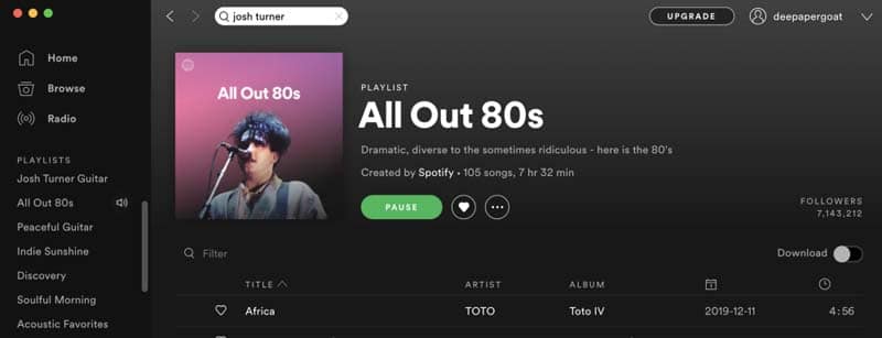
Source : Spotify
Compared to other navigation systems, we can say that personalization is a way to refine these systems.
- Personalized
navigation Personalized navigation consists in serving various contents to each user according to his style, his tastes and his needs on the web. YouTube is a perfect example.
- Social browsing
Since the advent of social networks, social browsing has become a strategy used by many sites to help users discover interesting content.
We can cite, among others, Reddit and Product Hunt, which use social browsing to offer their audience content based on their popularity.
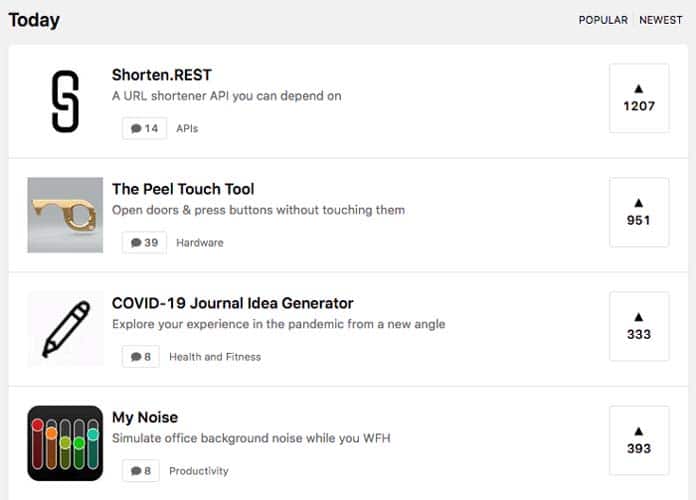
Source : Ux Planet
- Visualization
It can be interesting to add visual elements when creating your site to help your visitors quickly find the content they are looking for. These can be symbols, icons or images, especially for users who already know how to interpret these visual elements.
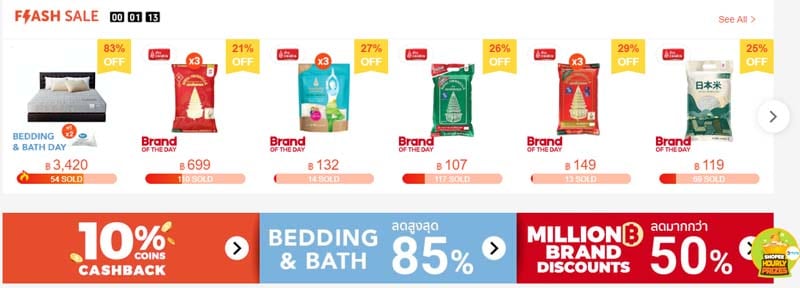
Source : Shopee
2.3.3. How to know if your navigation system contains flaws?
After implementing your navigation system, it is important to make sure it is working properly. To do this, here is a series of points to study to identify possible navigation problems and provide a better user experience:
- Do the inserted links really lead to the right page?
- Does the navigation bar contain too many links or embarrassing options?
- Are the links and labels self-explanatory enough?
- Does the navigation system allow you to return to previous information?
- Is it possible to navigate to the broader context of information?
- Is it possible to find services and other related information?
- Is the important information of a topic difficult to find?
- Did you struggle to determine the best location to perform your task?
- Did you have trouble finding your way around the site and knowing if it was the right place to do your job?
- Have you encountered any technical difficulties such as error messages, inaccessible pages for example?
2.3.4. The main recommendations for the design of navigation systems
Before designing any type of navigation system, it is important to consider the environment in which the site will evolve. The context of the site is therefore the starting point for the creation of a navigation system.
A good navigation system must present in a coherent and clear manner the hierarchical architecture of the content of the site. It must also, through the breadcrumb, specify the current location of use during navigation. Make sure the breadcrumbs actually show each user’s location.
Regardless of the navigation system adopted on the site, the user must be able to move easily from one page to another. This involves balancing the benefits and flexibility of each system against the risk of clutter.
Navigation systems should be carefully crafted to effectively complement and reinforce the hierarchy of content while ensuring flexibility on the page.
How do you ensure that your navigation system respects all these recommendations? Here is a test to assess the level of perfection of your navigation system to improve it as well as possible:
- Try to access the middle of the site directly without necessarily going through the home page;
- For each random page visited, check if the breadcrumb trail manages to specify your position in relation to the rest of the site or the parent page or the active section;
- Can you tell where this page can take you next? Are the links used explicit enough to clearly reveal the content of the page to which they refer? Is each link specific enough to help you choose it according to your needs without being spoiled for choice?
- Can you tell where the page will take you next? Are the links descriptive enough to give you an idea of their content? Are the links different enough to help you choose one over the other, depending on what you want to do?
2.4. Search
systems Search systems relate to the way Internet users search for information, generally by typing words into the bar of a search engine or from a numbered list.
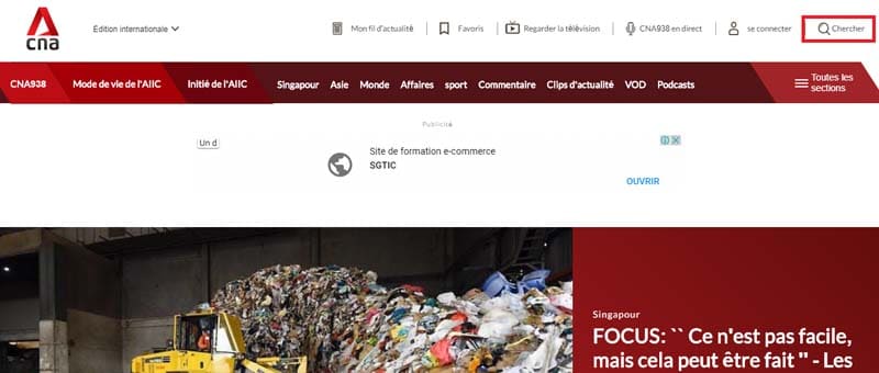
Source : Channel Newsasia
2.4.1. What should be done before building a search system?
Before starting to create a search system for your visitors, it is important to ask yourself a few questions:
- Does my website have enough content?
It is important to consider the volume of content on the site. This little analysis helps to get an idea of how long it takes to implement a search system on your page and what benefits it actually brings to site visitors.
If the site is large enough with many pages containing information, it is worth creating this search system for the benefit of users. Otherwise, you can opt out.
- Are navigation systems going to undermine your efforts to set up a search system?
What good would a search system be if the site’s navigation systems don’t work? In the event that the navigation systems adopted on the site bug and you try to fix the problem, keep the search system local. Don’t implement it until the problem persists.
- Do you have the time and knowledge to optimize the site’s search system?
If you don’t have enough time to fully invest in setting up your search engine correctly, reconsider your decision.
- Are there other effective alternatives?
If you do not have enough technical expertise or financial means to configure the search engine, you can for example opt for the creation of a site index.
- Will site users care about a search bar?
It is important to ask yourself if a search system is really useful for your users. A user looking for a greeting card would prefer to browse card thumbnails before initiating searches.
2.4.2. What to look for in your search systems?
Indexing everything in your search system might not be useful for your users. The creation of search zones allows users to better refine their searches.
Search areas designate the subsets of a site’s content that will be indexed independently of the rest of the content. Clearly, you can create a search box simply if you manage to logically group sub-contents.
To create your search areas, you can draw inspiration from the selection criteria when creating the organization diagrams to go faster. Search fields can be:
- Subject;
- Geography;
- Chronology;
- Author ;
- Department / type of content;
- Audience ;
- Role ;
- Subject / business unit.

Source : Design Your Way
Like organization charts, search boxes allow the overall site content to be broken down into smaller pieces of content to provide users with multiple views of the same site and its content.
Generally, a website contains two main types of pages namely navigation pages and landing pages. The actual information that can be searched on a site ends up on the landing pages.
As for the navigation pages, they include everything that is the main page, namely the search pages and those that facilitate navigation.
A search performed on a site should lead the user to these landing pages. And search results should not contain browse pages.
Making specific sections of your documents accessible to users via search boxes is a very useful strategy. Users will therefore be able to retrieve specific, precise and meaningful answers.
It is clear that a user of an e-commerce site would be more interested in researching products. Later, you can add other search boxes related to other parts of the site.
2.4.3. Presentation of results
The best guide to presentation of search results must display little, but precise information to Internet users who know what they are looking for. It can be only the title of a work with the name of its author.
In addition, this same guide will have to display several elements of answers for users who are not very sure of what they are looking for. It would also be useful to offer Internet users the possibility of choosing the elements to be displayed.
For this tip, be sure to offer the actual information needs of your visitors. If in doubt, just provide a coherent set of results where they can end up.
However, the majority, if not all, of users will not go past the first search page. So remember not to provide too much content per result, the very first may make it difficult for others to access.
It would still be useful to inform users of the total number of documents retrieved in order to situate them on the remaining number of documents to be scanned.
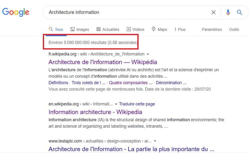
Source : Google
Also offer a dedicated navigation system to easily browse the results. It would also be useful to offer the possibility of revising and refining the elements of the answers. For example, you can have a “Revise Search” option right next to the number of response items. They will therefore be able to modify their request without having to enter it again.
To better index search results, the information architecture offers three methods: Sorting, grouping and classification.
- The sorting
method The sorting method consists of sorting the search results alphabetically or chronologically by date, regardless of the type of content – model, brand, use.
It is a fairly practical method for Internet users looking for precise information to make a decision or take an action.
It may be, for example, a potential customer who wishes to consult a list of products before “add to basket”. Sorting the search results would make it easier for him to finalize his action.
Chronological sorting by date is recommended for time-sensitive content such as press releases for example. This way of sorting search results is widely used to present historical data.
- The ranking
method The ranking method is useful for understanding information or learning something new. It is a method generally used to highlight the relevance of content retrieved from search results.
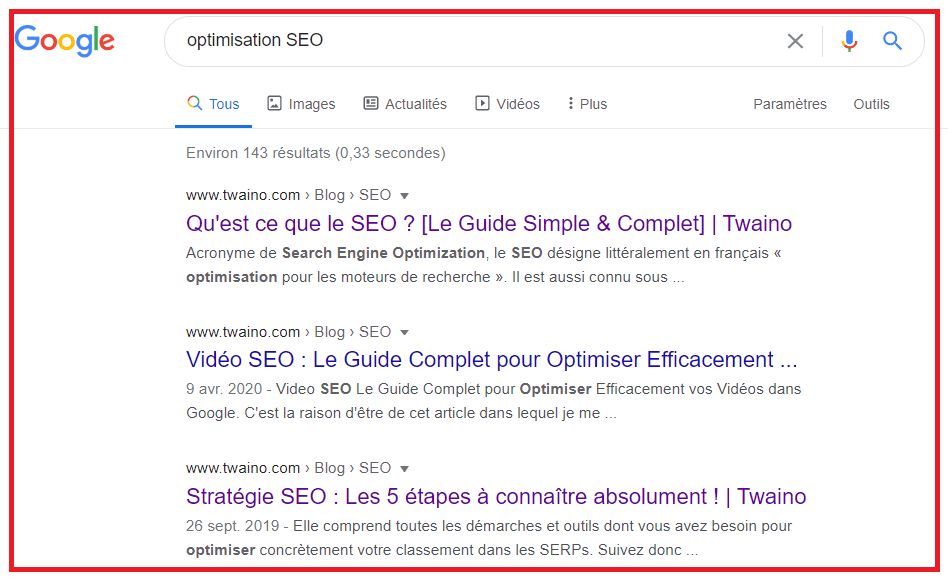
Source : Google
It is important to proceed with careful ranking since Internet users consider the very first results to be the best. For a successful classification, you can classify the response elements by popularity or by consumer (or expert) appreciation…
- The grouping
method This method consists of grouping retrieved results that share the same aspect in the form of a category or of classified list for example.
These different clusters formed describe a context for the response elements by constituting the document most suited to the needs of users. You have two ways to build your clusters: Either generate them automatically or use a specialist in the field.
Regardless of the method used to display your results, clearly tell users their search history and where the results came from. Also remember to describe the search filters applied, the content searched, the options chosen such as the sort order, etc.
Finally, you can add the possibility for Internet users to save, print on paper or send the results obtained directly by email. A sort of “basket” can be added to store selected search results as they occur.
2.4.4. The search interface
The composition of the search interface is a fairly sensitive process because of its influence on users.
To hope to have a good influence on your visitors, your search interface must remain as simple as possible: A clearly visible search field and a search button right next to it.
You must therefore demonstrate good taste and consistency. Generally, the search box is located at the top of the site near the navigation system.
The needs of your audience should also inspire you to set up an ergonomic, practical and simple search interface.
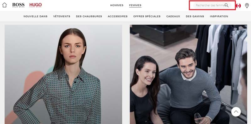
Source : Hugo Boss
In addition, you can opt for an advanced search interface that promises easy manipulation of search results. This advanced interface will satisfy Internet users who have an advanced sense of research.
Finally, the search is an iterative process, so make it easier to go back and forth between the navigation and the search itself. This also implies a policy of no “dead end” and always offering another solution even in the event of no returned result.
The solution can be a way to get the user to reformulate his query, or search proposals or even small search tips. You can also offer human contact to better assist your users.
2.4.5. Some essential points about search
If you think that the search for content on your site is already fully optimized thanks to the chosen search system, think again! Only 20% of findability depends on technical processes, the rest must be done “by hand”.
Since there is no shortage of competition in any industry, it is essential that your content is carefully written and well structured to ensure the best possible findability.
The real problem is not the search itself, but the quality of the content. Here are five key reasons that can prevent your users from finding information:
- Too much information;
- Not enough information;
- Not entering the correct information;
- Impossibility of recognizing the information available as being the correct information (labeling problem);
- A set of all the elements mentioned so far;
All of these reasons are due to:
- Broken processes;
- Poor structuring of content;
- A misunderstanding of the real needs of users;
- A bad combination of the different sectors of the organization;
- Lack of understanding of the principles behind digital content.
In addition to looking for a solution to the above problems, it is also important to understand how search engines and Internet users discover information:
- Internet users need page titles that are in alignment with their mental models. But also search filters that allow them to refine their search and significantly reduce the number of results.
- Search engines rely on metadata (content information) tags such as title, keywords, file format, etc. to unearth the best search results for the user.
Once the components and the basics of the information architecture have been recalled, we can move on without difficulty to the creation of the architecture itself.
Chapter 3: How to create an information architecture in 5 steps?
The achievement of your objectives, commercial or as they are, necessarily passes by that of your audience. And you’ll only really get there when you understand your users’ goals, aspirations, and pain points.
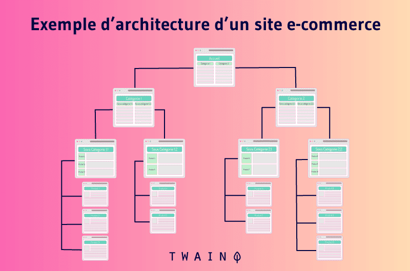
Here are 5 essential steps for the creation of a successful information architecture:
3.1. Collect everything you know about your users before you begin your site architecture.
It is important to integrate the mindset of your users before carrying out the information architecture. It therefore comes down to having a clear answer to each of the following questions:
- What problem are we trying to solve?
- Who are affected by the proposed solutions?
- What is the site for?
Once the purpose and objectives of the architecture are clearly stated, it will be easier to spot problems and easily resolve them. This will also help you stay focused and keep your end goal in sight.
You can start your investigation with physical discussions. One-on-one interviews and phone calls are proven to be one of the best ways to do this as well as online surveys

The idea is to identify the needs of users, but also the why of these needs. You should therefore expect different intentions, needs and use cases specific to each type of user.
3.2. Develop a list of customer personas and think of user stories to adapt your site to real people.
It is essential to put yourself in the logic that you are creating your website for someone and not for everyone. This is where you will have to identify the different customer personalities.
Customer persona profiles should be the result of your research on your users. It is both a factual and a fictional representation of your users.
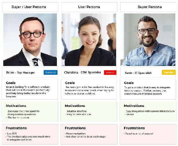
A customer persona should be carefully crafted and contain, at a minimum, the goals, characteristics, behaviors and motivations of the most influential people who visit your site.
Here is an example of a persona already created to better understand the principle. The attached photo is a random photo just to simulate a real user for whom the site wants to be created:
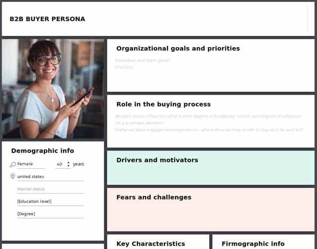
The creation of user personas is a very essential step in setting up the information architecture. However, we cannot claim to build a good persona without knowing the person to whom it is attributed.
After creating the personas, the next step will be to associate use cases with these personas. Use cases are sort of a simple way to choose and present the purpose of the project.
They are generally composed of two essential factors: The actors and the objectives.
By actors, we designate the people who are in direct contact with the site, the people who use it.
We agree that it will be a little difficult to identify all the actors of a website, especially if it has a large audience. What you should do is stick to only the most important user groups for the site.
Goals in this persona context therefore refer to the purpose of each, some, or all users. A use case must include:
- A specific objective;
- Actors who will perform tasks to achieve this goal.
On a website, the objectives in question are nothing other than:
- Consult the balance of an account;
- Make an appointment ;
- Request a quote;
- Download a program;
- Read a blog post;
- To order ;
- Etc.
The use cases make it possible to set the objective and the goal to be achieved in order to solve the problem. This is the first step to improving the user experience on a site.
Work on the architecture of your website by prioritizing personas and their objectives, allows you to work with more confidence and clarity to produce something worthwhile.
3.3. Start creating your information architecture based on the metadata and scenarios developed.
Once you understand your users’ intentions, reasons, and goals, you’ll have an idea of how to organize your content to engage your users.
You can do this in many ways, but here is an effective process that will help you every time:
3.3.1. Establishing the metadata needed to help users
Metadata is nothing more than data that can be collected from other information. They help users quickly find the content they are looking for.
Take the example of a user who goes to an e-commerce site specializing in the sale of bladeless fans, to buy one. If he spends more time without finding the fan he is looking for, this is proof that the site is missing the right metadata.
So if you manage to correctly determine the metadata, you can boast that you have passed the first hurdle in designing a website.
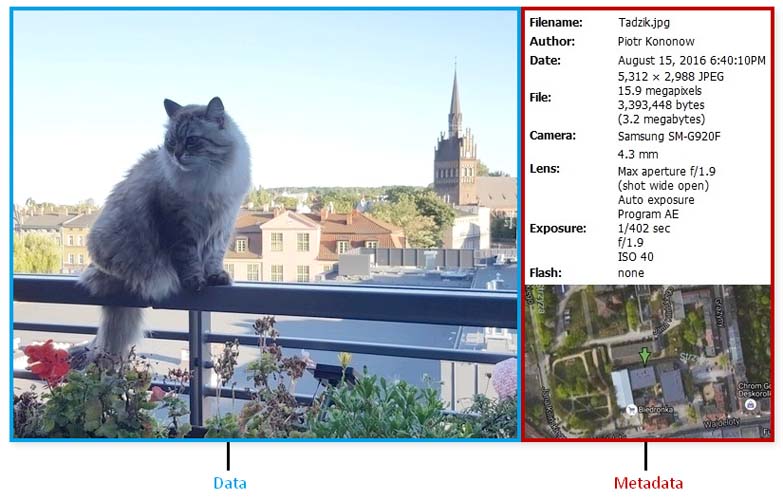
Source : Dataedo
But how to develop useful metadata for a site? Simply based on what really interests users.
Regarding the example of bladeless fans, are Internet users looking for the model? Wall? For ceiling? Or the color?
It is therefore important to master the parameters and variables of the product to better integrate them into your system in order to offer excellent search results to your users.
The metadata of a literary work can be:
- The cover image;
- Release date ;
- The title ;
- The author;
- The description ;
- Comments ;
- The ISBN…
3.3.2. Think practical user scenarios.
To ensure a better experience, you should create scenarios that feature user characters. The scenario is this little story related to a user personality of your site to perform a specific task or achieve a specific objective.
A scenario can therefore gather user actions to book a flight to Geneva or to buy a PlayStation 4 online.
We understand better how essential personas are to creating a coherent and practical scenario. They describe the reasons that can lead a user to visit your website.
- What does the character intend to achieve on the website?
- How can the site help him accomplish his tasks?
- What should be avoided to maintain a good user experience?
This therefore amounts to focusing more on your users and their tasks than on the internal organization of the site. So you can quickly gather enough information about what content to post to the site and how to organize it.
3.3.3. Map Actors to Tasks
It’s important to get all the content in place before you start thinking about the actual design of the site.

Then comes the time to decide which scenario to implement on the pages and on how many pages the scenario can take place. This therefore amounts to expecting two important aspects from each page:
- Assisting the user when performing a specific task;
- Make it easy to transition to the next step.
What good would a website be if its users couldn’t complete the tasks they set out to do? It is therefore an aspect to be taken seriously. However, succeeding in such a challenge comes down to recognizing that a task is nothing more than a series of small tasks.
And that it is the relationship between the different tasks that determines the quality of the user experience. Each page of the site is then involved in a process where it must contribute to the construction of the chain of tasks.
To take all this into account, your site must therefore have three types of pages:
- Navigation pages : This type of page helps Internet users to easily locate what they are looking for and also facilitates access to the corresponding content. They aim to direct users to the right place, usually to the homepage or a search results page;
- Consumer Pages : These are the places where users often go to view things such as an item, product price and delivery policy, videos, etc.
- Interaction pages : Thanks to these pages, the user can easily enter and manipulate data. The perfect example of an interaction page is a registration form or a search page.

Source : Colorlib
- Each of these pages is optimized and tailored for a specific type of user task. Successfully identifying the type of page you need on your site will help you in customizing the interface.
- It is important to notify when creating a sitemap or user flow map, if such page is a consumption, navigation or navigation page in order to treat them as such.
3.3.4. Offer the right help to users, at the right time and in the most discreet way
It is clear that all the pages of a site are not equal, both in terms of content and ease of use. Some pages will require more learning than others.
The ideal would therefore be to provide help texts to assist users in carrying out their task.
Each information provided must be related to the browsing context. If your site has a COMMENT section, you should answer questions from users there.
All the important questions and collected testimonials will help you put together an FAQ to prevent new users from asking the same questions. However, FAQs should be used in a support context and not as a sales tool.
Take this somewhat blatant example:
Q: “Should I buy this scrub for my caramel complexion?””
Of course you should!” “.
As Stephen Gracey, “A good FAQ is like insurance for your users when they need it, but hopefully they never do. »
On the image below, we can notice the FAQ of Studio Roméo which addresses the place of manufacture, the composition and the mode of maintenance of its baby carrier bands.
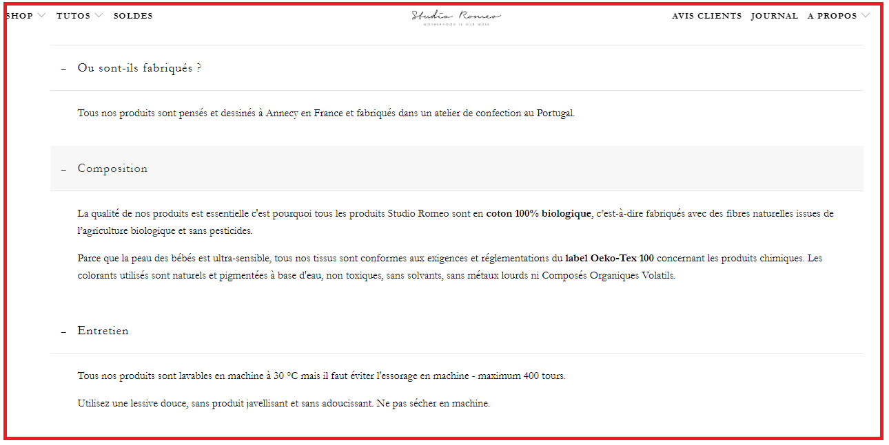
Source : Studio Roméo
Responding to FAQs on your site, especially e-commerce, is a strategy that gives customers confidence and encourages them to buy the product.
3.4. Build user flows to map the progress of users on your site.
Now that you’ve decided on the types of pages you want on your site, it’s time to create the user flows. Before starting, it would be useful to briefly recall the search modes, there are mainly 4 in all:
- Search for known elements: A user who already knows what he is looking for will enter his name directly into the search bar to win time. To further improve their experience on your site, you can attach a local navigation system to help them quickly browse the proposed answers.
- Exploratory research: Here, the user does indeed have a need, but does not yet know that it is the best solution for his satisfaction. It could be a remarketing solution or a new iPhone. This user will look at the available solutions, but will not know which of them is the right one for their circumstance. Make sure to manage such a situation of embarrassment of your visitors so that they find the best option for their problem.
- Sometimes users don’t have the right information. A customer wishing to buy jewelry made of precious stones must know the different precious metals, the resistance of each stone and many other characteristics. They will then consult the site in search of a specific need and will discover other things.
- Re-find: Other Internet users may desire products that they have discovered for some time. It may be a shoe that a customer liked during her previous visit and therefore decides to buy it this time. You must come up with strategies to help him find that famous shoe. For example, change the color of the links she had to visit or opt for permanent baskets.
Each reason that a user asks to search on your site must be considered and resolved using very specific navigation tools.
3.5. Create sitemaps, wireframes, and gather feedback on your website architecture
At the end of this selection of steps designed to help you successfully organize your site’s information, you should recognize that you you are only one person. And that bringing in new eyes and brains wouldn’t hurt, especially to challenge your work.
A detail may have escaped you. Or maybe you misunderstood a concept. There’s only one way to find out: work in teams. It doesn’t matter if it’s with associates or other peers, the idea is to get an outside opinion.
For the occasion, there are many tools such as sketches, wireframes, etc. to communicate and open up to other proposals.
Stay open and accept important recommendations and start the whole architecture again if necessary.
Chapter 4: How to create the best menu structure for your website?
Who wouldn’t want intuitive navigation on their site? However, it is navigation that comes at a price and requires painstaking work. We have listed research techniques and tests for you.
These are the processes used by UX experts to produce better information architectures, menu structures, navigation paths or workflows.
4.1. Sorting cards
A website usually contains many pages that must be well categorized. Where to rank each of these pages to achieve an architecture that promises a better user experience.
Sorting cards overcomes this problem and allows you to locate your users to quickly find the desired content. It is a very convenient and reliable method that will take care of categorizing content and functionality exactly as your users desire.
Especially for fairly popular themes like audiovisual equipment, lingerie, etc.
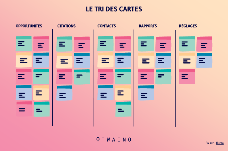
Map sorting is mostly appreciated for its flexibility, just a pen and paper to categorize the entire content of the site.
So how does the sorting method work?
- To begin, form a set of index cards and distribute a term on each of these index cards. Regarding the terms to write, it can be the name of a page, the content, etc. The idea is to represent each page (category) of the site by a form. Say your e-commerce store specializes in AV, you might choose terms such as “lenses”, “DVD players” or “DSLRs”.
- The ideal client is represented here by test subjects. Each test subject is associated with a file which previously contains a term.
- You instruct the first test subject to group the terms into a logical set and name the grouping.
- This term grouping process is repeated with each of the test subjects.
- After going around with all the test subjects, you can analyze their result and look for patterns.
Here is an easy to understand 3 minute video to explain the concept of card sorting:
The card sorting method exists in 3 different types:
- Open card sorting : This way of sorting the cards accepts that test subjects create their own names to designate the categories. Open card sorting provides insight into how your users rank your articles and their impressions about them.
- Closed-card sorting: Allows subjects to receive a predetermined number of category names. Their purpose is to assign records to these fixed categories.
- The Delphi method: It is different from the other methods. Here, test subjects work one after another, with the goal of refining a single model. The first test participant performs a traditional open-card sorting. The rest of the participants start with what the previous participant created. The method offers test subjects the ability to modify, either by renaming or restructuring the study or deciding to start over altogether. The process will be repeated until the subjects find no more significant changes to make.
Here is a video that better explains the Delphi method:
4.2. The tree test (reverse sorting of cards)
The tree test or reverse sorting of cards makes it possible to work out the best menu structure for your site. To achieve this, you have the choice of creating the structure yourself or by inspiring card sorting results.
A structure based on the tree test offers Internet users access to the content sought simply from the menu.
The purpose of this method is to ensure that the menu structure works properly before embarking on the actual design of the user interface.
The test tree is presented in the form of a simplified text of the structure to be adopted on the site, independently of the concepts of navigation and visual design.
Example:
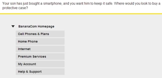
Source : Optimal workshop
We understand in this example that the user was in full navigation in the menu structure before reaching the PROTECTIVE CASES section.
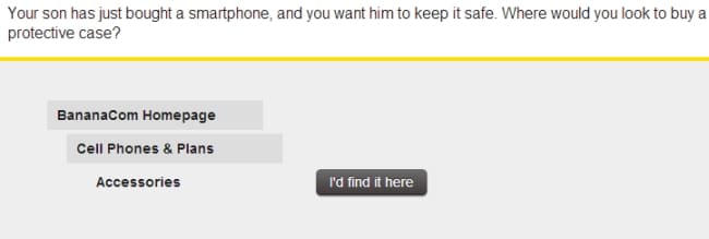
The card sorting method approves your proposed assumptions for organizing the menu structure or provides feedback to readjust it.
4.3. Online (remote) card sorting
If you have ever done in-person card sorting, you will surely have encountered some difficulties such as its cost, logistics and geographical limitations. With online card sorting, it’s the same result, but at best.
That is to say, you will get the same menu structure, but with less resources invested. It is done remotely with an online chat service, Skype to be able to communicate.
However, this method requires good prior training of all test participants. And it should also be remembered, online card sorting tools do not offer card sorting by the Delphi method.
If you prefer to use inline sorting to structure your menu, here are some tools available on the NET that offer such a service:
Source : usability TEST
With these tools you can also analyze the results instead of doing it manually.
4.4. How to analyze card sorting results?
After sorting the cards, two questions often come to mind:
- What if half of the visitors expect to find page A in category B? And that the other half is waiting for him in category Z? If this can reassure you, know that it is quite possible to insert the same link under two categories. As long as the trick can help your users find the right content in the right place, there’s no downside to report.
- Can I rely solely on card sorting results to build the information architecture of my site? Not entirely. Card sorting results should be used as a guide for labeling and organization. So you shouldn’t just gather card sorting results to pretend to build a good structure for your site. Logic dictates that these results should be supplemented by a task analysis and other complementary research on Internet users.
After designing the navigation system of the site, it is crucial to ask the question “What do the majority of users want when consulting my site?“. With another additional question: “What content should I make easily visible for the interest of my site? “
4.5. How many users can be tested when sorting cards?
According to Tullis and Wood, in a 2004 study, 20-30 users can be tested for card sorting. However, Jakob Nielsen has done his own research and only suggests 15 users for simple projects.
For large projects with huge funded resources, you can go up to 30 users.
To better situate yourself between these two theses, know that more test subjects are synonymous with more information, but less performance. Conversely, when using more than 15 test participants, study costs can easily escalate.
4.6. Content inventory
Carrying out a content inventory amounts to developing a complete list of all the elements that make up the content of the site. This is not only about the written contents of the site, but also images, data and applications.
To ensure that a complete inventory is established, it is essential to analyze all the elements used on the site. This therefore amounts to understanding the usefulness of each element present on the site as well as its precise location.

To begin the inventory, it is important to answer these few questions in order to produce a quality content inventory:
- What are your objectives? And why produce this inventory?
Understanding and answering these two questions will allow you to have a clear idea of the direction to follow to reach your goal.
- What is the scope of the inventory?
Knowing the scope of the inventory in advance will guide you on how much content to bring into the inventory.
For the little trick, it is advisable to start the inventory with a small range so as not to end up overwhelmed and abandon the inventory.
Once the objectives and the scope have been clearly defined, the inventory can begin as such. It will then be necessary to gather certain data for each element of the content of the site.
Of course, this data collection can vary from site to site, certain elements are typically present on any content inventory:
- Title
- Unique content ID
- Your site’s URL
- File format, including HTML, PDF, DOC or TXT
- Author
- Physical location of content, i.e. the location of the content management system
- Meta Description
- Keywords
- Content categories
- Dates, including dates the content was created, reviewed, or accessed
For ease of collection data, you can opt for a web crawler bot. These tools make it possible to extract information with the possibility of exporting it to a spreadsheet for better sorting.
Screaming Frog SEO Spider is a great tool to perform this task:
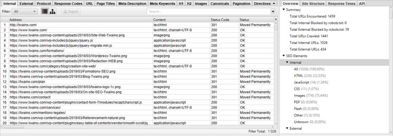
Once all the data is gathered, it has to be sifted through manually. This is a step that requires a sufficient degree of precision and prerequisites.
This careful treatment depends on the objectives set at the beginning and the scope of the inventory. These two factors define the type of evaluation to adopt.
Carrying out a content inventory is an operation that requires enough effort, but very beneficial in return for the site.
Indeed, the results obtained after an inventory can direct you on which pages to delete, which ones to revise, which gaps need to be reinforced or if the content should be moved.

Once the site has been inventoried, what should be done next? Content inventory also helps establish an effective navigation pattern for the site. It offers a basis that can inspire a complete overhaul of the style of navigation adopted on the site.
As you can see, collecting site information is not the only reason for doing a content inventory. Indeed, we can cite other reasons such as:
- Assessing the landscape of the site;
- Determine project schedule or cost estimate;
- Identify patterns in content structure;
- Set a baseline;
- Establish a baseline to track the migration.
However, it is important to remember that it is recommended to take inventory of content during the first stages of the reorganization of the site.
Aside from these steps, content inventory can also be performed just before a content management system migration or during ongoing site maintenance.
Conducting a website content inventory is not a simple project. People who are knowledgeable and experienced in the field, such as developers, can attest to the complexity of a content inventory.
It’s a project that can be time-consuming, monotonous and sometimes never-ending. Many developers agree that inventory is unnecessary for regularly updated sites.
One thing is certain, an inventoried site is an updated site. However, a site’s content inventory can become outdated very quickly. Which brings us to another important point of information architecture.
4.7. Wireframing
Wireframes are an information architecture method responsible for representing the interface of a page by focusing on the space allocated to each element on the site. The purpose of wireframes is to facilitate communication about the design of the site.
They purposely exclude the actual site design, color style, or graphics and focus more on page content and functionality.
A way not to get distracted by the choice of visual effects and to fully invest in the ergonomics and navigation of the site.
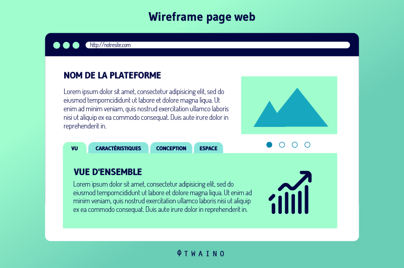
But in what context are wireframes really used?
There are several reasons that can lead to the use of wireframes. It can happen that a website is faced with one of these reasons or all of them together. Here are some of those reasons:
- Wireframes allow the user to connect the information architecture of the site to the visual design of the site by showing paths from page to page;
- Wireframes also make it possible to explain the means of displaying types of information in the user interface;
- They can also help determine the functionality of that interface;
- Finally, wireframes can help scale content throughout the site.
This way of staggering the content with wireframing allows you to have an idea of the space to reserve for each element and to find a specific location for it on the site.
Clearly, wireframes make it possible to determine the ideal place for certain elements of content and navigation on a page of the site.
We already know that wireframes don’t incorporate appearances and visual designs.
However, they require some recommendations to be successful:
- Do not dwell on the colors. It is advisable to keep the colors in gray tones to differentiate the elements from the content of the page. If you are used to distinguishing between two elements with too strong colors, grayscale is best for a wireframe.
- Stick to one font. Again, the wireframe does not take into account the appearance of a page. So, if you plan to adopt the Lobster in your wireframes, it doesn’t really matter. Keep it simple and opt for a more generic font. On the other hand, in the wireframes themselves, sometimes we need to emphasize the difference between headers and sub-headers and the rest of the content. In this case, you can use different sizes of the same font to show the distinction.
- Refrain from inserting images into your wireframe. You will come back to this later in the actual web design. If you want to allocate content space for an image, just draw a text box and insert an “x” in the middle to indicate that the box should contain an image.
- Avoid describing interactive features in your wireframes. Being two-dimensional, they are not too recommended to handle interactive features. These include drop-down menus, hover states, and accordions.
Like content inventory, the components of a wireframe can differ from site to site. But traditionally, certain components are assumed to be standard for any type of wireframe:
- The site logo;
- A search field or bar;
- Ariadne’s thread – Its elements make it possible to follow the path of the user on a site. They are generally positioned horizontally in the navigation bar, indicating to the user his path during navigation and his current position on the site;
- The header of the site which includes the title of the page under H1 and the subtitles under H2-Hn;
- Navigation systems, including global and local navigation
- Normal content;
- Share buttons including Twitter, Facebook, etc.
- The contact details of the company or person appearing on the site;
- The site map;
- And a site footer.
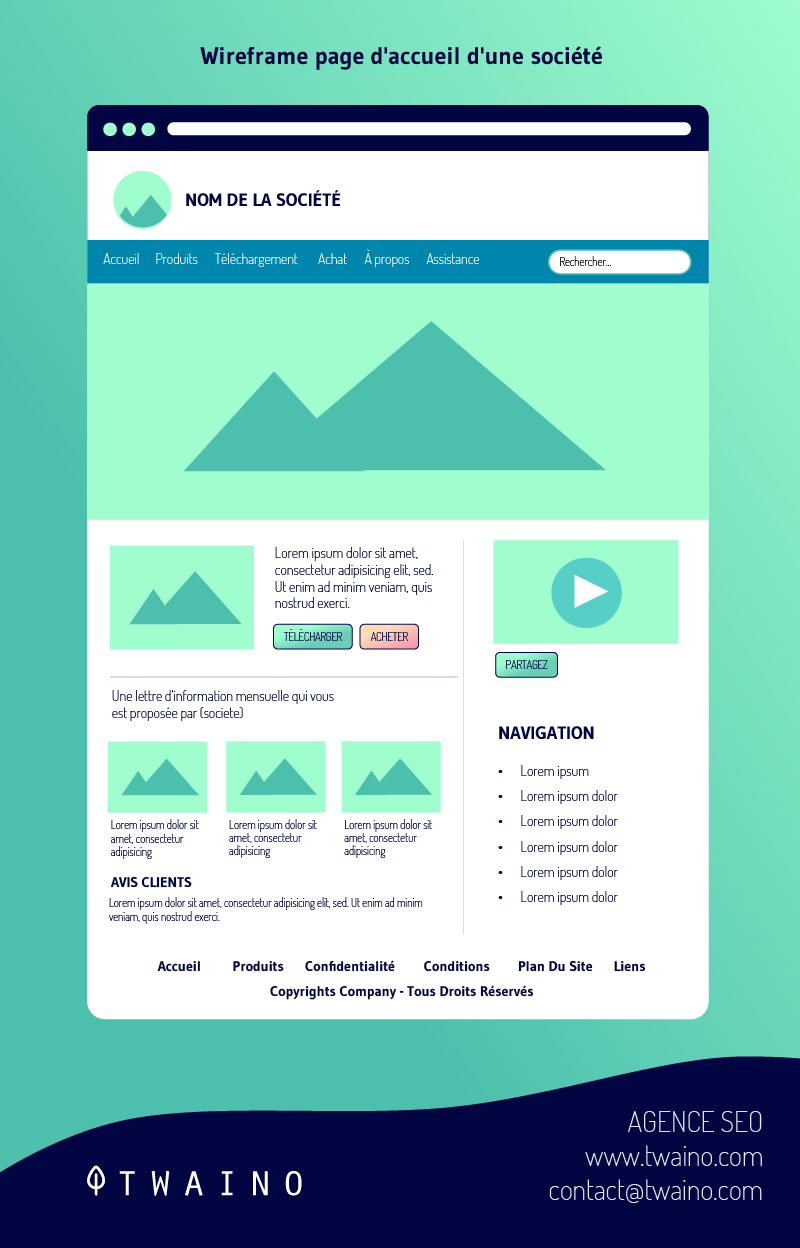
Websites can differ from each other in a thousand ways, same principle for wireframes. Indeed, there are several types of wireframe that differ in typography and inserted details.
But generally, there are two: the low fidelity wireframe and the high fidelity wireframe.
- Low-fidelity wireframes are faster to build and are used to foster communication and cooperation within the project team. Details aren’t given too much thought when it comes to low fidelity wireframes. Here, frames tend to be more abstract, relying on simpler symbolism to fill space and include fictional content. You may have seen this kind of wireframe once.
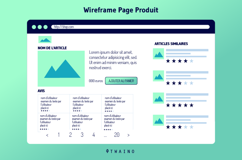
They are particularly recognizable thanks to their content written in Latin or lorem ipsum just to fill the space. The idea is to temporarily occupy the space with fictional content to fill it properly at a later date.
- High fidelity wireframes are much more detailed. They are excellent at providing documentation.
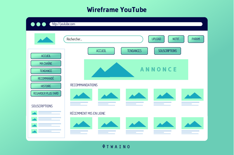
These wireframes provide information on each element of the page. This may be, for example, the behavior of a user at a specific location, or the dimensions of the content or even the actions linked to any interactive element of the page.
4.8. The database model
The hierarchical method consists of staggering the content of the site, from top to bottom. Conversely, the database model takes an opposite approach.
In a database model, the content will instead be divided from bottom to top. And it’s the links in the site metadata that control the database model.
Compared to other models and schemas, the database model seems to be the most dynamic. It also offers more search capabilities with advanced filtering to help the user specify their search better.
4.9. Site diagrams In
addition to information architecture methods, you can use site diagrams to get an idea of information grading.
It would be interesting to communicate your organizational concepts in the form of diagrams to the rest of your web team and to your collaborators. Admittedly, team communication, in a brainstorming process, is essential for the smooth running of a project.
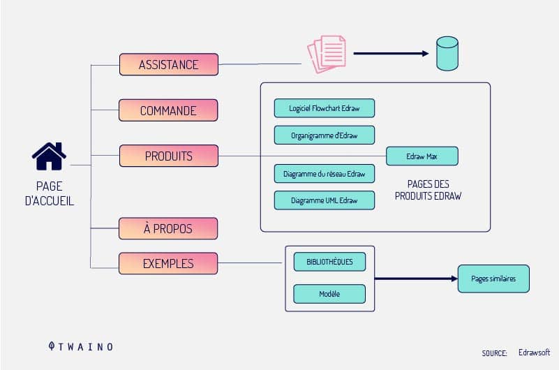
Site diagram can be represented as a hierarchical organization chart which is nothing but a simplistic version of a diagram.
Site diagram can also refer to an informative map illustrating the site’s design, information, and user experience. Everything will depend on the needs of your team throughout the process.
So, what is a site diagram actually made of? Again, this will all depend on the details and scope of the diagram, but typically many site diagrams include:
- Content organization and structure;
- Divisions and subdivisions of content on the site;
- Structural relationships;
- The number of clicks required to access a certain page;
- The type of page or template (home page, menu page, internal page, etc.);
- The level of user access to the site;
- Navigation terms;
- The RSS feed or applications;
- Internal and external linking relationships.
A site diagram can be simplified or complete depending on the needs of the site. We can for example notice purely conceptual site diagrams in order to communicate a maximum of information to the team.
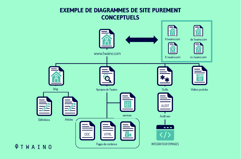
As the project progresses, the site diagram should be more complete. The principle is to transmit the information not only to the team, customers and collaborators, but also to constitute a complete user guide.
A site diagram can be made using various drawing tools such as Adobe Illustrator. However, there are more advanced tools for making specialized site diagrams such as Microsoft Visio, OmniGraffle or ConceptDraw.
4.10. Create sustainable structures
Simply creating the architecture of a website may not be enough. It is important to ensure that the structure you organize now is not only effective in the immediate term, but also in the long term.
Over time, the architecture will need to adapt to different aspects of the site’s content. It is clear that no one would like their site to remain static. Moreover, this is a detail that cannot escape users.
This is because users are the first to notice if a site hasn’t been updated for a while. They may decide to abandon the site, which will have a negative impact on its traffic rate and its referencing.
It is therefore important that as the content of a site evolves, its structure also follows suit. To make the information architecture sustainable, certain elements must be taken into account from the start:
- Prioritize growth: In any type of website, you must continually offer new content. For this, it will be necessary to ensure that it has enough space to contain its new elements. It is therefore a detail to allow the site to grow over time. But if you find that there is not enough room for adding or changing content, simply recreate the wheel.
- Also, be sure not to build too shallow or too deep a structure, find the right balance. This amounts to readjusting the structure to a good size. A superficial structure requires large menus to navigate the site. Conversely, a structure that is too deep can bury some content under too many layers. The user will therefore have difficulty finding what he is looking for on the site.
Chapter 5: 19 Tools to Use to Create Your Site’s Information Architecture
There are a number of tools for creating a site’s information architecture. These are among others:
5.1. Dyno Mapper
Dyno Mapper is a visual sitemap generator capable of allowing the creation, customization, modification and sharing of interactive sitemaps.
It is a tool through which it is also possible to take care of inventory, content auditing and keyword tracking.
Source : Dyno Mapper
Sharing and displaying important site-related data on Google Analytics is also seamless with Dyno Mapper. Also, with this tool popular with webmasters, all sites are treated in accordance with the standards in force and are accessible to everyone.
Dyno Mapper is designed to allow web designers to generate sitemaps from URLs and XML files.
This necessary and very useful feature makes Dyno Mapper one of the easiest to use when it comes to creating information architecture.
5.2. Omnigraffle
Omnigraffle is a sitemap creation tool, only usable on Mac. It allows the creation of superb graphics and also exists in two versions, standard and pro.
These two versions each provide their users with the following features:
- Line, shape, text and pen tools;
- Precise geometric positioning;
- Automatic layout;
- Text objects;
- Positioning and alignment;
- The default templates;
- Smart guides;
- Manual guides;
- Position snapping;
- The distance ruler guides.

Source : Omnigraffle
The pro version, which obviously costs more than the standard version, offers more features. Artboard layers, line-to-shape conversion, and text-to-shape conversion are some of these.
Omnigraffle has the particularity of offering enough power for the creation of site maps.
5.3. PowerMapper
PowerMapper is a tool capable of mapping, testing and analyzing your site. Like the Omnigraffe, it allows for the creation of sitemaps through the use of stunning graphics and through the reverse engineering of existing websites.
It is a perfect tool for analyzing website pages as well as capturing thumbnails and metadata of each page. These captures are made in the form of blocks. The tallest blocks represent the page closest to the home page.
Source : Power Mapper
It is ideal for users looking for a tool that can detect the structure of the website. Using this feature, the user can check the location where most of their website information is located.
Finally, it also allows the display of a site plan in a given order and an isometric view.
All these features make Powermapper used in more than 50 countries and by big organizations like: NASA and Bank of America Boeing.
5.4. SortSite
This is a tool used by many information architects, web developers, and usability analysts. About 30% of Fortune 500 companies also use it.
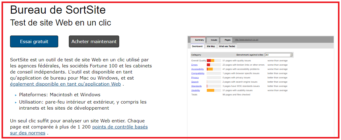 Source : SortSite
SortSite allows the checking of sitemaps for:
- Spelling errors;
- Broken links;
- Browser compatibility;
- Search engine problems;
- And the web standard validation.
The SortSite is used on both Windows and Mac for creating sitemaps. It only requires the use of the integrated browser to access the website and then a click on the map. This step completed, he is responsible for producing the site plan in record time.
5.5 Microsoft Visio
Microsoft Visio is a tool that allows the creation of diagrams with handles of different colors, icons, texts and graphics. Used by professionals, it exists in different models, some of which have more than 250,000 shapes included.
It is a tool that also allows collaboration with other users through Skype. If the user wishes, he can also share his project with any of his contacts through a link.
Source : Dyno Mapper
The recent Microsoft Visio allows connectivity to Excel data and the protection of its users’ files. The modernization of its forms allows the layout of the office.
It also includes other features such as: information rights management, detailed shapes, updated shapes and new themes for the Visio interface.
5.6. Xtreeme Sitexpert
Xtreeme Sitexpert is the ideal tool for creating and maintaining sitemaps. These plans will have the particularity of remaining up to date and of being usable quickly on different types of browsers.
Source : Xtreeme
This is a tool with highly optimized codes that allow sitemaps created through it to be compatible with the vast majority of browsers. Another very important feature is the ability for users to change the appearance of the browser menu.
This customization will allow the menu to match the user’s expectations for their sitemap.
The Xtreeme Sitexpert comes with tutorials and help documents to guide users through the entire sitemap creation process. Demo version of DHTML Menu Studio and Search Engine Studio are also included.
5.7. The Smartdraw
Smartdraw is one of the most affordable alternatives since it comes with free support with a multitude of different models. It helps in creating complex diagrams through its multiple built-in examples and drawing tools.
Source : SmartDraw
With such software, it is possible to create more than 70 different types of visuals, including charts and diagrams. It also offers the possibility to the user to do without the integrated models and to create more personalized ones.
Although used by brands such as Nestle, FedEx, Mayo, GM or Kraft, Smartdraw is a program within everyone’s reach.
5.8. A pencil and a piece of paper
With all the advances observed in technology, it may seem old-fashioned to take a sheet of paper and a pencil to plan the structure of a site. Yet it’s one of the easiest and most effective ways to build sites, anywhere or anytime.
You don’t need a WiFi signal, cord or batteries to build your sitemap. You just need to list the content elements of your site and start drawing small circles.
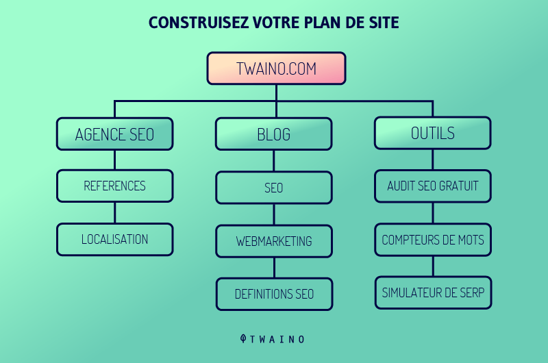
Source : Dyno Mapper
You may also prefer white or blackboards or even index cards with an easel.
5.9. Online Whiteboards Online
whiteboards are simple, yet powerful information architecture tools. There are several models on the net, but which essentially offer the same functionalities.
They provide the ability for the information architect to view pieces of site content as well as add other people to the study to participate.
These people intervene by drawing circles around the contents present in a similar group. Clearly, these are tools that allow you to obtain user feedback on sitemaps.
Here are some web platforms that offer online whiteboards:
5.10. PowerPoint
This is one of the tools that is truly within everyone’s reach. It allows the creation of lists of elements thanks to its integrated functionality called OrgChart. These lists are then grouped by line or login box users around content items.
Grouping therefore follows the same principle as with online whiteboards. PowerPoint still requires that we avoid inserting a large number of content items in lists.
Source : Home Ppt
This precaution must be taken, in order to avoid that the information architect runs out of space on a single page. However, there is a trick to get around this kind of inconvenience.
It involves creating a custom page size larger than standard pieces of paper. The person in charge must therefore keep in mind that a large-scale printing could cause him some small problems.
5.11. Excel or Google Sheet
Excel has the particularity of being present in the majority of user software. This feature makes it a tool that can be consulted from anywhere.
With Excel the user carries out an optimized study of the information architecture and creates lists of content elements. Once the lists have been drawn up, he can get help from other people to put them together.

Source : Distilled
It is a suitable tool for very large websites because of the many cells it has. It also allows the treatment of sites containing a large number of content elements even if these are per page.
5.12. The Google Adwords Suggestion Tool
This is a tool that is often used by search engine marketers. They use it to discover terms similar to the main terms, on which to advertise through AdWords.
The same principle can be observed at the level of information architects. The Google Adword helps address potential issues with terms to include when building the sitemap.
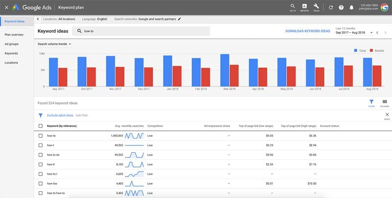
Source : Keywordtool.io
Thus, architects deduce variations and subsets of content elements, from the main sets. The user also has at his fingertips keywords sorted by relevance allowing him to create similar content more quickly.
However, a precaution remains to be taken when using the Google Adwords suggestion tool. Make sure to always check the ”use synonyms” box. The tool will thus be able to account for any variations in the terms entered.
5.13. Xsort

Source : Xsortapp
This is a tool designed only for Macs that allows you to create and group content lists. Xsort is very useful in establishing card sorts. Very easy to use and free to use, it allows users to create, read, print and export various reports.
5.14. Stickysorter by Microsoft Office Labs
Stickysorter is an automated version of sticky notes that sorts content lists in groups for free. Thanks to it, individuals rally content concepts to their similar groups.
Exploring new data from an information architecture will no longer cause problems for users. However, to benefit from an optimal power of the Stickysorter program,

the user must have an up-to-date and current version of Windows. Thus, the stickers can be separated into groups, be color coded, organized, sorted or formatted with data fields.
5.15. Treejack
Treejack is ideal for any card-based classification or reverse card sorting. It is used in the reverse card tree test technique.
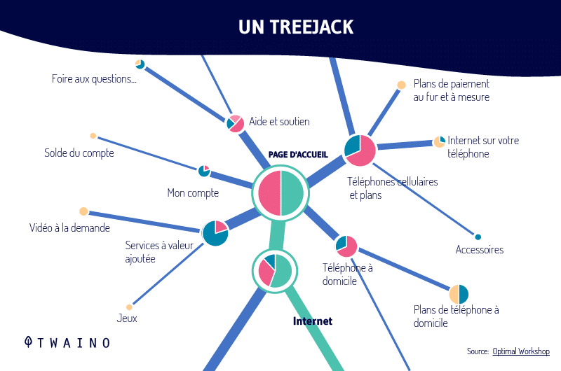
Using a simplified version of the text-only website, it measures the provability of topics. It is a tool used by large companies around the world.
5.16. Visio Stencils
It is a tool created by Microsoft that has more than 300 icons that allow the creation of visual representations. These representations are made only on behalf of the following Microsoft products:
- Office;
- Office 360;
- Skype for Business;
- Exchange Server;
- Skype for Business Server;
- LyncServer;
- SharePointServer.
Stencils Visio has symbol sets from 2012, 2014, and 2016. It offers the possibility to its users looking for more shapes, to search for them on their computer among the shapes installed through Visio.
In case users are not satisfied with the forms available on their computer, they can do further research on the internet.
5.17. Nick Finck
Stencils Nick Finck Stencils is a great tool for people who are familiar with different information architecture practices. The stencils found on the site are free, but must not be resold. They are essentially composed of clouds, cylinders, diamonds and boxes.
Source : Pochoirs Nick Finck
There are also templates for use with Microsoft Office Visio 2003 or later. There are four of these:
- Wireframe
templates Wireframe templates are made up of boxes that will later appear as images or other features such as navigation bars.
- Site map templates
These represent pages and lines that connect boxes representing the hierarchy of the site.
- Arrow Templates Arrow
templates convey one-way access between pages.
- Process Flow Templates
These are basically flowcharts that explain and define the process of a website or other system.
5.18. UI8
The UI8 program is designed to allow users to lay out the flow and basic functionality of a project before embarking on the wireframing process. It has around 250 templates, over 500 elements and is compatible with Sketch 3+ and Adobe CS6+. The user will find there:
- Wired kits;
- Predefined themes;
- Individual icons;
- Fonts;
- Sounds ;
- Sketching capabilities;
- Etc.

It is therefore a complete program that allows its user to take advantage of predefined themes and focus more on the creation of content.
5.19. Sharepoint
is a web-based application that integrates with Microsoft Office and is marketed as a document storage and management system. It can be used for various purposes and has important features.
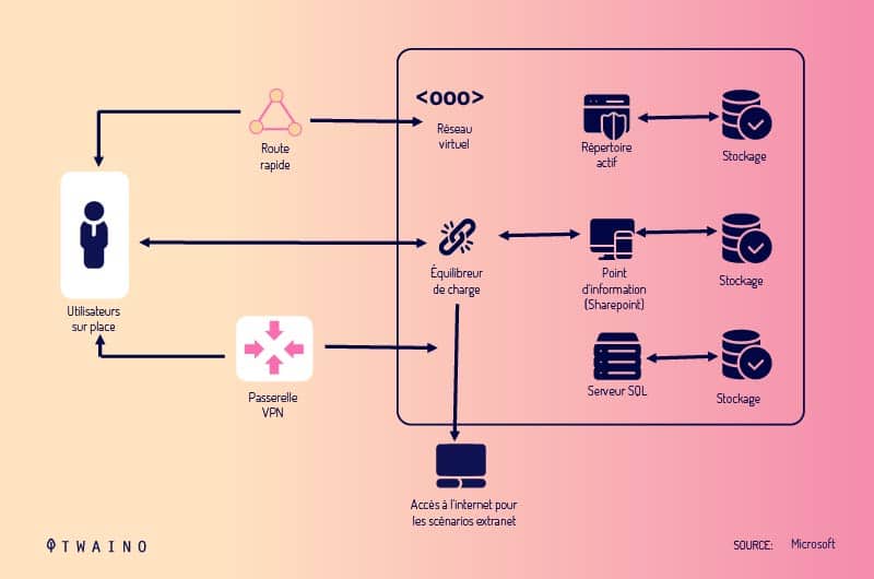
The Sharepoint has a site part that manages audience targeting, security storage, governance tools, and web analysis features. It also has another part called the community part.
The community part is made up of a ”MySites” sub-part, tags, notes, the organization hierarchy browser and the company’s wikis.
Finally, we note the content section which allows to improve the compliance of records and documents, content management, word automation services and managed metadata.
It is an application that provides its users with ready-to-use workflow templates and BCS profile pages. Everything you need to create an information architecture.
In summary
The creation of a website goes far beyond the fact of producing content. A simple publication is not enough for them to be easily identifiable by both search engines and Internet users.
Information architecture provides a set of procedures and organizational conventions to ensure this user experience. This explains the complementary relationship between information architecture and user experience.
A UX optimized site will therefore be that site which results from a harmonious combination of navigation, labeling, search and organization systems.
To achieve this, architecture advocates teamwork with a range of dedicated tools that allow communication between employees, but also facilitate and above all accelerate the study.
I sincerely hope that this guide has helped you in your need to organize the content on your website.
See you soon !

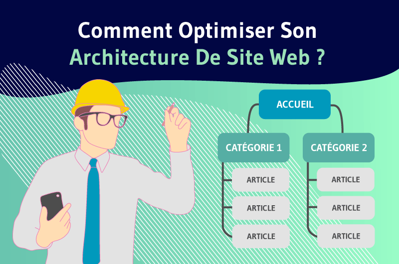


great and informative post
I have this question. Should the sitemap be with all its content, or is it enough for the latest content to be available on it? Let’s say the map has the 500 most recent publications. However, should all of them be available on the website visible to users? Does it matter?
Hello Poradnik,
The sitemap XML exists to help search engine boots to crawl more easily your website.
Consequently all the pages won’t be present inside, because the webmaster / SEO can consider some of them are not relevant (Page “Noindex” for example).
This action is automatically treated if your are using a plugin like YOAST.
For the rest of the pages, I will personally add all the pages / blog posts on my website inside the sitemap XML, to assure no “orphan pages” and help Google bots.
For the users, you can display a sitemap HTML, it is useful when your website start to be big.
Thanks,
Your article has answered the question I was wondering about! I would like to write a thesis on this subject, but I would like you to give your opinion once