According to Hootsuite and We Are Social, 55% of the world’s population use the Internet, or almost 4.2 billion people. The technological medium that attracts the most Internet traffic remains mobile, with a share of 51.6%, followed by computers with 44.1% and other media with 4.3%.
This means that more than half of all Internet users access websites via their cell phone. For this reason, your website design project should take into account the need for an interface that adapts to different interfaces. In fact, you’ll need to make it responsive in order to benefit from traffic from users who don’t necessarily use a computer. To do this, I’m going to guide you through the process of adapting a page on your website to the telephone.
This article, part of a long series, will take you step-by-step through the process, so you can do it yourself. Don’t forget to follow the accompanying video, which is likely to help you a lot.

Get “Responsive” pages!
Find out in this video how to adapt your website pages to the phone:
What is a responsive website?
With the evolution of technology, more and more people are connecting to the Internet. Most of them do so via their cell phone, which is why your website needs to adapt perfectly to the phone format in order to guarantee users an optimized browsing experience.
In fact, Mobify found in a study that 30% of Internet users abort a transaction when a website doesn’t adjust to their mobile’s format. What’s more, if a website takes more than 3 seconds to load, 57% of mobile customers tend to leave it.
For example, you’re likely to be annoyed by a website that requires you to zoom in with your fingers, scroll up and down or left and right in order to read its content.
Consequently, a responsive website needs to be able to adapt automatically to the different devices used by Internet users. And there are several reasons why you should switch to a responsive site.
Why should you have a responsive website?
There are many reasons to adopt a responsive website, but I’ll tell you which are the most important and can have a big impact on your business.
Google recommends responsive websites
With over 90. 6% of the world’s market share, Google remains the search engine most used by Internet users. This makes it a benchmark for user experience, and the fact that it favors responsive websites is no coincidence.
In fact, in its search results, the Mountain View company highlights websites that adapt to the mobile format. To this end, Google has created the ” Mobile Friendly ” label, enabling webmasters and site administrators to determine whether their website pages display well on mobile devices.
In this way, for a web surfer making a search via his or her cell phone, Google will rank “Mobile Friendly” pages first in the results, to the detriment of those that are not. In other words, a site whose layout is adapted to the mobile version.
Improved sales or contacts
Visitors are likely to automatically leave your website if they find that its pages don’t display properly on their mobile. Yet 12.1 million
french people make purchases via their cell phone, out of a total of 37.5 million who have purchased on the Internet.
That’s why we’re so interested in this category of Internet users.
Your site easier to manage
In the past, some owners created two different sites, one for mobiles and the other for computers. This had the disadvantage of doubling the tasks involved in managing sites, content, etc..
That’s why I suggest you opt for a responsive website, which will save you all this trouble since it’s just one site.
Basic elements for adapting your site to mobile devices
There are a number of elements that come into play when we talk about a phone-friendly site. These include :
1. CSS and HTML:
The heart of any responsive website lies in its structure and style. HTML and CSS are the foundation of this structure and style. HTML defines the structure of a web page, while CSS defines its visual characteristics, such as colors, font sizes and element layouts.
When you want to adapt your site to mobile html format, it’s crucial to use these two languages effectively to ensure that it can adapt its layout to different screens.
2. Media Queries
Media queries are an important tool for making your site adaptive. It enables the browser to dynamically modify the design of your site according to certain conditions specified by the end user, such as screen width or height, device orientation or pixel density.
By making judicious use of multimedia queries, you can apply different style sheets to different devices, ensuring a consistent presentation whatever the screen used.
3. Fluid layouts
Another important technique is to create fluid layouts. Unlike fixed layouts, where dimensions remain constant irrespective of the viewing window, fluid layouts automatically adjust their sizes according to the viewing window.
This can be achieved using relative units (%, vw, vh), rather than absolute units (px). This approach ensures that your content remains visible without the need for excessive horizontal scrolling or overlapping as it passes from one device to another.
4. Flexbox layout
Flexbox is a relatively new technology introduced with CSS3 that greatly facilitates the creation of flexible layouts.
It provides a simple way of distributing available space between multiple daughter elements, rotating objects on their main or secondary axis and controlling the vertical alignment of child elements.
Using Flexbox makes it easy to create responsive designs that can adapt quickly and intuitively to changes in screen size.
5. Responsive images
When designing responsive websites, it’s also imperative to take into account the images displayed on our site.
To ensure that images are always displayed clearly and do not slow down page loading excessively, techniques such as srcset and sizes attributes in HTML or background-size property in CSS should be used.
These methods enable the browser to automatically select the best version of the image for the current screen size, thus improving overall site quality and user satisfaction.
6. Speed
Last but not least, speed plays a major role in theUX of a responsive site. Long loading times often result in visitors abandoning the site prematurely, which is directly detrimental to our responsive design efforts.
Practices such as compressing images, minifying CSS and JavaScript files, enabling browser caching and optimizing web fonts can dramatically speed up overall loading times, delivering fast, enjoyable browsing on all kinds of devices.
How to adapt my website page to mobile devices: steps for you to do it yourself
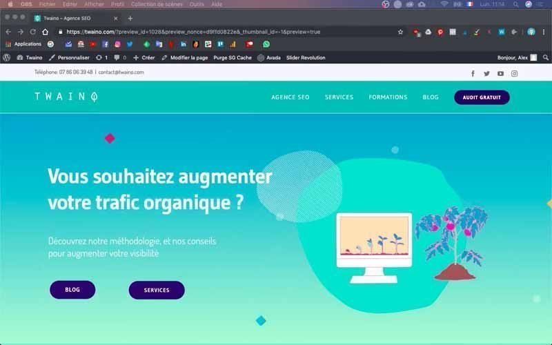
To give you a full understanding of the steps you need to take to adapt your website to the phone, I’m going to use the website of my SEO Agency, Twaino.com.
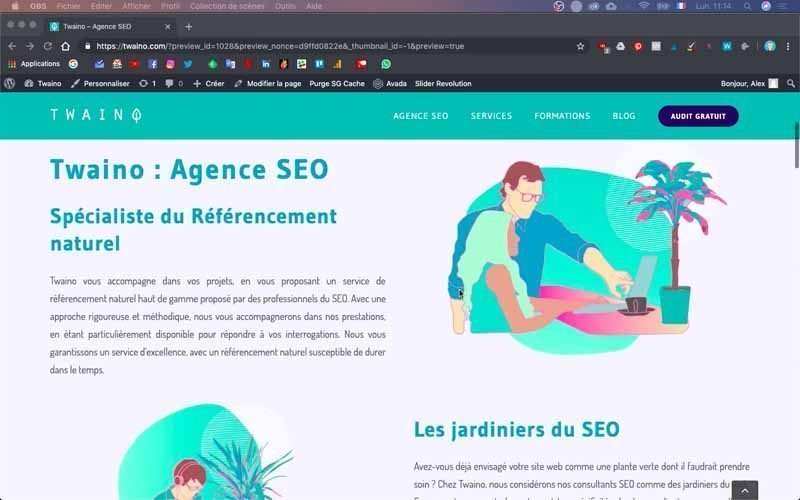
It runs on the WordPress CMS and the theme I’m using is “Avada”.
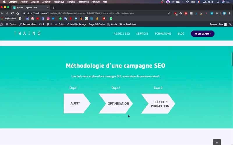
First of all, note that I’ve started a series of articles on creating a website that you can consult depending on the stage you’re at in creating yours.
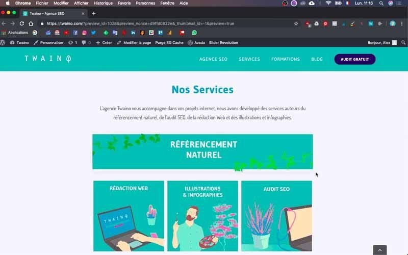
1) Responsive Design: Check your site’s display on mobile devices

If you want to check your site’s display on mobile devices, you can simply use your smartphone to see what your site looks like on this medium, but you can also use your computer’s browser. To do this, simply reduce the width of your browser window by at least a third, while maintaining its height.
When I do this for mine, I notice, among other things, on the home page that :
- The title “Twaino: SEO Agency” is a little too big for a phone;
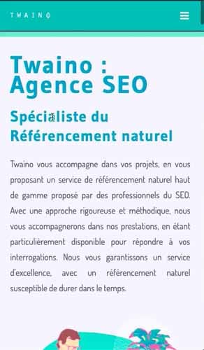
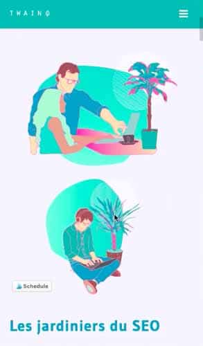
- The layout of the images is not right, since I have two images that follow each other and I’m going to shift their position by putting them between each text;
- The arrows in the “SEO Campaign Methodology” section don’t fit horizontally, but follow each other vertically;

- There are large image squares in the “Blog” section, whereas carousels of two smaller ones could make the user experience more pleasant.
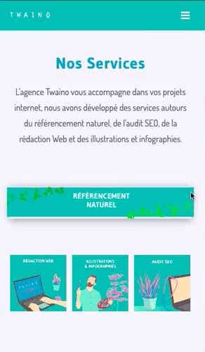
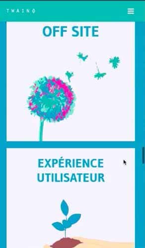
These are just some of the changes I’ll be making. Follow along!
2) Log in to your website dashboard
To make the changes you need, you need to access the WordPress console.
All you have to do is add “…./wp-admin” to the URL of your website in your browser. Mine is “https://twaino.com/wp-admin”.
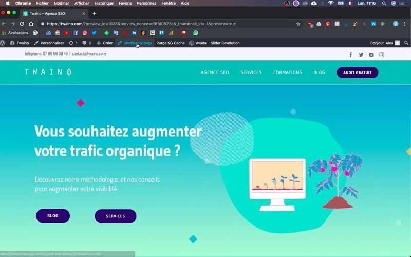
On the login page, fill in the boxes with your identifiers and then validate to access the dashboard.
3) Go to the home page
Once you’re in your dashboard, go to the page you want to make responsive. In my case, this is the home page, and once there, click on the “Modify page” window preceded by a pencil icon, located just to the right of “Create” and right at the top of the page.
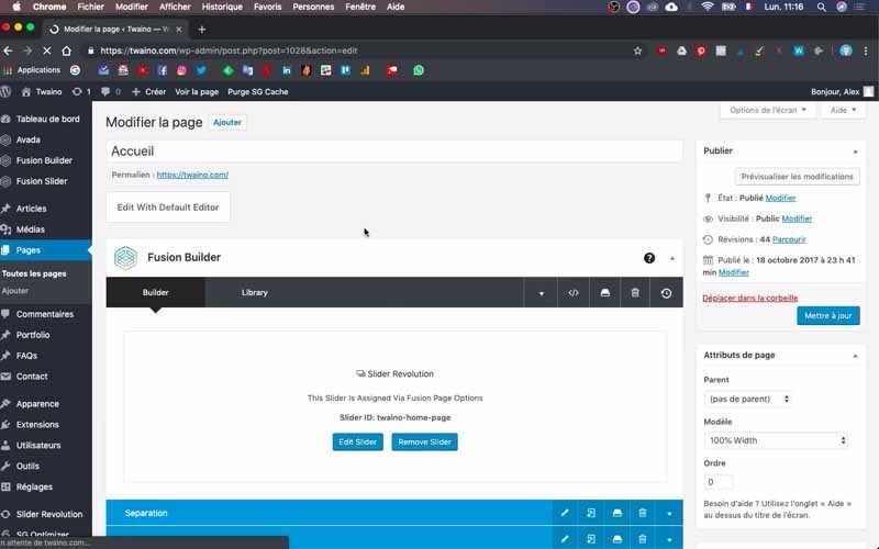
Once on the new interface, you’ll see all the blocks that make up your web page, thanks to your website’s theme. Mine is “Avada” and I’m going to use this interface to make the various configurations.
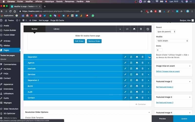
At this point, I suggest you duplicate the home page window in your browser and reduce it. This will allow you to appreciate all the modifications you’ll have to make as you go along.
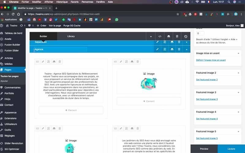
4 Creating blocks for mobile devices or for computers and tablets
You’ll need to perform this action several times, as you’ll be creating mobile blocks for all the blocks you wish to modify. I’ll use the first modification I intend to make to illustrate this.
If you have titles on your page, they may not be optimized for display on a mobile phone. In my case, the title “Twaino : SEO Agency” is too large and I’m going to reduce it.
4-1) Duplicate the block to be modified
To do this, find the block in which the text is located and click on it. The block I want to modify is “Agency” and I click on the little arrow on the right to see its contents.
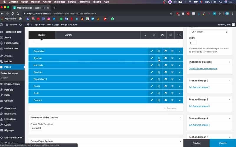
I then suggest you duplicate the block by pressing the second icon from the left. This allows you to create the block for display on cell phones.
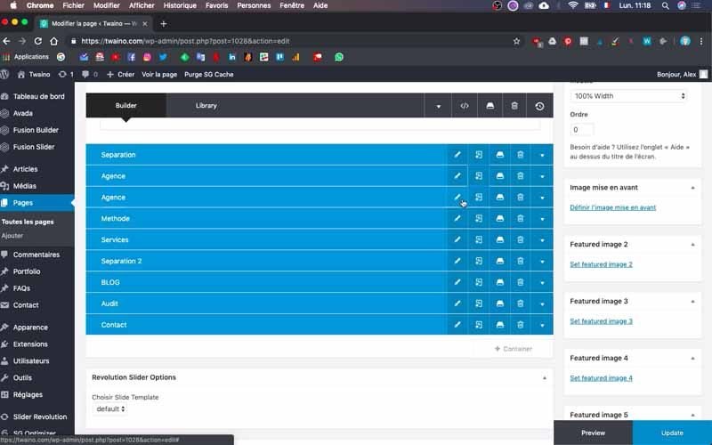
Next, name this new block to make it easier to find. I call it “Agence Mobile”.
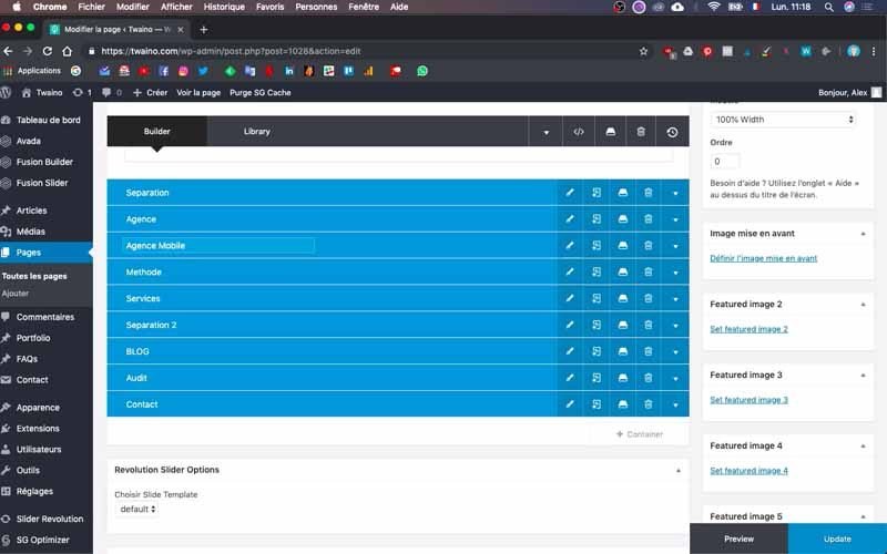
4-2) Create the block for computers and tablets only
The first block you’ve duplicated, which is “Agence” at my level, is the one that will be displayed on all media by default. You must therefore deactivate the phone display option.
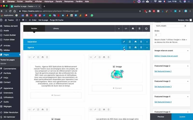
This action allows you to reserve only the first block for display on computers and tablets, and the second block, “Agence Mobile” in my case, for display on phones.
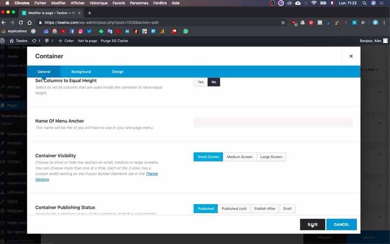
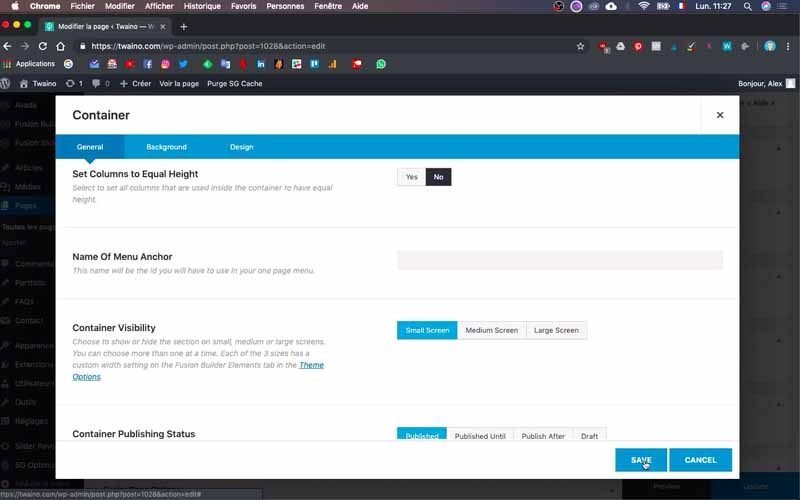
To do this, click on the edit icon, which is first from the left. Then scroll down to “Container Visibility”, which gives you three options:

- Small screen: For small screens including telephones;
- Medium screen: For medium screens, including tablets;
- Large screen: For large screens including computers.
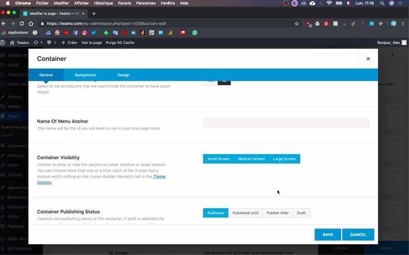
Since I want this block to be visible only on computers, I’ll deselect “small screen” and keep only “medium” and “large screen”.

Save this modification to continue.
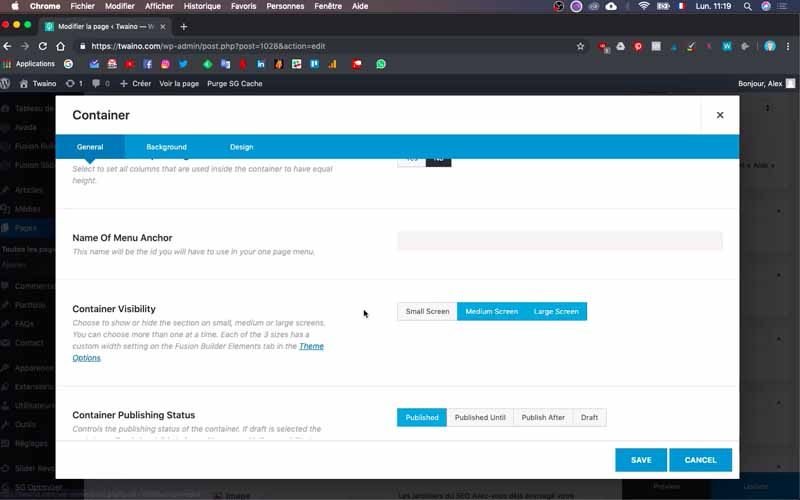
4-3) Create the mobile-only block
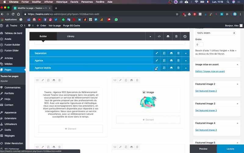
This is the same procedure as the previous step, except that here you’ll deselect :

- Medium screen
- Large screen
Make sure that their color turns gray, which will allow you to use the configuration of the second block, “Agence Mobile” at my level, for display on phones only.
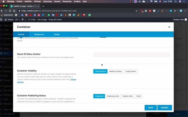
Save this change to take effect. At this point, I’d advise you to always reduce the blocks you don’t use, to avoid making mistakes. If you don’t, you run the risk of making certain changes in the wrong block and having to start all over again, which is not a good idea.
5) Change the font size of your title
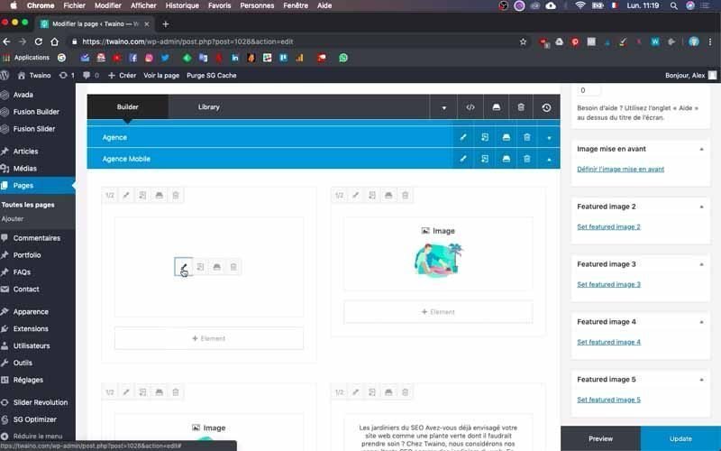
After these steps, you can now move on to the actual editing phase. To change the size of your text, drag your mouse cursor over the area where the text is displayed as a thumbnail. You’ll see an editing icon in the shape of a pencil, which you can press in the first position on the left.
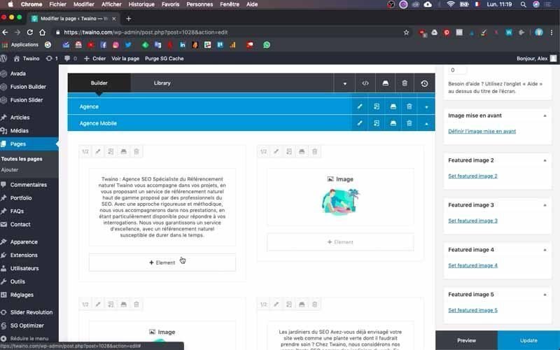
On the page that appears, you’ll see a field containing your text and several options for its formatting.
Then click on the “Text” tab in the top right-hand corner of the text field.
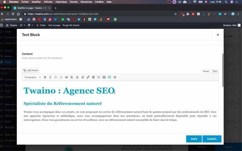
You’ll see the html format of your text, and look for the word “font-size” followed by a number. This is the size of the text you wish to modify.
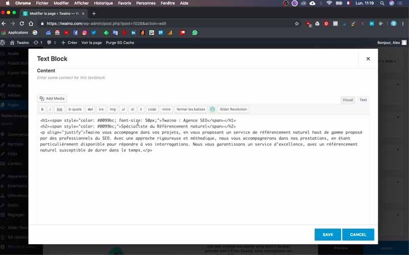
At my level, I have “font-size: 50 px” on the same line as the title whose size I want to change, “Twaino: SEO Agency”.

This indicates that the size of the title is 50 pixels, which I change to 40 pixels.

6) Move your images
There are two images in a row in the “Mobile Agency” block, which doesn’t look good on the phone. So I’m going to move one of them below the text that follows it. Here’s how to do it if you’d like to do the same.
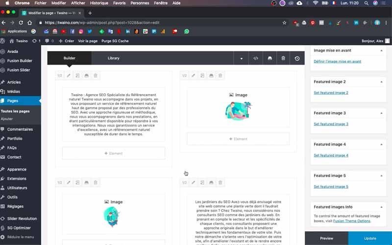
It’s a very simple operation and once in the block, left-click and hold on the image frame and drag it to the area where you want to place it.
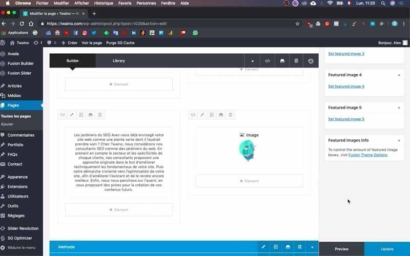
At my level, I drag it to the right and it takes the place of the second text, so I’ve just placed it in the last position.
Save your changes by clicking on the blue “Update” button in the bottom right-hand corner. You can now check whether the settings have been taken into account.
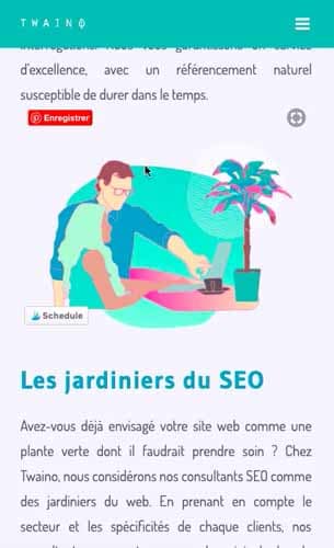
To do this, I refresh the home page in the reduced tab of my browser, and the changes have been taken into account, with a good rendering that is different when moving from a computer display to a phone display.

7) Arrange shape layouts
In the “Method” block, I have arrows that fit in well with the computer display, but give a different result for the phone.
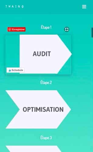
To perform the same action as I did, first duplicate the block and then name it. In my case, I write “Methode Mobile” to differentiate it from the first.
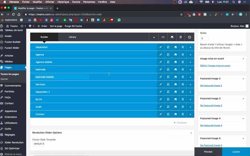
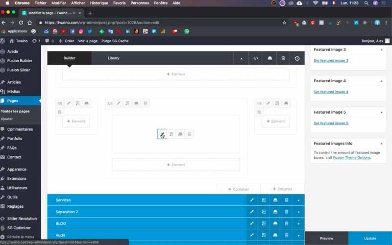
Then, as you did in step 4, deactivate :
- Small screen” for the first block.
- Medium screen” and “Large screen” on the new block.
You can now proceed with the phone modifications.
7-1) Remove old arrows
Click on the little arrow on the far right to see the contents of the new block you wish to modify, “Methode Mobile” in my case.
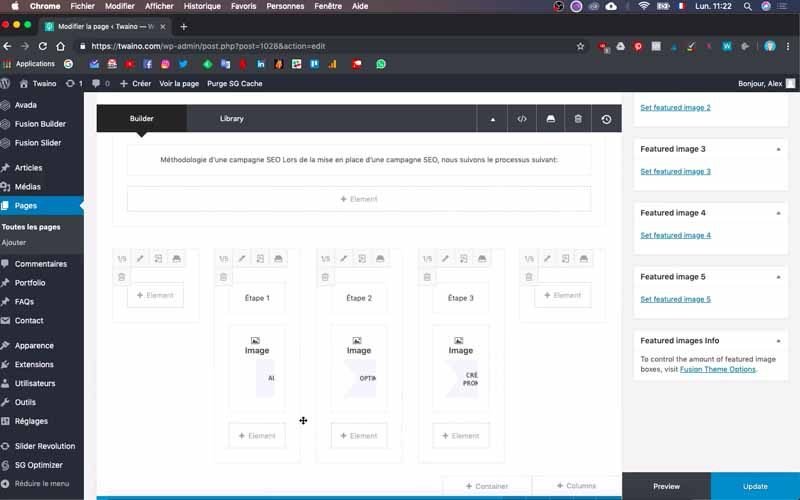
I’ll delete the other elements, leaving just one, which will allow me to have all the content on the same line. To do this, simply click on the trash icon that accompanies them.
7-2) Insert an image
Move your cursor over the image and press the pencil-shaped edit icon on the left to make your changes.
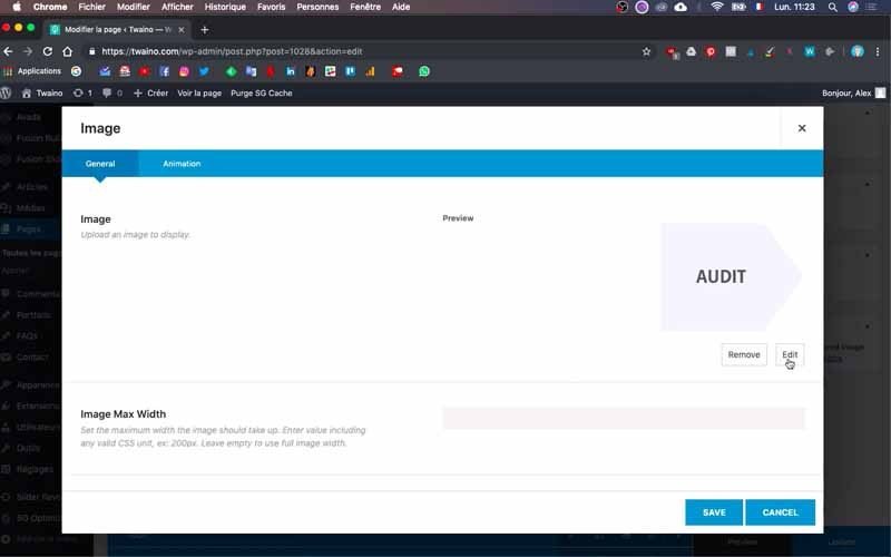
On the interface that appears, select the “Edit” button on the far right, just below the image. This takes you to your website’s “Media Library”.
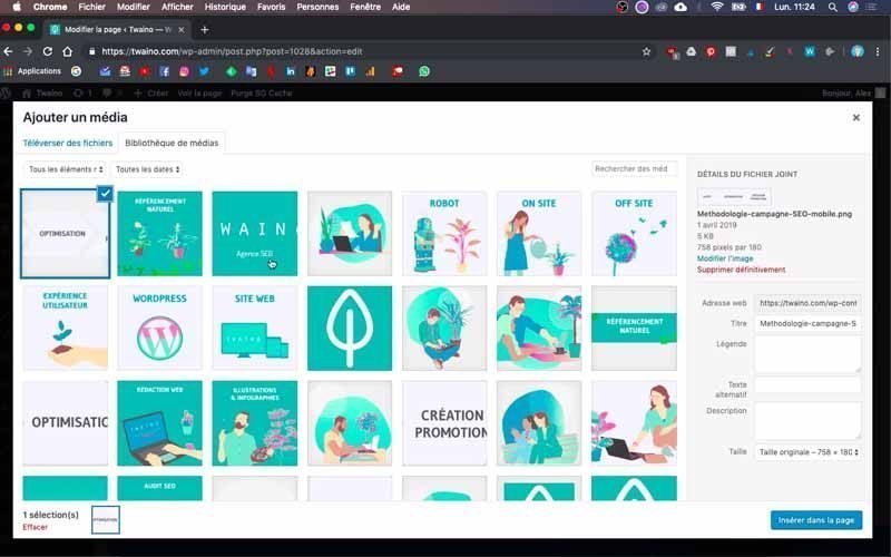
You can select one of the images already in your library or upload a new image. At my level, I’ve already created a small image with Adobe Illustrator that I can use.
To do this, I click on “Upload files” and then on “Select files” to upload the image from my computer.
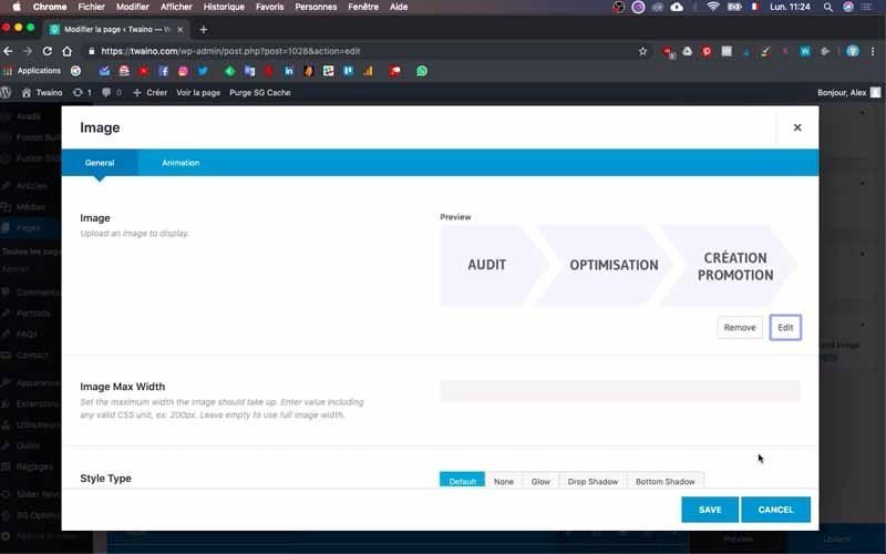
I take care to name the image and press the “Insert on page” button. After saving by clicking on “Save”, I click on “Update”, which takes my changes into account.
Once I’ve updated the home page, I can see that I’ve got the look I wanted.

Bear in mind that at this point, we’ve just inserted a single image for the phone display instead of three different images for the computer display. As a result, there will be just one link and one clickable image for the mobile display instead of three in the second case.
8) Create a cube of well-structured images
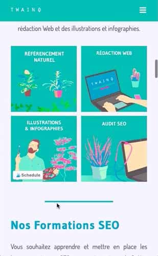
In the “Services” block, the actual mobile display is skewed. In fact, of the three images that follow each other below the “NATURAL REFERENCEMENT” banner, only two appear.
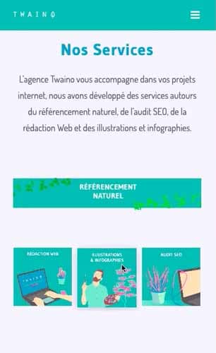
To correct this, I’m going to create a cube in which I’ll place the three images as well as a square “NATURAL REFERENCEMENT” image.
8-1) Create the new block
To make these changes, which will only affect the mobile display, first proceed in the same way as in step 4. In other words:
- Duplicate the old block;
- Rename the new block;
- Configure the display for both blocks.
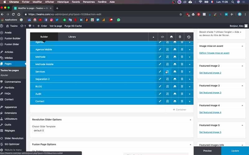
In my case, I have “Service” as the old block and “Service Mobile” as the new block.
8-2) Create a cube of 4 images
Click on the little arrow on the far right to see the contents of the new block. To get the result I want, I remove the “NATURAL REFERENCING” banner. Next, I modify the organization of the three images.
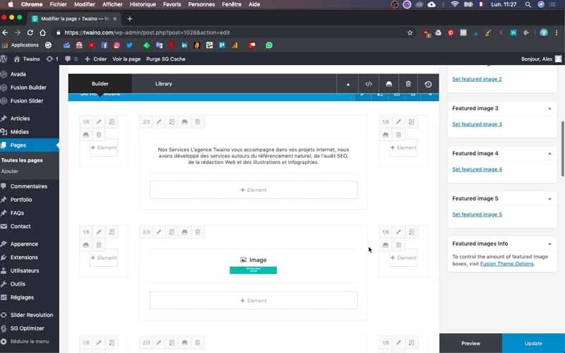
I click on the pencil-shaped edit icon and delete one of the images to obtain the two that will form a line in my cube. To do this, simply click on the trash icon on the same bar as the image name and save.
Finally, I’ve got two images that I’ll duplicate to make the second line of my cube. To do this, click on the icon just after the pencil icon in the second position.
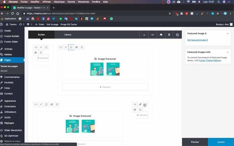
Adjust them so that the two sections are correctly aligned one below the other. Now change the duplicated images by putting the other two images in their place, either from your “Media Library” or by loading them from your computer.
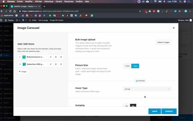
I’ve now got my four images featuring my services:
- NATURAL REFERENCING ;
- WEB COPYWRITING ;
- TRAINING;
- SEO AUDIT.
8-3) Change the distance between the images
I save the changes and refresh the home page to see how it looks. My cube with the four images has appeared, but the vertical distance is quite large.
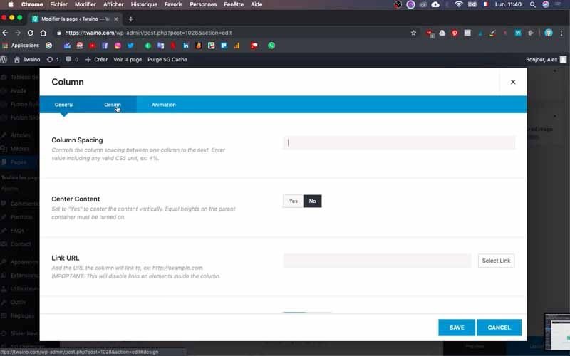
To reduce it, press the edit icon in the first row of images in the “Mobile Service” block. Then click on the “Design” window, which is right in the middle of “General” and “Animation”.
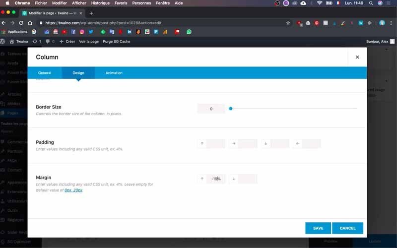
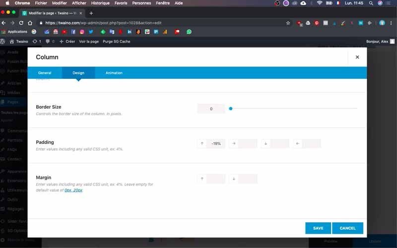
In “Margin”, enter a lower number – I’ve filled in “-15%” at my level. Then save and refresh your page to see how it looks. Mine is perfect, and I recommend varying the “Margin” to get the ideal result if you don’t get it all at once.
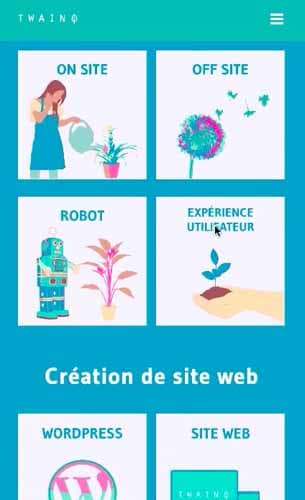
9) Add image carousels
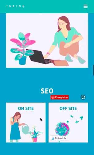
In the “Blog” block of my website, I’ve got large images that follow each other horizontally, which doesn’t look good. So I’m going to create lines of two images each.
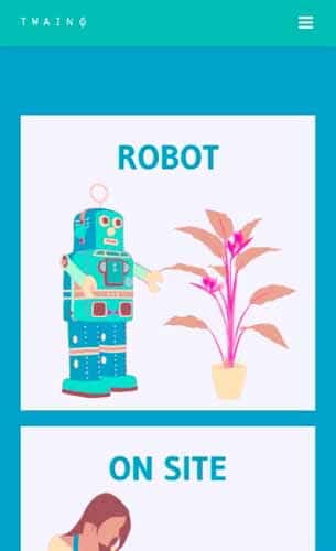
So I go to the “Blog” block and duplicate it to create the “Mobile Blog”. Use the same process described in step 4 to do this.
9-1) Choose carousel and insert images
Open the content of the “Mobile Blog” block by clicking on the little arrow on the right. Then click on “Element” and search for “Carrousel” in the appropriate bar.
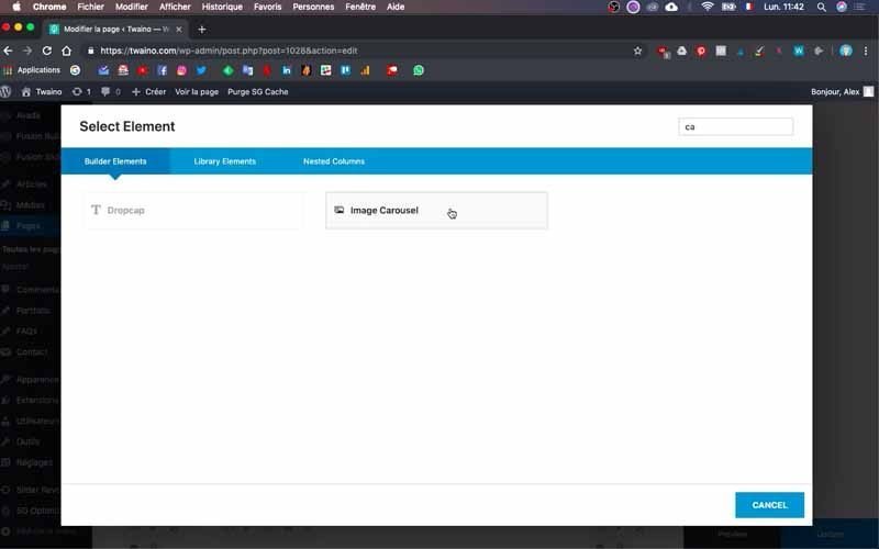
The “Image Carousel” button appears, which you click on. On the page that appears, press “Select images” under “Bulk image Upload”, which takes you to your “Media Library” to select images.
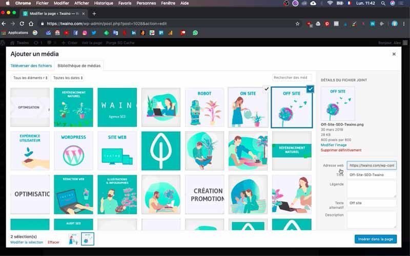
In my case, I first select the two images marked “ON SITE” and “OFF SITE” for the “SEO” carousel.
9-2) Configure the carousel
After selecting images, scroll down to :
- Picture size” and press “Auto” to enable automatic sizing;
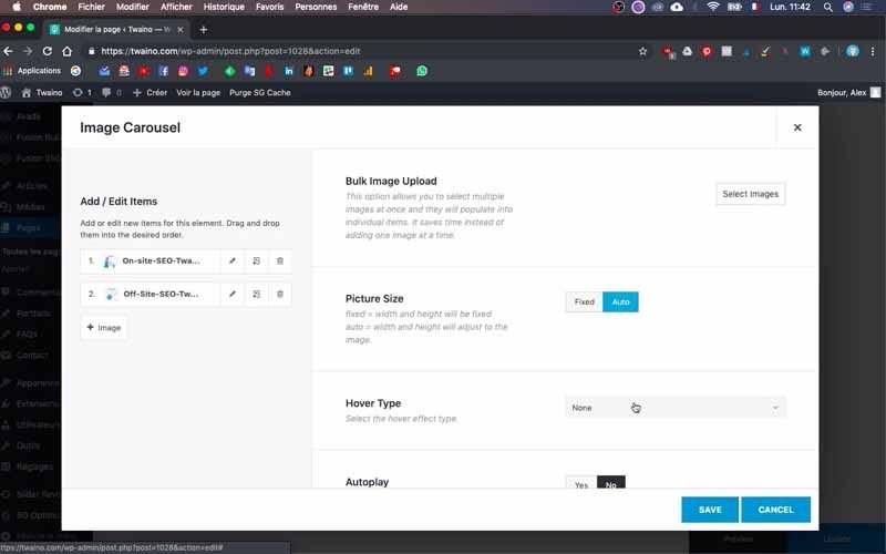
- Hover Type” and select “Lift Up”;
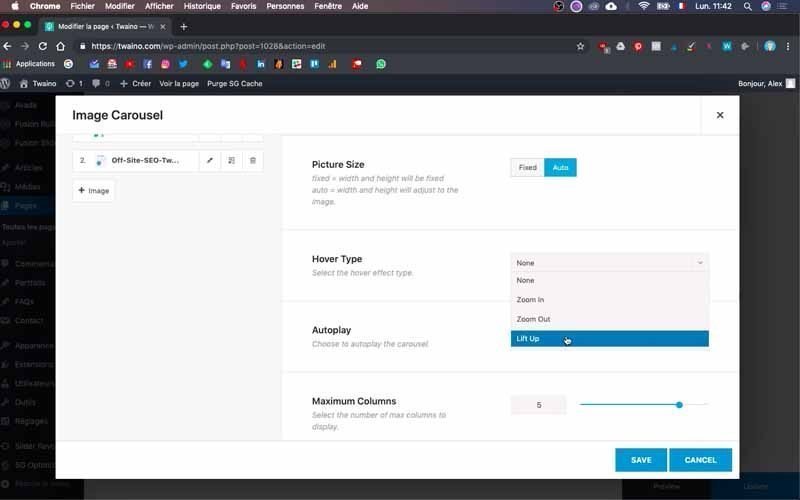
- Autoplay” and check “No”;
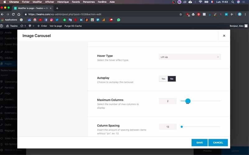
- From “Maximum Columns” and select the number you want. I use two for my images;
- From “Show Navigation” and select “No”.
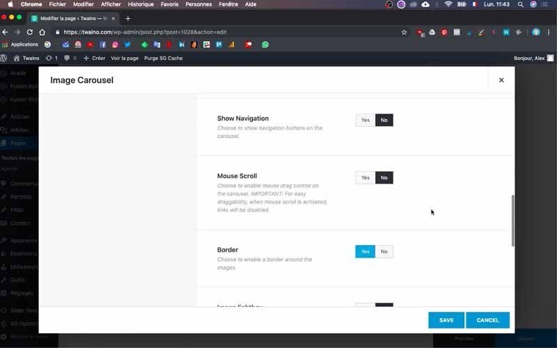
I then save these modifications to view the rendering on my website’s home page.
The result is conclusive and to continue, you need to remove superfluous elements from your block. To do this, click on the trash can icons just above the elements.
9-3) Create other carousels
If you wish to add other image carousels, duplicate the first one you’ve just created. This allows you to keep the various configurations you’ve already made.
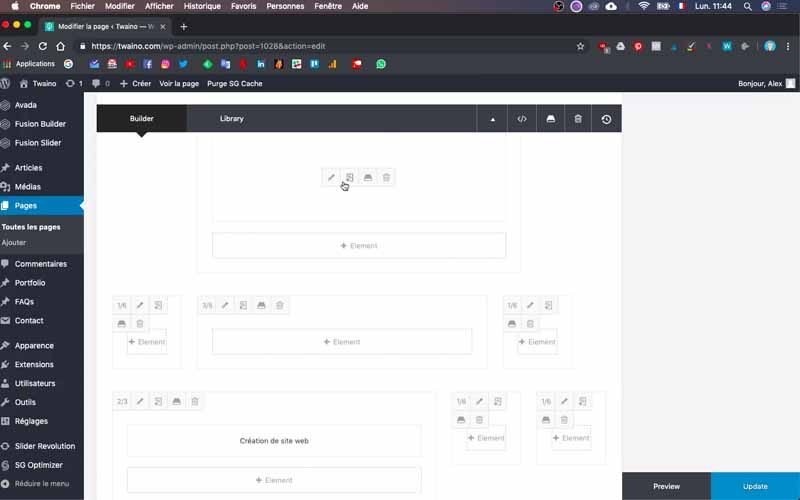
Then select the images you wish to replace those already present.
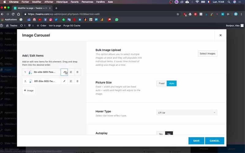
To do this, click on the edit icon on each old image. This allows you to select the new images one by one.
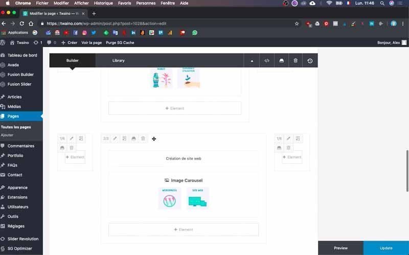
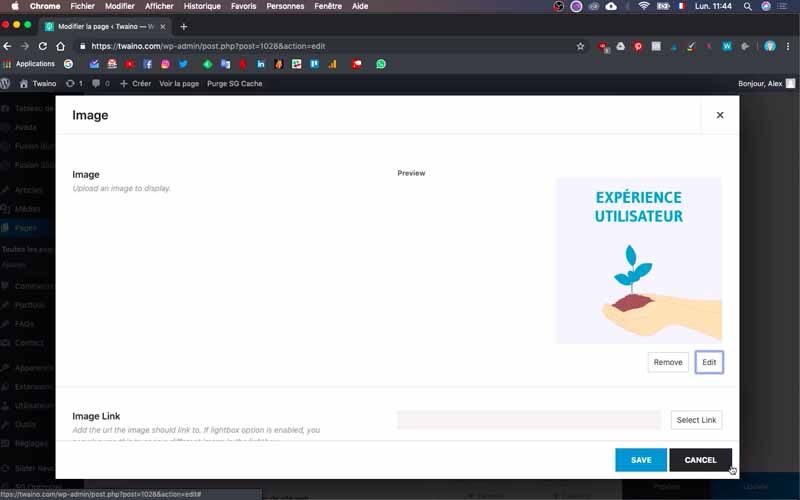
At my level, I take the two images labelled “ROBOT” and “USER EXPERIENCE” for the “Website Creation” carousel.
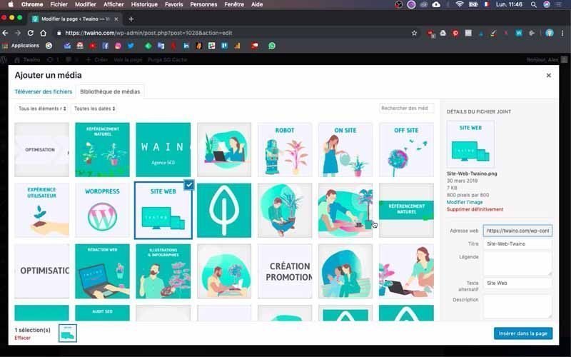
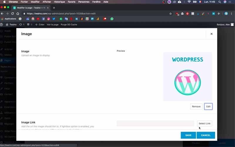
I do the same for another image carousel, this time importing “WORDPRESS” and “WEBSITE”.
I also take the opportunity to set the “Margin” of the “Design” parameter to “-19%” so that the distance between images is small.
9-4) Adjust spaces
I save the changes and refresh the home page. The rendering is good, except for the space between the “Mobile Blog” and “Contact” blocks.
To reduce it, click on the edit icon on the same line as the block name and click on the “Design” window.
Decrease or increase the “Padding” depending on whether you wish to decrease or increase the distance.
Feel free to go back and forth several times to find the perfect result.
10) Check your changes one last time
You’ve just finished optimizing your website for cell phones. But to make sure everything’s working properly, carry out a final check. This involves examining the final display on each support.
This will let you know if you’ve tampered with the widescreen display without realizing it. From there, you’ll know exactly what to do to solve the problem.
And that’s it! You’ve just adapted your website to the telephone.
FAQ:
What is responsive design?
What is responsive design?
Responsive design is an approach to website design that aims to deliver an optimal user experience whatever the type of device used to access the site. It’s about making the site’s content and layout fluid and automatically adapt to the width of the screen, rather than creating separate versions of the site for each screen resolution.
Why should I make my website compatible with mobile devices?
More and more users are browsing the web from their smartphones or tablets, so it’s important to offer them a pleasant, easy-to-use experience. A website that isn’t adapted to small screens can be difficult to read and navigate, which discourages visitors and can harm your search engine rankings.
Do I need to create a sub-domain specifically for mobile devices?
There’s no need to create a sub-domain dedicated to mobile devices if you opt for a responsive design. You can simply use media queries to modify the presentation of your site according to screen width. This method has the advantage of being simpler to set up and of not splitting your traffic between several domains.
What can I do to test my website’s mobile compatibility?
You can use online testing tools, such as Google Mobile-Friendly Test or BrowserStack, to simulate the display of your site on different device types and identify potential problems. It’s also advisable to manually test your site on several devices to ensure that it functions correctly and offers a good user experience.
Conclusion
Today, more than half of all Internet users connect to the Internet via cell phones. As this number continues to grow, it’s important to create a responsive website that automatically adapts to all types of media.
This will considerably enhance the user experience. A factor that is also very important for Google, which doesn’t hesitate to rank responsive websites in the top positions. I suggest you follow the steps outlined in this article to offer your users the best possible experience.
See you soon!

