Want to offer future visitors to your website an impeccable navigation menu? Congratulations !
You are in the right place since I will take care of offering you all the tips, tools and procedures to follow to obtain the appropriate result according to your needs.
Indeed, the menu of a website is a very important element for visitors, and contributes to a good user experience.
And for good reason, the menu allows you to have a global view as well as all the sections of the website. It is therefore an element that allows Internet users to determine whether or not they will continue their visit.
You therefore have to offer an impeccable menu. So that you can do this, I am adding a video to this article that visually shows you the steps described here.
Creating a menu in WordPress
I show you in thisvideo how to create a menu in WordPress using Avada theme:
The menu: Essential tool for navigation
The menu of a website or the navigation bar is the element that allows you to easily browse the pages of a website, even if it is very dense.
If you take a look at the top of this article, you will see the following headings:
- TWAINO: This page redirects you automatically to the home page;
- SEO AGENCY: Presentation of my Twaino SEO Agency;
- SERVICES: This page presents my different services;
- TRAINING: In this section, I tell visitors the training I offer;
- BLOG: This page includes all my articles and videos;
- FREE AUDIT: Takes you to a form.
As you can see, it only takes a simple click on one of these sections to automatically find yourself on its page, so it is simple and effective navigation, which visitors will appreciate. This is exactly the main role of the menu or navigation bar of a website.
What are the best places to position your menu?
Always placed in the same place from one page to another, the navigation menu is generally arranged in two places:
- Horizontally at the top of the page;
- Vertically to the left of the page.
This provision gives it the privilege of always being visible and being quickly accessible regardless of the size of the browser window.
We can therefore say that localizing the menu in this way is part of the standard, and facilitates the user journey.
Note, however, that the menu can also be arranged vertically on the right and can be floating: this is called a mega menu.
But I strongly recommend that you do not choose this option since Internet users have already become accustomed to the two previous provisions and especially the first.
Showing originality will therefore not necessarily be a positive thing as it will only disturb them and scare them away.
On the other hand, it is sometimes useful to insert navigation zones that are independent of the main navigation menu.
Indeed, these areas can be specific to certain pages and offer users additional elements to deepen theirnavigation.
These include, for example, options for refining the purchasing criteria on an e-commerce site with, for example, the presence of a filter: size, price, color, gender and many others.
Best practices for having an impeccable navigation menu
Think about the structure of your site beforehand
Before moving on to the stage of creating my menu, I first had the opportunity to design the model for my Twaino.com website. I advise you to do the same for several reasons that I mentioned in my article on the subject, which also includes the process to follow to successfully design your website.
This step allows you to create the tree structure of your website and identify the different sections that you will have in your navigation menu.
Choose the most suitable location
You have the choice between the three provisions that I mentioned a little above:
- Menu horizontal ;
- Vertical menu on the left;
- Vertical right.
You can make combinations, but try to avoid redundancies in order to optimize the user experience as much as possible.
Limit the number of links
In a navigation menu, you can add the number of sections you want. But I suggest you not exceed 7 different sections.
Indeed, too much choice will lead to less readability and risks increasing the confusion of the user who will avoid your website.
Instead, consider creating submenus and using your footer to integrate some static pages like “Who are we?” », “Legal notices”, etc. In addition, make sure that your menu does not have any redundancy, such as putting the “Home” section when your logo is clickable and leads back to this page.
Choose explicit names
Another very important element is the choice of the names of your sections or “menu items” and you must ensure that they are explicit. Indeed, you must ensure that the visitor to your website immediately knows what they will find on the page and only one word is generally enough. So, instead of choosing “The blog of…. » take “blog” or “our rentals” instead of “our furniture rentals…..”.
Moreover, choose names that are really meaningful for your activity. For example, if I only put “Services”, this does not allow visitors to know at first glance that I offer SEO services and training.
Order the links in your menu correctly
Another very important aspect remains the order of display of links in your navigation menu. I suggest you put the most important pages or the heart of your activity first. The custom is to put the “Find us” or “Contact us” pages at the end and Internet users are already well accustomed to this provision.
Remain consistent on the different pages of your site
It is possible to have menus on certain pages that differ in terms of layout and order.
But I recommend that you keep the main menu and if necessary add a secondary menu specific to certain pages. You will thus offer a coherent site and facilitate navigation for Internet users who will be able to follow you easily.
Create your own menu on WordPress: the steps to follow with the Avada theme
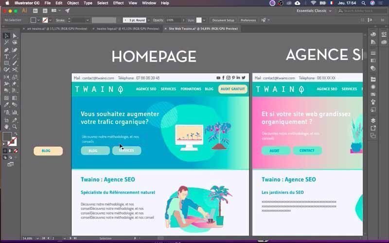
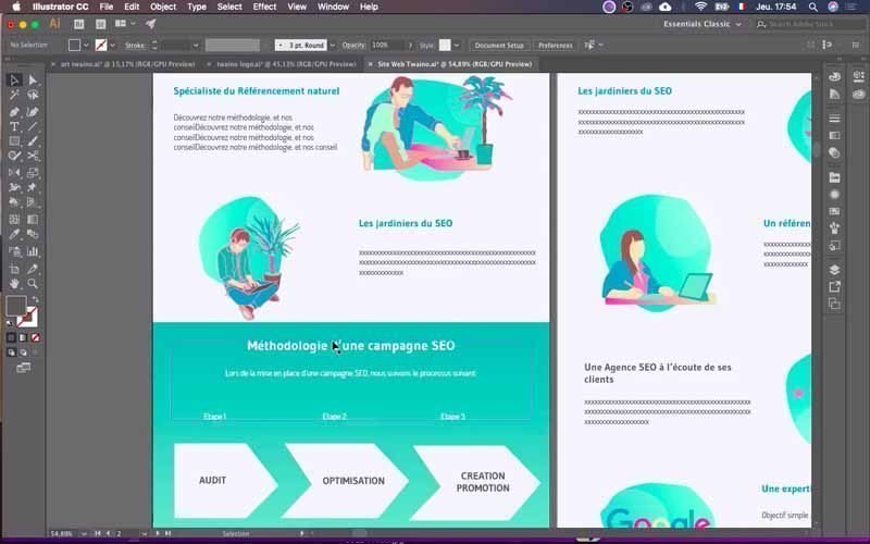
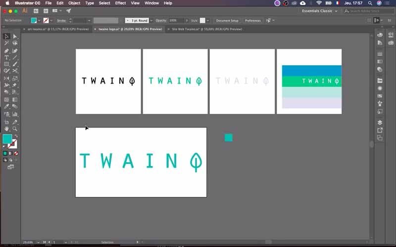
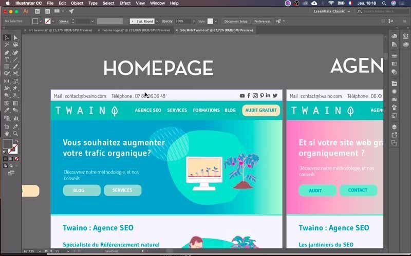
I will use the model that I created with the softwareAdobe Illustrator to create the menu for my website Twaino.com.
Indeed, this model allows me to have a precise idea of the expected result and therefore to know how to proceed exactly.
Additionally, note that I will be using the “Avada” theme that I installed and that the entire process is based on it. Depending on the themes you have, you’re probably not going to have the exact same interfaces as me. However, you have the option to adapt the process to suit your own theme.
It is important to note that the creation of the navigation menu involves two main stages including:
- Adding your logo;
- Creating sections of your navigation menu ormoney menus (list of sub-elements) and its design.
So I will first show you how to add your logo to the navigation bar in your header.Insecondly, I show you how to configure and designate the sections of your navigation menu.
Let’s go then!
Log in to your site’s “Admin” account
Before beginning either of the two main steps, you must first log in to your website administrator account to access the WordPress Dashboard. Therefore, all you need to do is add “…./wp-admin” to the URL of your website. Then fill in the boxes with your identifiers and validate.

Add your logo to the navigation menu: the steps to follow
For my demo theme “Avada SEO”, there is already a default logo. So what I’m going to do is change this logo and put mine in its place.
1) Go to your theme options
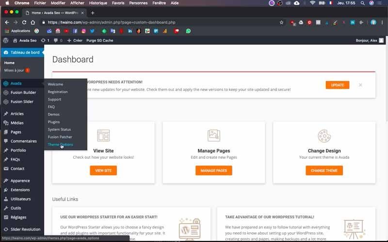
On my dashboard, I go to the “Avada” section, which is my theme, and in the menu that appears, I choose “Theme Options” which offers me a configuration space with several elements.
2) Choose the type of logo to change
On this new page, click on the “Logo” option onthe second left sidebar. You then have two subsections including:
- Logo: this is the classic navigation menu logo;
- Favicon: this is the small icon that appears on browser tabs. This allows the Internet user to identify the tab of your website, even if it is on another website.
3) Change the default logo and its variations
3-1) Change “Default Logo”
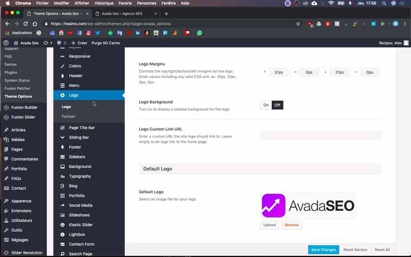
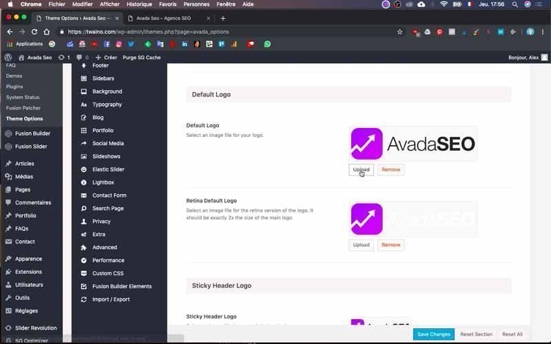
To change the default logo, you click on the “Logo” subsection and scroll down to the “Default Logo” option. At this level, click on the “Upload” button to replace your logo.
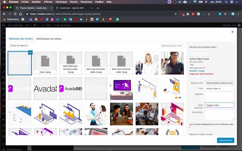
I would like to point out to you here that on the interface that appears, you can directly see the size of the current logo to have a precise idea of the size needed for your logo to correctly fill the space that ‘occupies this one.
To do this, look at its details which are presented in the right sidebar.
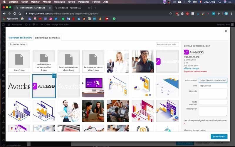
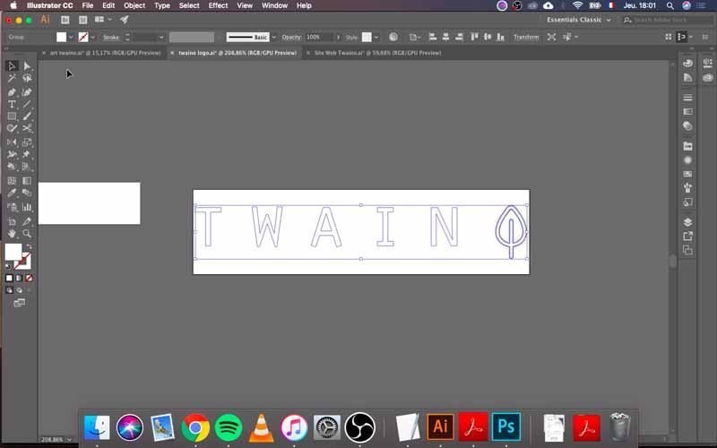
At my level, I have 165 x 41 pixels and if you created your logo yourself, you can easily modify its size as I will do with Adobe Illustrator in the video.
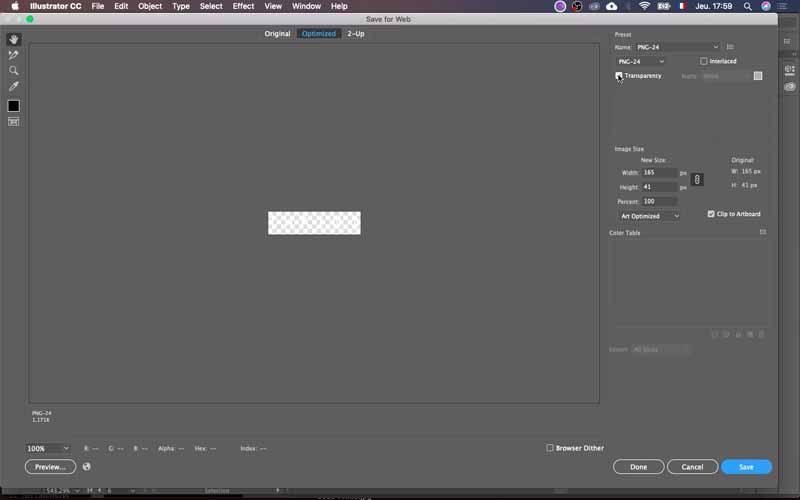
If you haven’t designed it, just communicate the sizes to your graphic designer so they can do so.
If your logo is already ready, press the “Upload files” window which allows you to directly download the logo from your computer. You have two choices:
- Directly drag and drop the logo file onto the page;
- Click on the “Select files” button to manually search for the logo in your folders.
I choose the second option and my logo loads into the “Media Library” of my website. Here you have the opportunity to name your logo, which I do by saying “Twaino-logo 1x” and then press the blue button at the bottom “Select”.
My logo takes the place of the default logo.
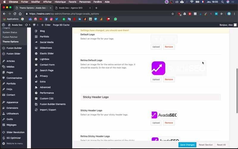
3-2) Change the other variations of the default logo
3-2-1) Retina Default Logo
Then go to “Retina Default Logo” and click on “Upload” to change it. I proceed in the same way as before by taking the exact dimensions to adjust my logo. I upload it to the “Media Library”, name it “Twaino-logo 2x” and select it.
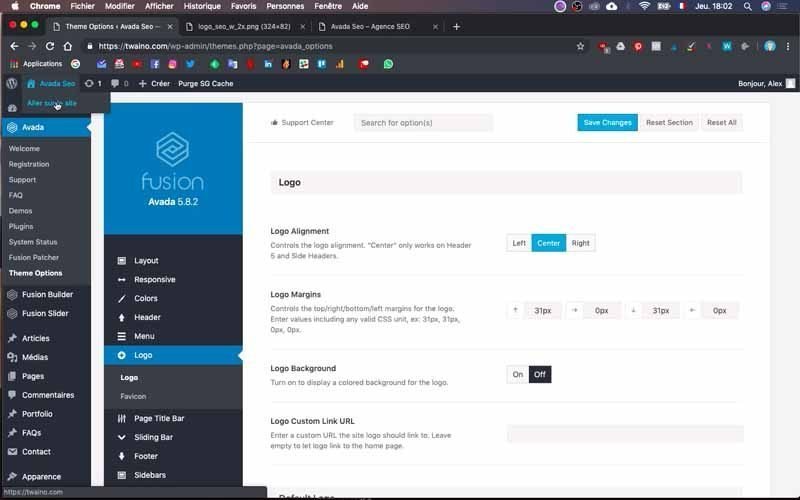
I first save to see if the changes have actually been taken into account. For this, I mustreturn to the home page of my website and of course in another tab.
To do it simply, go to the top left corner and click on the house icon followed by the demo theme name “Avada SEO”. Then press “Go to site” which takes you directly to the home page, in another browser tab.
I can see that the default logo has been replaced by my logo.
3-2-2) Sticky Header Logo
I continue the modifications this time with “Sticky Header Logo”. Indeed, a sticky header is a menu that will remain “fixed” at the top of your page, even when you go down while browsing/reading.

At this level, I have two options including “Sticky Header Logo” and “Retina Sticky Header Logo”. Note that stickers are very interesting elements on a website and which will be the subject of another article.
I proceed in the same way as before to replace these default logos. Except this time, I just have to select the corresponding logos in the “Media Library”. Try to select the chosen logo from “Default Logo” to “Sticky Header Logo” and “Retina Default Logo” to “Retina Sticky Header Logo”.
3-2-3) Mobile Logo
Right at the bottom of “Sticky Header Logo” there is “Mobile Logo” and you also need to change the default logos it includes.
Proceed in exactly the same way as in the previous step and take care to choose the same “Default Logo” logo for “Mobile Logo” and the “Retina Default Logo” logo for “Retina Mobile Logo”. Then save by clicking on the blue “Save” button which is located at the bottom.
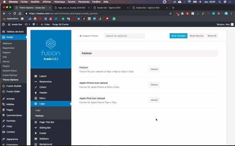
4) Change the Flavicon
Then click on the “Flavicon” subsection of the “Logo” menu to change the Flavicon of your website. Indeed, a Flavicon is a small image that is located in the bar of your search browser. This is a small image that will help Internet users very easily identify your website in a browser.
On the page that opens, you will see three different options with the appropriate dimensions for each of them. It is :
- Flavicon: a size of 16 px x 16 px or 32 px x 32 px;
- Apple iPhone Icon Upload : 57 px x 57 px ;
- Apple iPad Icon Upload : 72 px x 72 px ;
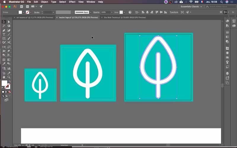
You will therefore proceed to modify the size of your logo to have these three different formats. In my case, I do it quickly with Adobe Illustrator software.
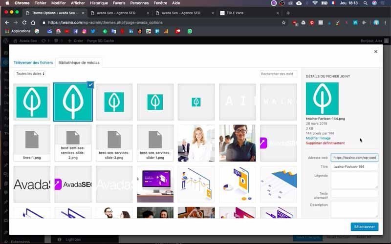
Then, simply click on each “Upload” button to upload the logo corresponding to each option.
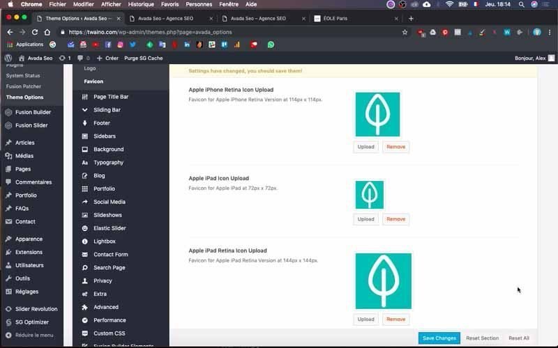
By adding these logos, you will notice that there are other options added. Just modify your logo again in order to upload them too. I advise you to do everything at once so as not to leave anything that could probably cause you trouble later.
After loading all the logos, click on the blue “Save changes” button at the bottom to save the changes. If you go to the home page of your website, you will see that your logo appears in your browser tab.

My logo appears well in my browser and as everything seems perfect, I move on to creating the sections for my navigation menu.
Creation of navigation menu sections: the steps to follow
There are two different ways to create the navigation menu:
- From the home page;
- From the “Avada” theme.
The first is actually a navigationproposed failing that by WordPress and personally I don’t necessarily use this method, but I find it interesting to present it to you.
From the home page
Still connected to your administrator account, you will go to the home page.

Then click on the “Personalize” button followed by a brush and which is located at the top and to the left of the update icon.

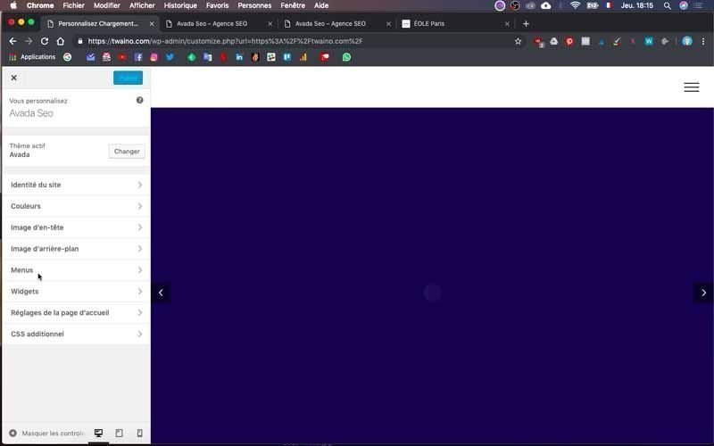
On the interface that appears, tap the “Menu” section located on the left sidebar.
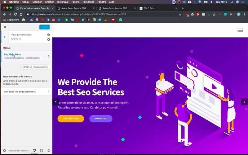
I then click on the name of the menu “SEO Main Menu” in my situation.
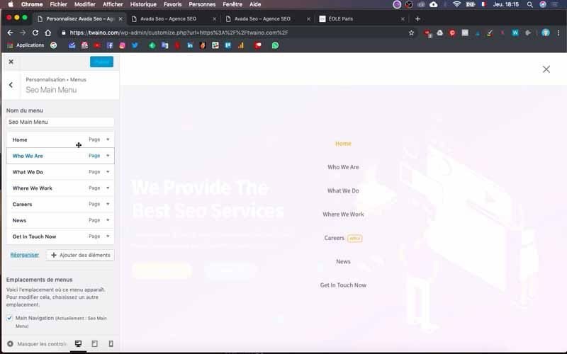
An interface then follows where all the categories of the default navigation menu are located. By clicking on “+ Add elements” you will be able to add other sections to those that already exist. You can also reorder them by clicking on “Rearrange”.
Configuring the navigation menu with Avada
This method allows you to configure your navigation menu much more precisely. This is the main reason why I personally prefer it to the previous one. Note that at this level, I distinguish two main stages including:
- Creation of the menu (with text);
- Le design du menu.
1) Creating the menu (with text)
This step allows you to display the different sections that you want to have in your navigation menu.
1-1) Access the menu configuration page
There are two possibilities to go to the menu configuration page:
-From the home page, click on the “Avada SEO” window and in the menu that appears, select “Menu”;
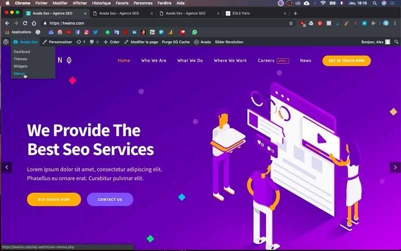
-In the Dashboard, you must click on the “Appearance” section and then on the “Menu” option.
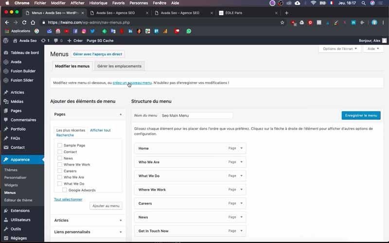
1-2) Create a new main menu
On the configuration interface, click on “create a new menu” which is located just at the bottom of the “Edit Menus” window. Then indicate the name of the menu you want to add then press the blue “Create menu” button which is located just to the right. For my website, I create the “Twaino” menu.
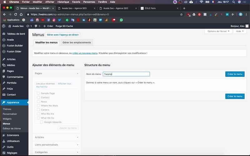
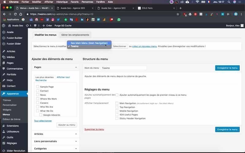
You can now configure your new menu and different options are offered:
- Main Navigation: Allows you to make it your main menu;
- Top Navigation: Allows it to appear on the bar located just above the navigation menu bar;
- Mobile Navigation: Allows you to create specific menus for mobile navigation;
- 404 useful pages: For 404 error pages;
- Sticky Header Navigation: Allows you to integrate it into the menu that appears when you scroll down your site.
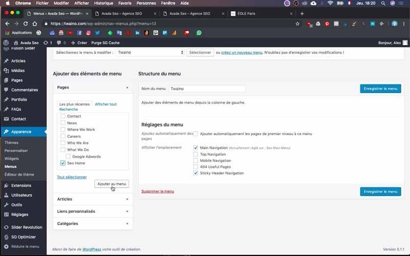
In my case, I select the first option and the last for my “Twaino” menu.
1-3) Then create the menus
After creating this main menu, you can create the menus that will appear on the navigation bar.
To do this, several options will be available to you to add items to the menu:
- Add a recent page: You will be able to choose in this section a page that you wish to integrate into your menu;
- Add an article: WordPress gives you the possibility to add an article to your menu with this option;
- Add a custom link: If you want to send your visitors to a particular page on your site or to an external site, you can use this option by adding the URL of your choice;
- Add a category: To navigate a site, it may be interesting to add a category to the menu.
In my case, since my website has just been created, I don’t necessarily have the pages and articles that exist. Therefore, in order to show you how to do this, I will add “custom links”. Obviously, once all my pages are built correctly, I will have the opportunity to change my menu to make it perfectly clean.
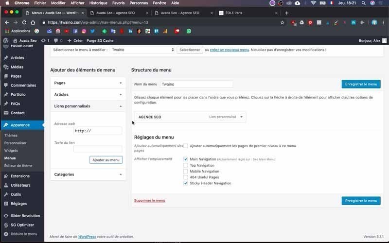
For the purposes of my video and this tutorial, I’m going to click on “Custom Links” which is just at the bottom of “Articles” in the sidebar just to the left and labeled “Add Posts” at the top. menu items”.
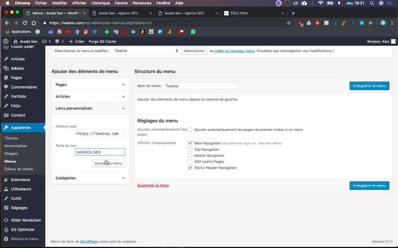
Take care to first indicate the link to your site in the “Web address” section. Don’t forget to complete the “s” in “http” if you have already switched to HTTPS.
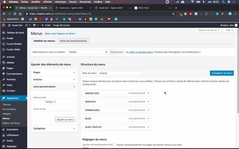
In the “Link text” section, enter the names of the menus you want to have. At my level, I write “https://twaino.com » and successively the following names:
- AGENCE SEO ;
- SERVICES ;
- FORMATIONS ;
- BLOG ;
- LISTEN FOR FREE
Then you click on the blue “Save Menu” button which is located just at the bottom to have a first preview.
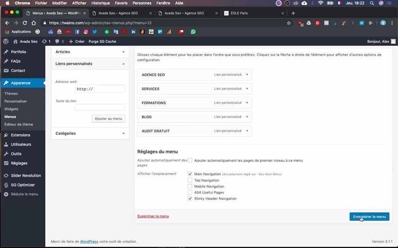
If you go to the home page of your website, you will notice that the menus have actually appeared as I have on the home page of my website. The next step is to modify the design of the current menu to achieve the desired result.

2) The design of your menu
To have the desired design for your menu, you will go to your theme options.
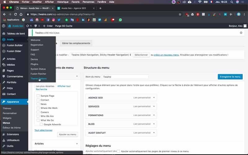
To do this, go to “Avada” in the left sidebar of your dashboard and click on “Theme options” then “Menu”.
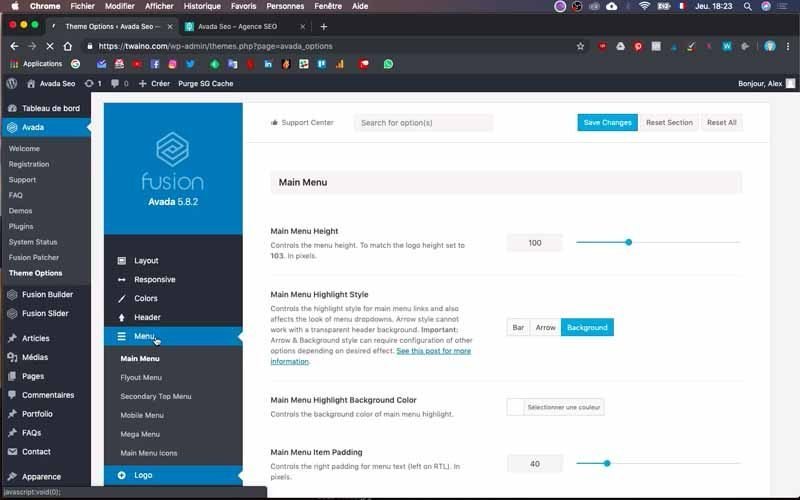
On the interface that appears, you have all the options to “design” your menu.
2-1) Change menu text color
First click on the “Main menu” section then scroll down to “Main Menu Font Hover/Active Color”.
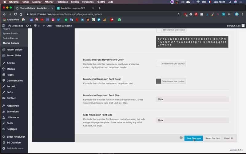
Press “Select a color” and choose the color you want to give to your menu names.
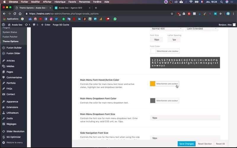
I take the white one given the model that I established previously. Validate this modification by clicking on the “Save Changes” button and go to the home page of your website to see this change. In my case, I have all the names of my menus in white.
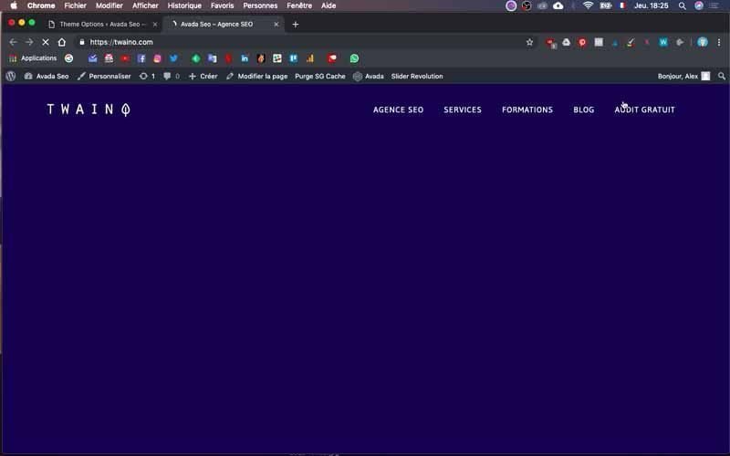
2-2) Put a colored button under a menu
For my “FREE AUDIT” menu, I want to place a colored button below to make it stand out from other menus. If you want to do this too, go to the “Appearance” section located on the left sidebar of the dashboard. Then click on “Menus” and on the menu bar in question, press the arrow on the sideright to unroll it.
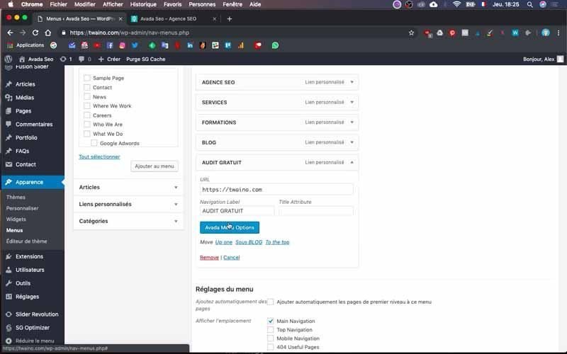
Select the blue “Avada Menu Option” button which takes you to the configuration interface. At the “Menu First Level Style” level, you can choose the size of the button. I choose “Button Medium” to have an average size.
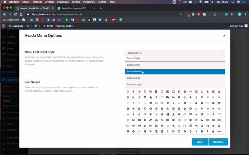
You can also integrate aicon and change the color of the button. For the last point, click on “Select a Color” which is in front of the “Menu Highlight Label Background Color” option. Choose the color that suits you, but as I already have a color to use, I simply copy its code and paste it in the corresponding part to have exactly the color I want.
After these configurations, validate them by pressing “Save menu”.
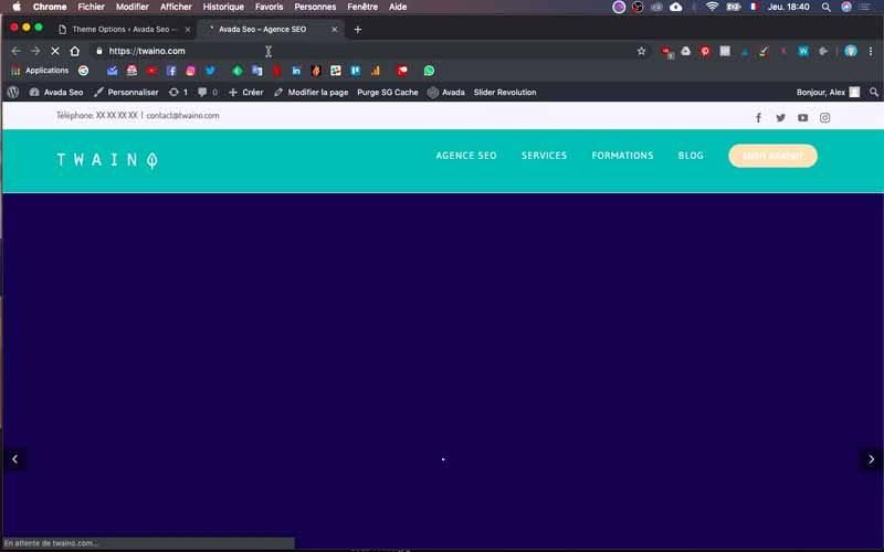
Refresh your home page and you will see that the button has indeed appeared.
I do have the “FREE AUDIT” menu which is located on a colored button. However, sometimes the color does not correspond to what we want to have.
2-3) Change the color and font of your menu button
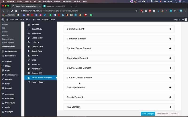
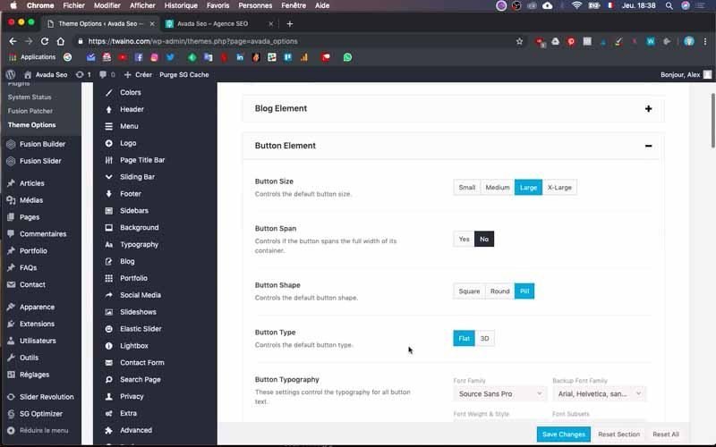
If you followed the previous steps without having the color you want, you may have an option that is still active. To do this, go to the “Theme Options” menu of your theme and click on “Fusion Builder Elements” then “Button Element”.
You then have the different configurations for the buttons on your website.
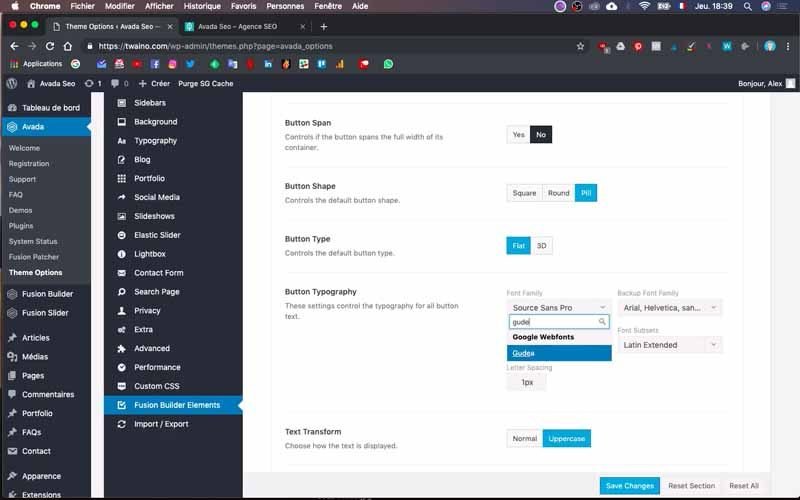
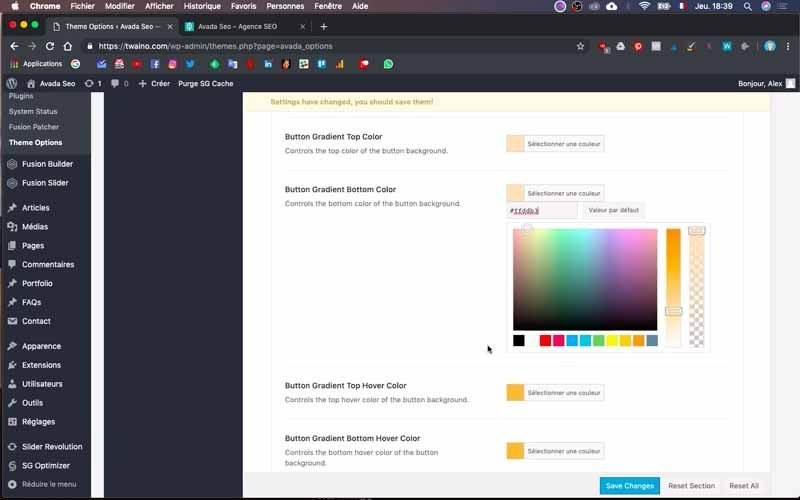
First, I will change the font of the “FREE AUDIT” button. To do this, go to “Button typography” and select the “Font Family” that suits you. I take “Gudea” given the layout of my website.
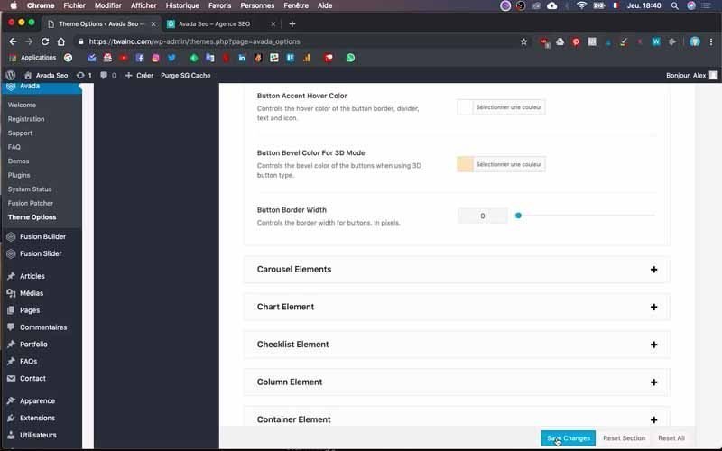
In second position, I change the color of the button by going to the different “Button Gradien” to choose the color I want to have. I saved the changes and there was a change in button color and menu font.
2-4) Select your menu style
Go to the “Theme Options” menu of your theme and click on “Header” then “Header Content”.
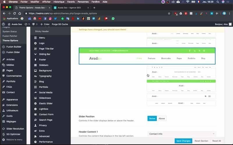
You therefore have the choice between several menu styles, it’s up to you to make the choice based on what you want to have.
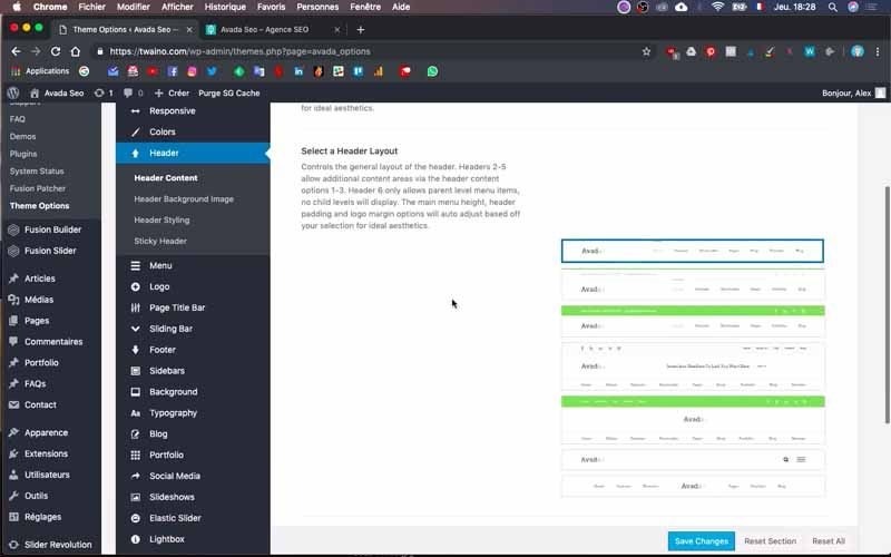
Additionally, there are some configurations you can already do here.
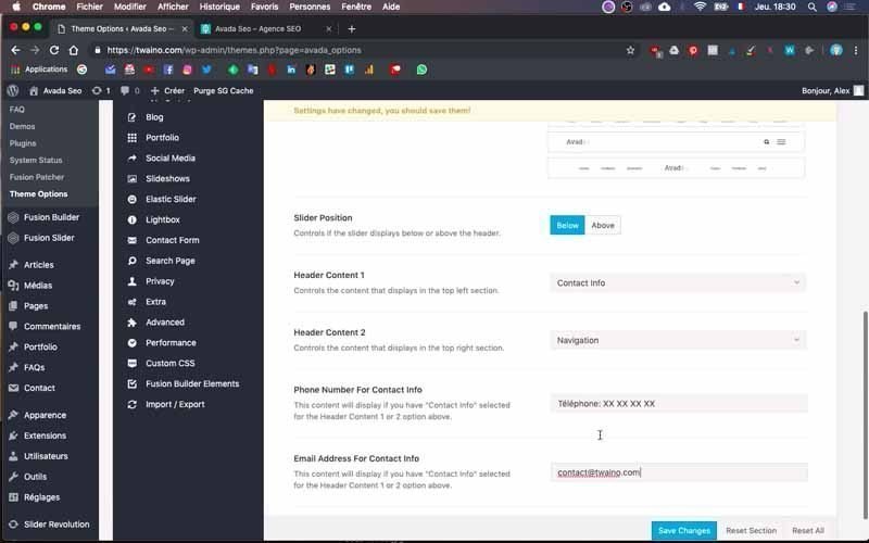
This involves adding the telephone number and your email by going to the “Phone number for Contact info” and “Email Address for Contact info” option.

Also, at the level of “Header Content 2” select “Social Links” if you want, like me, to directly insert the links of your social network accounts at the very top of your website.
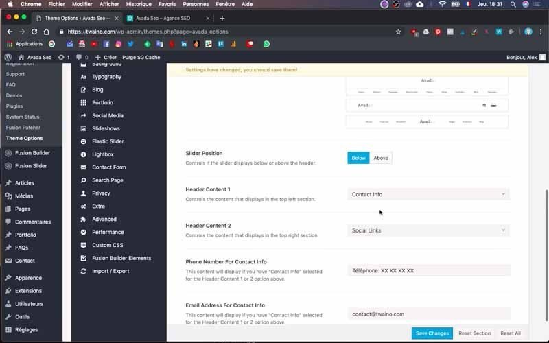
At the end, validate the changes by clicking on the blue “Save Changes” button.
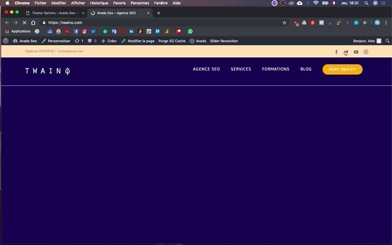
2-5) Activate Sticky Header
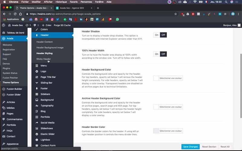
Still at the “Header” level, click on “Sticky Header” and press “On”.
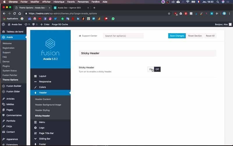
Then save and go to the home page of your website to see the changes that have been made.
2-6) Change the color of your “Header”
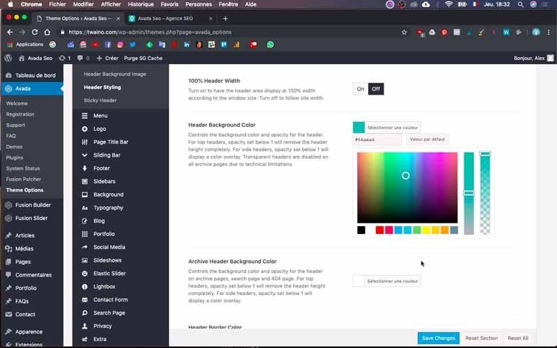
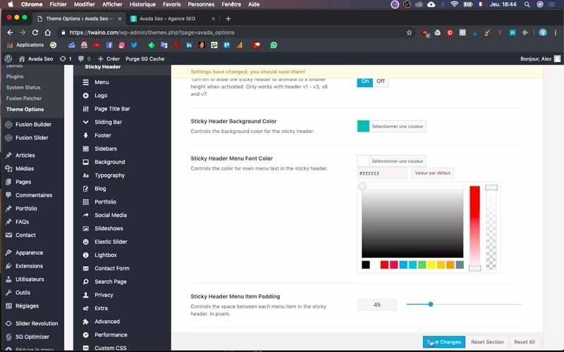
To change the color of your “Header”, go to “Header Styling” and scroll down to “Header Background Color”.
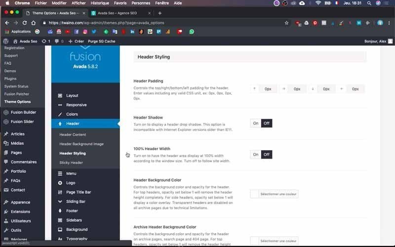
Select the color you want to have and go to “Header Top Background Color” to change the color of the “Top Header” including the social network links.
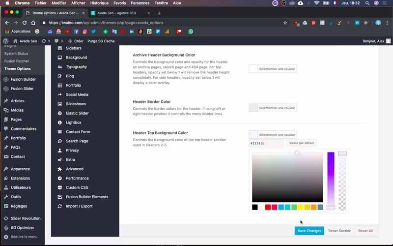
Save the changes by saving.

2-7) Change the size and colors of the “Top Header” texts
To perform this operation, click on the “Secondary Top Menu” option in the “Menu” section of “Theme Options”. Once on the page, scroll down and choose the colors you want to have for the three parameters:
- Secondary Menu Font Color ;
- Secondary Menu Dropdown Font Color ;
- Secondary Menu Dropdown Font Hover Color.
To change the size of writings, simply go to the “Secondary Menu Font Size” setting.
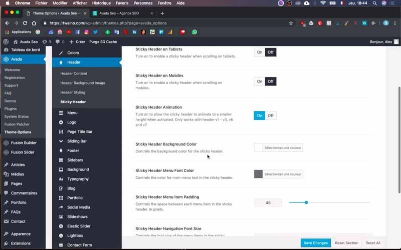
Indicate the size you want and don’t hesitate to experiment to get the best result. Then save these changes to have a preview.
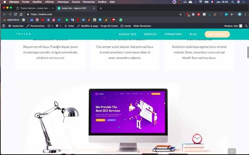
And There you go ! I have just finished creating the navigation menu for my website. As you can see, the result is almost the same as my website mockup.
In summary
The navigation menu is one of the first elements to put in place when you start creating a website.
But although its realization is not extremely complicated, as you have seen, there remains a very important element that should not be taken lightly.
To do this, I strongly recommend that you establish a mock-up of your website in advance, which saves a lot of time during this step.
And for good reason, you will know exactly what you want to achieve, and all you have to do is use the process described above to achieve the desired result.
Don’t hesitate to experiment a little since it sometimes happens that different options influence the same setting, as was the case with the color of the button in my “FREE AUDIT” menu.
