

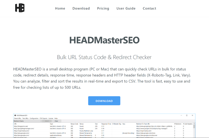
Responsive Breakpoints Generator
94% of people judge websites based on responsive web design. That said, site creators must work to make their sites responsive, a task that is no longer complicated these days. But while building responsive sites is getting easier and easier, making images responsive is a lot more difficult, because it relies on a separate technology: calculating image breakpoints. Thanks to the Responsive Breakpoints Generator tool, you can easily make your images responsive in order to adapt them to all the screens that will be able to access your site. In this description, we discover this tool and how to configure them to process your images.What is Responsive Breakpoints Generator?
It is a tool that will allow you to interactively upload your images and then set parameters to find the image dimensions that suit your graphic design requirements. One can define the required image width range, the file size step in kilobytes and a safety limit of the maximum number of images allowed. Additionally, you can request that the results include double resolution images for DPR 2.0 displays.
To understand the value of this tool, we will have to look at Google’s requirements that websites must be mobile-friendly.
It’s about designing websites to respond to mobile device screens. For this, webmasters use responsive technology to display their sites correctly on any screen.
Additionally, you can request that the results include double resolution images for DPR 2.0 displays.
To understand the value of this tool, we will have to look at Google’s requirements that websites must be mobile-friendly.
It’s about designing websites to respond to mobile device screens. For this, webmasters use responsive technology to display their sites correctly on any screen.
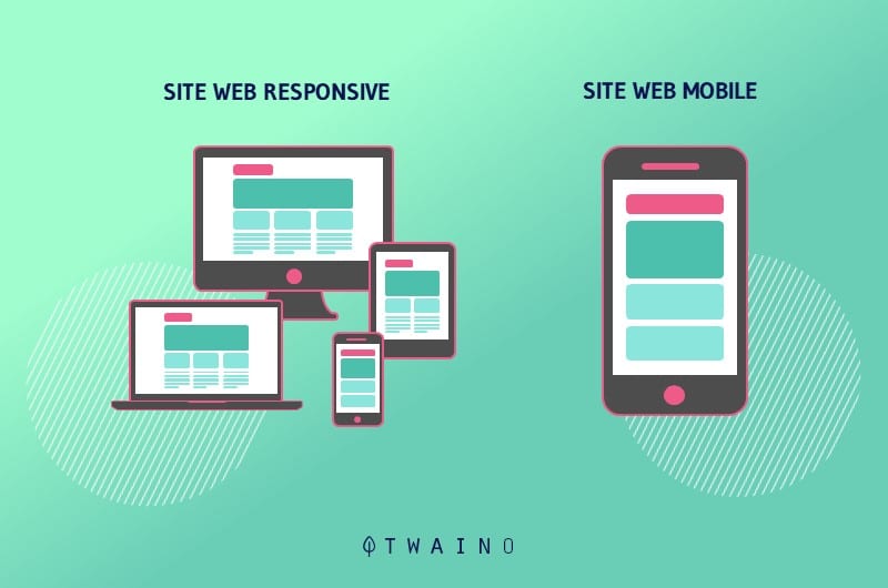 When it comes to images, even the most modern responsive sites often have it’s hard to select image resolutions that best match users’ different devices.
They are content to make concessions either on the dimensions of the image or on the number of images. However, this problem can be solved by calculating the breakpoints of the images in a more mathematical way.
Responsive Breakpoints Generator is a generator of these breakpoints or breakpoints. It can help developers automatically find the optimal image sizes needed for the best viewing experience in apps and on a variety of screen sizes.
The breakpoint generation tool uses Cloudinary’s advanced algorithms to easily generate the best breakpoints for each image you’ll upload.
When it comes to images, even the most modern responsive sites often have it’s hard to select image resolutions that best match users’ different devices.
They are content to make concessions either on the dimensions of the image or on the number of images. However, this problem can be solved by calculating the breakpoints of the images in a more mathematical way.
Responsive Breakpoints Generator is a generator of these breakpoints or breakpoints. It can help developers automatically find the optimal image sizes needed for the best viewing experience in apps and on a variety of screen sizes.
The breakpoint generation tool uses Cloudinary’s advanced algorithms to easily generate the best breakpoints for each image you’ll upload.
Who is Responsive Breakpoints Generator for and why should they care?
The breakpoint generator is especially for webmasters, website owners and web developers. Indeed, responsive images are more than news and are now integrated into the core of WordPress. However, things seem increasingly complicated for web developers as the number of different devices and potential screen resolutions increases. Manufacturers trying to set themselves apart with their innovations in laptop screens and mobile devices. Furthermore, new devices such as televisions and smartwatches are entering the market, making the race even more complex. To adapt to these innovations, websites must be able to display their images correctly on their screens without trying to create separate content for each of them. The advantage is that the Responsive Breakpoints Generator tool can help do this for free.Configuring the Responsive Breakpoints Generator Tool
You can configure this breakpoint generator tool in two ways:Settings
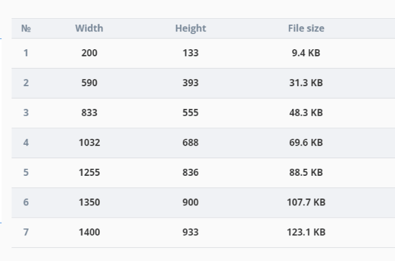
When you upload an image, breakpoints are generated according to your parameters and are calculated automatically in the cloud.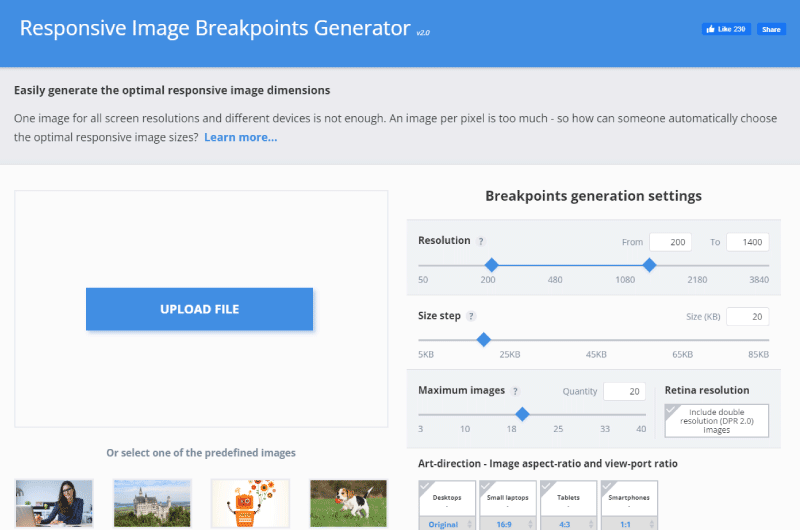 These breakpoints are then presented in a summary table and visually illustrated on your uploaded image.
 It is also possible to download a zip file containing all the reduced and optimized images that correspond to the generated breakpoints.
The generator tool also generates an HTML5 image tag which will simply be copied and pasted into your code.
It is also possible to download a zip file containing all the reduced and optimized images that correspond to the generated breakpoints.
The generator tool also generates an HTML5 image tag which will simply be copied and pasted into your code.
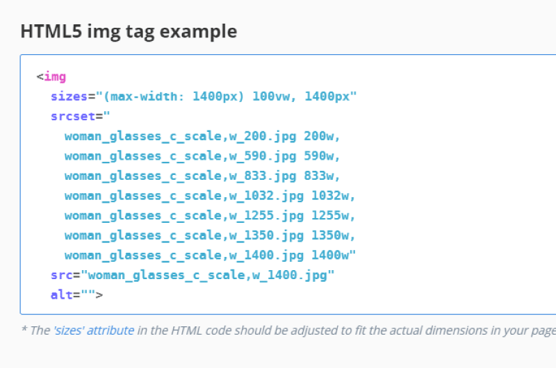 The srcset attribute of the img tag is configured to list the image versions and width values corresponding to skillfully selected breakpoints.
So modern browsers that process the img tag will recognize the correct version of the image based on the available space in your responsive web layout.
The srcset attribute of the img tag is configured to list the image versions and width values corresponding to skillfully selected breakpoints.
So modern browsers that process the img tag will recognize the correct version of the image based on the available space in your responsive web layout.
Art Direction — Image Aspect Ratio and Viewing Hole Ratio Responsive
layouts require art direction. This is because the original images might need to be cropped to match a different aspect ratio required by the graphic design, for a mobile device for example.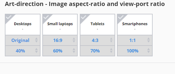 The breakpoint generation tool allows multiple aspect ratios to be selected and breakpoints will be generated for each aspect ratio separately.
During this time, the original image is cropped to conform to the required aspect ratio.
The breakpoint generation tool allows multiple aspect ratios to be selected and breakpoints will be generated for each aspect ratio separately.
During this time, the original image is cropped to conform to the required aspect ratio.
 The downloadable zip file also contains all images of all aspect ratios.
In addition, the build tool features sample HTML5 “picture” element code that combines the various aspect ratios and their breakpoints into a single responsive HTML solution.
The downloadable zip file also contains all images of all aspect ratios.
In addition, the build tool features sample HTML5 “picture” element code that combines the various aspect ratios and their breakpoints into a single responsive HTML solution.
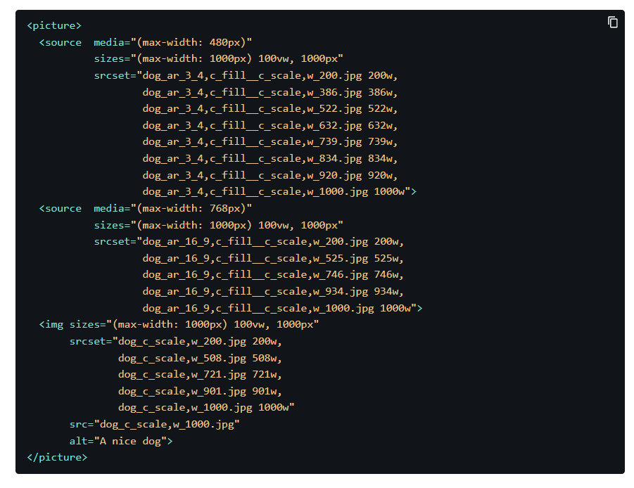 You will find for example the “picture” tag that most recent browsers already support.
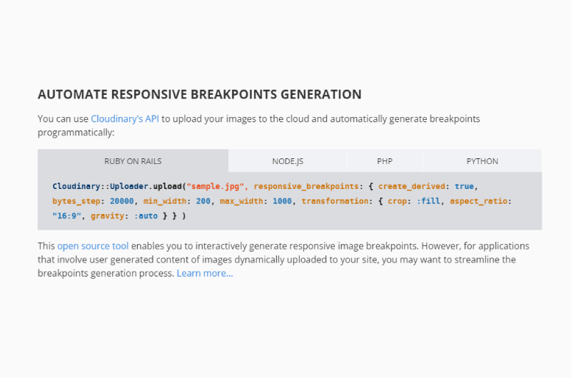
Automating Breakpoint Generation with Cloudinary’s APICopy
The web-based breakpoint generation tool described above allows you to process your images interactively, which is handy when you have a reasonable amount statically uploaded images. However, what if your web application includes user-generated content? To generate breakpoints for user-uploaded images, you must programmatically generate them from your code. With each frame uploaded, you need to call an API method to generate the breakpoints, store them or cache them on your end. Then your HTML5 or CSS responsive web code will be built based on these breakpoints. The Cloudinary API will allow you to programmatically request breakpoints for newly uploaded images or for existing images. It is possible to specify parameters such as:- The width range;
- The file size threshold and the maximum number of images;
- The image transformations to apply to the original image.
 You can call the cloud-based API from your development framework code using Cloudinary’s open-source SDKs for:
- Ruby on Rails;
- Node.js;
- Python;
- Java;
- .Net.


 Alexandre MAROTEL
Founder of the SEO agency Twaino, Alexandre Marotel is passionate about SEO and generating traffic on the internet. He is the author of numerous publications, and has a Youtube channel which aims to help entrepreneurs create their websites and be better referenced in Google.